Scoring genre clarity...

Hyper Light Drifter capsule

Hyper Light Drifter

Explore a beautiful, vast and ruined world riddled with dangers and lost technologies.

$19.99Very Positive(140)
Pixel GraphicsGreat SoundtrackAtmospheric
Heart MachineMar 31, 2016

Hyper Light Drifter scores 88/100 — better than 100% of Pixel Graphics capsules (n=5,137).

Very Positive (140 reviews) · $19.99 · Released Mar 31, 2016 · By Heart Machine

Quick text summary

Hyper Light Drifter scored 88/100 on Steam Analyzer — Excellent for a Pixel Graphics capsule. Top priority fix: [genre_clarity] No fixes needed—genre communication is excellent at all sizes

Capsule scores by dimension

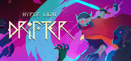
  • Genre Clarity: 9/10 — Cyberpunk action-adventure instantly clear. The central character in a pink cape and goggles, crossed-arm pose, surrounded by neon geometric UI elements and angular weapon shapes immediately signal action-adventure cyberpunk. At tiny size, the silhouette of the goggled character and magenta-blue color palette read unmistakably as stylized action game with sci-fi themes. The drifter pose and tech-forward aesthetic are genre-defining without ambiguity.
  • Title Readability: 8/10 — Title readable at all sizes with style. HYPER LIGHT DRIFTER text uses a distinctive geometric font with strong letter separation and white color that maintains contrast against the black background. At small and tiny sizes, the title remains legible though the decorative angular letterforms lose some detail. The top-left placement on clean dark space ensures it stays readable even at thumbnail scale without competing with central elements.
  • Contrast & Color: 9/10 — Striking neon pop on dark background. The magenta-pink character and cyan-purple geometric elements create excellent value separation against the pure black background, essential for Steam's dark theme. Neon saturation and brightness ensure the capsule pops on quick scroll at any size. Even in grayscale, the subject maintains clear silhouette definition and the layered geometry provides depth without muddiness.
  • Uniqueness & Polish: 9/10 — Distinctive cyberpunk aesthetic, premium craft. The art style is unmistakably Hyper Light Drifter with its signature angular geometry, neon color grading, and minimalist character design that conveys story and mood rather than photorealism. Every element—cape, goggles, weapon shapes, geometric background—feels intentional and cohesive, avoiding generic sci-fi tropes. The visual storytelling communicates a lone drifter in a high-tech ruined world without needing text.
  • Brand Consistency: 9/10 — Iconic character and consistent visual identity. The crossed-arm drifter silhouette, neon magenta-cyan palette, and angular geometric art direction are immediately recognizable as Hyper Light Drifter and would be consistent with the game's store presence and visual language. The minimalist character design with goggles is a memorable identity signal that sets it apart from generic action games. All stylistic choices reinforce the game's signature cyberpunk-noir aesthetic.
  • Composition: 9/10 — Strong hierarchy, clear focal point. The central character serves as the unambiguous focal point, flanked by supporting geometric shapes that guide the eye without competing. Title occupies safe top-left space away from critical elements, and the background geometry creates depth layers that enhance rather than clutter. Composition is resilient at small and tiny sizes—the character remains center-dominant and readable at all scales.

What works

  • Iconic character instantly recognizable. The drifter silhouette with crossed arms and goggles is a memorable visual signature that communicates identity and personality without needing dialogue.
  • Neon color palette pops on Steam dark theme. Magenta and cyan against pure black background create maximum contrast and visual appeal in quick scroll conditions.
  • Coherent cyberpunk aesthetic throughout. Every element from character design to geometry to color grading reinforces a unified visual style that feels premium and intentional.
  • Title placement and readability optimized. Top-left positioning on dark space with geometric font maintains legibility at tiny thumbnail size without relying on decorative fragility.

What hurts the capsule

  • Fine geometric detail softens at tiny size. The intricate angular background elements and thin lines lose some definition at thumbnail scale, though core subject remains clear.

Priority fixes

  1. [genre_clarity] No fixes needed—genre communication is excellent at all sizes
  2. [composition] No composition changes required—hierarchy and focal point are strong

Store copy priority fixes

  1. [feature_communication] Add a sentence clarifying the role of the illness mechanic in gameplay—does it affect combat abilities, progression, or serve purely as narrative framing?—to help players understand the core challenge loop.
  2. [uniqueness] Explicitly name a specific design or mechanical distinction (e.g., 'wordless narrative,' 'color-coded enemy types,' 'seamless fast-travel via dashing') to differentiate from generic 16-bit homages.
  3. [audience_targeting] Add a brief note on expected playtime, solo focus, and whether this is a contemplative/narrative-driven experience vs. action-focused, so players can self-identify fit.

Related guides

Steam app ID: 257850 · Tags: Pixel Graphics, Great Soundtrack, Atmospheric, Indie, Adventure