Scoring genre clarity...
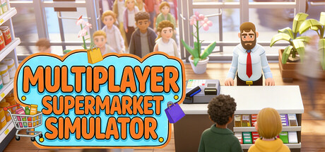
Run your own supermarket with your buddy! Set product categories/prices, handle checkout, hire staff, expand your store, source goods, grow & sell crops, build town relations, and become the town’s richest resident!
$9.99
SimulationShop Keeper3D Platformer
Supermarket SimulatorFeb 15, 2026