Scoring genre clarity...
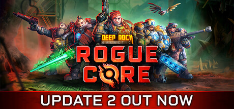
Deep Rock Galactic: Rogue Core capsule

Deep Rock Galactic: Rogue Core

DEEP ROCK GALACTIC: ROGUE CORE is a 1-4 player co-op FPS action roguelite featuring sci-fi dwarves, alien horrors and procedurally-generated caves. Join the elite dwarven Reclaimers and fight through perilous mining facilities infested with deadly Corespawn. For Rock and Stone!

$29.99Mostly Positive(1,352)
FPSDwarvesCo-op
Ghost Ship GamesMay 20, 2026

Deep Rock Galactic: Rogue Core scores 83/100 — better than 97% of FPS capsules (n=1,344).

Mostly Positive (1,352 reviews) · $29.99 · Released May 20, 2026 · By Ghost Ship Games

Quick text summary

Deep Rock Galactic: Rogue Core scored 83/100 on Steam Analyzer — Good for a FPS capsule. Top priority fix: [composition] Shift the rightmost character slightly left to ensure all figures remain safely within margins and avoid edge-cropping on mobile/tablet Steam views.

Capsule scores by dimension

  • Genre Clarity: 8/10 — Strong sci-fi action roguelite cues. The capsule effectively communicates a co-op sci-fi shooter through multiple visual signals: heavily armored dwarven characters in combat poses, glowing energy weapons (green laser visible), alien/industrial environment with rocky terrain, and dynamic action staging. At tiny size, the silhouettes of armed figures and the green energy beam still register as combat-focused sci-fi, though the specific roguelite mechanic is not visually explicit. The genre reads clearly as action-oriented with sci-fi setting.
  • Title Readability: 9/10 — Excellent contrast and hierarchy. The title 'DEEP ROCK GALACTIC: ROGUE CORE' uses bold red lettering with thick black outlines positioned prominently in the center-lower area against a darker background region. The two-line layout with 'DEEP ROCK' on top and 'ROGUE CORE' below creates strong visual hierarchy. At small and tiny sizes, the title remains fully legible due to high value contrast, thick letterforms, and strategic placement away from character clutter, making it one of the capsule's strongest elements.
  • Contrast & Color: 9/10 — Vibrant palette with excellent separation. The capsule features a warm orange-red gradient background contrasting sharply against the cool green glow of the energy weapon and blue/cyan armor accents on the dwarven characters. The red title pops dramatically against the darker mid-tone regions. In grayscale mental test, the characters and bright laser maintain clear silhouette definition, and at tiny size the value separation between characters (mid-light tones) and background (warm orange to dark green) remains strong and readable.
  • Uniqueness & Polish: 8/10 — Polished co-op sci-fi visual identity. The capsule demonstrates high production value with multiple armored characters arranged in a dynamic team composition, each with distinct armor colorization and equipment. The art direction feels cohesive and premium—rendering quality, lighting coherence, and the intentional warm-to-cool color split creates visual interest without looking generic. The 'Rogue Core' branding combines with the team staging to communicate both roguelite depth and co-op focus, though it shares compositional DNA with other squad-based action games.
  • Brand Consistency: 8/10 — Strong dwarven identity reinforced. The capsule consistently emphasizes the core brand identity of Deep Rock Galactic: heavily armored dwarf characters as the primary visual anchor, industrial mining equipment aesthetic, and sci-fi alien danger. The iconic dwarven silhouettes would be recognizable to series fans. The color language (warm industrial oranges, cool sci-fi blues/greens) and team composition align with established visual identity expectations without feeling derivative.
  • Composition: 8/10 — Well-balanced team staging layout. The composition arranges four armored dwarves in a diagonal sweep from left to right, with overlapping layering that creates depth and visual flow. The title sits in the lower-center region on a semi-dark band, protecting it from clutter. At small and tiny sizes, the character cluster reads as a unified group silhouette, and the title placement ensures safe margins. The green laser beam and background elements support the focal point without competing; however, the right edge contains some character overlap that risks tight cropping.

What works

  • Outstanding title contrast and legibility. Red text with thick black outline reads perfectly at all sizes from full to tiny, positioned strategically to avoid character clutter.
  • Vibrant color palette with visual pop. Warm orange-red background combined with cool green energy and blue armor creates strong value separation and stands out against Steam dark background.
  • Clear team composition and character identity. Multiple distinct dwarven armored figures with different equipment communicate co-op gameplay and reinforce the franchise's core visual brand.
  • Strong depth layering and hierarchy. Foreground characters, midground laser effects, and background environmental details create readable visual layers at all scales.

What hurts the capsule

  • Right edge character overlap risk. The rightmost character sits close to the edge and may experience awkward cropping on certain Steam platform implementations.
  • Roguelite mechanic not visually explicit. While the sci-fi action genre reads clearly, the procedural or roguelite-specific gameplay loop is not communicated through visual design elements.
  • Limited environmental context. The capsule focuses heavily on character silhouettes with minimal visible cave, mining facility, or alien threat details that define the game's unique setting.

Priority fixes

  1. [composition] Shift the rightmost character slightly left to ensure all figures remain safely within margins and avoid edge-cropping on mobile/tablet Steam views.
  2. [genre_clarity] Add subtle environmental prop (e.g., mining drill, cave wall texture, or alien creature silhouette) in background to reinforce the mining roguelite identity without cluttering the focal point.
  3. [title_readability] Consider adding a small secondary tagline like 'Co-op Roguelite' in a secondary font below the main title to improve genre specificity, testing readability at tiny size first.

Store copy priority fixes

  1. [feature_communication] Add a prominent Early Access banner or notice in the opening 'About the Game' section to manage expectations around content roadmap and balance changes.
  2. [hook_strength] Insert a brief gameplay-focused paragraph immediately after the short description explaining the core loop: 'Start each mission with basic gear, find and craft upgrades from found minerals, build synergies, execute the objective under time pressure, repeat with permanent meta progression.'
  3. [uniqueness] Add 1-2 concrete examples of build synergies or game-changing combinations (e.g., 'Pair Falconer's drone with Spotter's ammo crates for unlimited aerial assault') to illustrate why roguelite mechanics feel fresh in this context.
  4. [feature_communication] Reorder content to move 'About the Game' narrative and class descriptions before the FAQ, presenting story and mechanics first, then reserving FAQ for edge cases and console/DLC questions.

Related guides

Steam app ID: 2605790 · Tags: FPS, Dwarves, Co-op, PvE, Roguelite