Scoring genre clarity...

Reach to Tsukuyomi capsule

Reach to Tsukuyomi

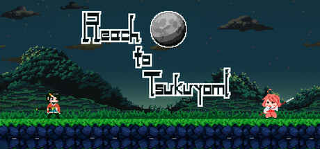
"Reach to Tsukuyomi" is an exhilarating short action game on a 2D platform. Fight a variety of enemies and powerful bosses to free your hometown from Yokai in this simple action game. What awaits you at the end of the story, which unfolds in cute pixels...?

$5.99Mostly Positive(23)
Action2D PlatformerCute
Tortoise Gear bitDec 25, 2025

Reach to Tsukuyomi scores 67/100 — better than 13% of Action capsules (n=8,535).

Mostly Positive (23 reviews) · $5.99 · Released Dec 25, 2025 · By Tortoise Gear bit

Quick text summary

Reach to Tsukuyomi scored 67/100 on Steam Analyzer — Solid for a Action capsule. Top priority fix: [uniqueness_polish] Add a distinctive visual element tied to Tsukuyomi/Yokai mythology—consider a glowing moon aura, spectral enemy silhouette, or Japanese torii gate motif to differentiate from generic platformers.

Capsule scores by dimension

  • Genre Clarity: 8/10 — Pixel action platformer clear. The retro pixel art style, 2D side-scrolling layout, and character sprite poses immediately signal classic action platformer gameplay. The moon icon reinforces the game's Tsukuyomi theme, and the presence of two distinct characters at ground level suggests player choice or progression. At tiny size, the pixelated silhouettes and horizontal level design remain legible as a classic action game.
  • Title Readability: 6/10 — Readable but decorative layout. The title 'Reach to Tsukuyomi' uses a decorative geometric font with white outlines that reads clearly at full size and maintains legibility at small size due to the high contrast white-on-teal background. However, the title's scattered vertical arrangement with the moon breaking up the text flow is somewhat inefficient spatially. At tiny size, word separation becomes slightly harder due to the staggered layout, pushing readability down from excellent to functional.
  • Contrast & Color: 7/10 — Good separation with strong silhouettes. The teal-blue sky background (#1b2838 adjacent) provides solid contrast against the white title text and the bright green grass platform. Character sprites pop clearly with distinct red and yellow clothing colors against the darker environment. The grayscale test shows clean value separation between foreground characters, mid-ground grass layer, and background sky, though the dark cloud elements blend slightly into the overall tonal range.
  • Uniqueness & Polish: 6/10 — Competent pixel art, generic execution. The retro pixel art style is cleanly executed with a cohesive color palette and recognizable character designs, but the overall composition feels like a standard 2D platformer template rather than a distinctive visual hook. The moon and Tsukuyomi theme are visible but not strongly leveraged as a unique selling point—the scene reads as a generic grassy level with enemies rather than communicating the Japanese mythology angle that makes this game special. Polish is present but the design lacks a memorable signature that distinguishes it from dozens of other indie platformers.
  • Brand Consistency: 6/10 — Consistent pixel style, weak identity. The pixel art rendering is consistent in style and technical quality throughout the visible elements, and the teal-green-warm color palette is cohesive. However, there are no strong iconic visual motifs or signature design choices that would make this capsule instantly recognizable as 'Reach to Tsukuyomi' rather than a generic indie platformer. The game's Japanese mythology theme is present but underdeveloped visually—the design could work for many action platformers without the Tsukuyomi context.
  • Composition: 7/10 — Balanced layout, title placement effective. The composition uses a clear three-layer depth structure: ground-level characters in foreground, grass platform in midground, and sky with clouds and moon in background. The title is centered horizontally with vertical distribution that avoids the exact center, preventing a static feel. The focal point is distributed between the moon (top center) and the two character sprites (bottom), which works well at small size. At tiny size, the layout remains readable, though the scattered title arrangement loses some elegance—no critical elements are cut off by Steam's standard cropping.

What works

  • Clear retro platformer identity. Pixel art style, 2D side-scroll layout, and character silhouettes immediately communicate the action platformer genre without ambiguity.
  • Readable white title on teal. High-contrast geometric font with white outlines reads well at both full and small sizes against the cohesive background.
  • Balanced three-layer depth. Sky background, grass midground, and character foreground create clear visual hierarchy and prevent compositional flatness.
  • Consistent color palette. Teal-green-warm tones are applied uniformly across all elements with no jarring value shifts or palette breaks.

What hurts the capsule

  • Generic platformer composition. The scene lacks a distinctive visual hook or unique selling point—moon and Tsukuyomi theme are present but underutilized to create a memorable identity.
  • Scattered title layout efficiency. Vertical word distribution with moon interruption reduces spatial efficiency and makes tiny-size legibility slightly harder than a standard horizontal title would.
  • Weak Japanese mythology integration. The Tsukuyomi and Yokai concept are core to the game but barely visible in the capsule—the design communicates 'retro platformer' rather than 'Japanese folklore action game'.
  • No iconic visual signature. Characters and design elements are competent but generic—nothing visually suggests this specific game versus other pixel platformers in the same genre.

Priority fixes

  1. [uniqueness_polish] Add a distinctive visual element tied to Tsukuyomi/Yokai mythology—consider a glowing moon aura, spectral enemy silhouette, or Japanese torii gate motif to differentiate from generic platformers.
  2. [brand_consistency] Design or emphasize an iconic character or symbol (e.g., a stylized Yokai creature or protagonist pose) that could become instantly recognizable as 'Reach to Tsukuyomi'.
  3. [title_readability] Test horizontal or simplified title layout to improve spatial efficiency and readability at tiny size without sacrificing the decorative font's charm.
  4. [composition] Strengthen the focal point hierarchy by making either the moon or a unique protagonist character the dominant visual anchor rather than splitting emphasis equally.

Store copy priority fixes

  1. [hook_strength] Replace 'exhilarating' in the short description with a specific, concrete gameplay hook: 'Master split-second counter timing and shurikens to defeat Yokai bosses and reclaim your hometown' or similar action-forward language that shows, not tells.
  2. [feature_communication] Expand the counter mechanic description: explain the risk/reward or skill-expression aspect (e.g., 'perfectly-timed dashes trigger counter-attacks for massive damage') to help players understand combat depth.
  3. [uniqueness] Add a sentence differentiating this game: either emphasize what makes the boss encounters special, the story's emotional stakes (childhood friend confrontation), or the combo/flow of combat—something that would not apply to every 2D platformer.
  4. [audience_targeting] Add a clarity sentence to the short description signaling whether this is a casual, story-focused platformer or a skill-based boss-gauntlet (e.g., 'A short, story-driven action game for players who love character-rich platformers' or 'A challenging boss-rush platformer for action fans').

Related guides

Steam app ID: 2606330 · Tags: Action, 2D Platformer, Cute, Pixel Graphics, Female Protagonist