Scoring genre clarity...

Merchants of Rosewall capsule

Merchants of Rosewall

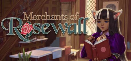
As a new Merchant in the bustling city of Rosewall you'll manage your own shop, craft artisan goods, hire Companions, and even unravel a mystery of the city! Immerse yourself in a fantasy world where conflict is a thing of the past in this visual novel meets shopkeeper simulator.

$19.99Mixed(19)
Shop KeeperFantasySimulation
Big Blue Sky GamesMar 4, 2025

Merchants of Rosewall scores 75/100 — better than 52% of Shop Keeper capsules (n=304).

Mixed (19 reviews) · $19.99 · Released Mar 4, 2025 · By Big Blue Sky Games

Quick text summary

Merchants of Rosewall scored 75/100 on Steam Analyzer — Good for a Shop Keeper capsule. Top priority fix: [composition] Shift the upper-left decorative arch inward by 15-20px or scale it smaller to ensure it clears all common Steam crop boundaries and maintains intended symmetry.

Capsule scores by dimension

  • Genre Clarity: 7/10 — Fantasy shopkeeper sim clearly signaled. The capsule effectively communicates a fantasy merchant/simulation theme through the ornate banner, diverse character cast in merchant/adventure clothing, and magical aesthetic with warm lighting and detailed fantasy architecture. At tiny size, the banner text and character grouping remain readable enough to suggest a management/merchant game, though the precise genre blend (visual novel + simulator) is not immediately obvious from visuals alone without text.
  • Title Readability: 8/10 — Strong banner placement, clear at all sizes. The 'Merchants of Rosewall' title is prominently centered on a cream-colored banner with dark blue text and a circular coin logo, creating excellent contrast against the background. At small and tiny sizes, the banner remains legible and the logo-text pairing holds together well, though minor letterform detail is lost at extreme reduction the hierarchy remains intact.
  • Contrast & Color: 8/10 — Warm fantasy palette with strong separation. The composition uses a complementary warm golden/orange lighting on characters and foreground against cool purple-blue background architecture, creating clear value separation and silhouette definition. The cream banner with dark text pops effectively against the dark Steam background, and the grayscale silhouettes of characters remain distinct even at tiny sizes due to strong rim lighting and position layering.
  • Uniqueness & Polish: 7/10 — Polished fantasy art with coherent direction. The capsule demonstrates solid craft with hand-drawn style character art, atmospheric lighting, and intentional fantasy world-building that avoids generic simulator template aesthetics. The magical shop setting and character diversity communicate a unique narrative hook beyond standard management sims, though the overall composition follows familiar merchant-game visual conventions without a breakthrough distinctive visual signature.
  • Brand Consistency: 7/10 — Cohesive fantasy palette, recognizable setting. The capsule maintains consistent warm-lit character rendering, purple-toned architecture, and a recognizable fantasy merchant town aesthetic that would align with the game's visual novel meets simulator identity. The ornate banner and character lineup establish a memorable brand identity for this specific title, supported by the distinctive coin logo and color palette, though without iconic character moments that would stand out across multiple marketing materials.
  • Composition: 8/10 — Clear hierarchy, balanced depth layering. The composition effectively uses foreground characters, mid-ground banner with logo, and background architecture to create depth and guide the eye from banner to supporting cast. The focal point (banner center) remains clear at small and tiny sizes, character silhouettes frame the composition naturally, and safe margins prevent critical element loss in Steam's typical cropping, though the upper-left decorative arch sits slightly close to edge risks.

What works

  • Banner logo and typography execution. The cream banner with coin emblem and dark blue serif text is clean, readable across all sizes, and provides strong focal hierarchy without requiring magnification to parse.
  • Fantasy atmosphere and color language. Warm golden character lighting contrasted against cool purple-blue architecture creates an immersive, cohesive mood that immediately communicates the fantasy merchant setting and appeals to the genre audience.
  • Character silhouette clarity. The diverse cast is positioned with rim lighting and varied poses that maintain readable silhouettes and depth separation even at tiny thumbnail sizes, supporting visual interest.
  • Depth layering and composition balance. Foreground-to-background progression creates natural visual flow, with no dead space or awkward empty zones that would weaken the design at reduced scales.

What hurts the capsule

  • Genre blend ambiguity at tiny size. While the fantasy merchant theme is clear, the visual novel component of the game is not communicated through imagery alone, potentially missing players seeking narrative-heavy experiences.
  • Limited distinctive visual signature. The capsule relies on well-executed but familiar fantasy merchant aesthetic cues rather than a unique visual hook that would make it instantly recognizable among competitor shopkeeper sims at quick scroll.
  • Decorative arch edge proximity. The ornate purple arch in the upper left corner sits very close to the edge and risks partial cropping in some Steam display contexts, potentially breaking the intended frame composition.

Priority fixes

  1. [composition] Shift the upper-left decorative arch inward by 15-20px or scale it smaller to ensure it clears all common Steam crop boundaries and maintains intended symmetry.
  2. [uniqueness_polish] Introduce a distinctive visual motif or character expression moment that communicates the unique narrative hook and differentiates it from generic shopkeeper sims in competitor thumbnails.
  3. [genre_clarity] Consider adding a subtle visual cue (prop, UI element, or pose) that hints at the visual novel / story-driven component alongside the merchant management theme.

Store copy priority fixes

  1. [hook_strength] Rewrite the short description opening to lead with a specific player action or emotional hook—e.g., 'Build a shop, nurture your staff's dreams, and uncover the secrets behind Rosewall's peaceful reign' instead of 'As a new Merchant in the bustling city...'
  2. [feature_communication] Restructure the detailed description to open with a 3-4 sentence gameplay loop summary (what you do each day/turn) before expanding into story and world-building—this helps players grasp the core experience faster.
  3. [uniqueness] Add 1-2 sentences explaining what the visual novel layer *does* for the shopkeeper experience—does it unlock alternative paths, deepen character depth, or change endings based on choices? Why does this hybrid matter?
  4. [audience_targeting] Include a brief sentence signaling playstyle—e.g., 'perfect for players who value narrative depth and relationship-building over rapid progression' or tone/pacing cues to help the right audience self-select.

Related guides

Steam app ID: 2616800 · Tags: Shop Keeper, Fantasy, Simulation, Crafting, Cooking