Scoring genre clarity...
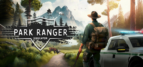
Manage your own park facility in a huge open world in Park Ranger Simulator. Take on all the tasks that need to be completed as a park ranger - alone or together in cross-platform multiplayer! You have a variety of vehicles and equipment at your disposal to complete the challenges ahead!
$14.99Very Negative(80)
SimulationCasualNature
Polygon ArtFeb 19, 2026