Scoring genre clarity...

Call Of Dookie capsule

Call Of Dookie

Imagine you went to the crapper, and emerged an hour later to a monster apocalypse! Retro first-person shooter action inspired by 90's classics! Old-school deathmatch & co-op!

$3.996 user reviews
Boomer ShooterFPSPvE
Marrone GamesMar 26, 2026

Call Of Dookie scores 72/100 — better than 48% of Boomer Shooter capsules (n=263).

6 user reviews · $3.99 · Released Mar 26, 2026 · By Marrone Games

Quick text summary

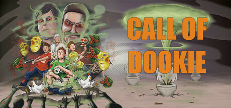
Call Of Dookie scored 72/100 on Steam Analyzer — Good for a Boomer Shooter capsule. Top priority fix: [brand_consistency] Introduce a distinctive recurring visual element—such as a signature toilet motif, character silhouette, or unique logo—that remains recognizable without text for stronger brand identity across store pages.

Capsule scores by dimension

  • Genre Clarity: 7/10 — Retro FPS parody vibe clear. The capsule effectively communicates a comedic retro shooter through exaggerated character faces, chaotic action poses, and green radioactive/toxic visual effects that evoke 90s FPS games. At TINY size, the green glow and clustered character silhouettes still read as action-oriented chaos, though the specific parody humor and toilet/bathroom setting are harder to parse at small sizes.
  • Title Readability: 8/10 — Bold orange title, strong legibility. The large orange sans-serif 'CALL OF DOOKIE' text is positioned on the right side against a lighter gradient background, ensuring high contrast and readability even at TINY size. The letterforms are clean and bold without decorative flourishes that would collapse at small scales, and the two-line stacking maintains clarity across all viewing sizes.
  • Contrast & Color: 8/10 — Vibrant orange pops against dark. The bright orange title provides excellent value separation from the Steam dark background (#1b2838), and the green radioactive glow creates secondary color contrast that enhances the toxic/chaotic theme. Character silhouettes are well-lit with warm tones and green accents, creating clear depth separation from the neutral brown-purple background, though some mid-tone areas between characters blend slightly at TINY size.
  • Uniqueness & Polish: 7/10 — Comedic retro parody executed well. The capsule successfully conveys the 'crapper apocalypse' premise through stylized exaggerated facial expressions, chaotic character clustering, and deliberate toxic/radioactive effects that distinguish it from serious FPS competitors. The art style is intentionally cartoonish and retro-inspired, but execution feels more like quality fan art than a premium AAA polish—it lacks the refined cinematography or ultra-polished craft of top-tier capsules, yet the parody concept is clearly realized and memorable.
  • Brand Consistency: 6/10 — Coherent theme, limited iconic symbols. The capsule maintains internal consistency with a unified chaotic retro-shooter aesthetic, warm color palette, and exaggerated character design that aligns with the toilet-based premise and indie comedic tone. However, there are no clear iconic motifs, recurring symbols, or signature visual elements (like a distinctive character or logo mark) that would make this instantly recognizable across other marketing materials or store pages without the text.
  • Composition: 7/10 — Balanced chaos with clear hierarchy. The composition effectively separates the busy character cluster on the left from the clean title space on the right, creating a clear focal point hierarchy despite the intentionally chaotic subject matter. The title placement avoids the center and uses safe margins well, and at SMALL size the left-heavy character mass and right-side text still read as balanced; however, the dense overlapping characters lack distinct depth layering and could feel slightly cluttered at TINY sizes when individual silhouettes merge.

What works

  • Bold orange typography contrast. The large, clean orange title maintains excellent legibility against the dark Steam background at all viewing sizes and requires no decorative elements.
  • Clear genre parody identity. Exaggerated character faces, chaotic action poses, and green radioactive effects instantly signal a comedic retro FPS, differentiating it from serious action competitors.
  • Smart composition separation. Clustering characters on the left and positioning title on the right creates natural hierarchy and avoids center clutter or awkward empty space.

What hurts the capsule

  • Limited iconic brand symbols. No distinctive character, logo mark, or visual motif is prominent enough to create instant brand recognition without the title text present.
  • Character silhouette clarity at tiny. Dense overlapping of multiple characters causes some individual details and expressions to merge and blur at TINY thumbnail size, reducing personality readability.
  • Generic retro-parody execution. While the theme is clear, the visual approach feels like competent fan art rather than premium polish that would stand alongside top-tier competitor capsules in craft and production value.

Priority fixes

  1. [brand_consistency] Introduce a distinctive recurring visual element—such as a signature toilet motif, character silhouette, or unique logo—that remains recognizable without text for stronger brand identity across store pages.
  2. [contrast_color] Increase definition between overlapping character silhouettes by adding subtle darker outlines or rim lighting to prevent merging at TINY sizes while maintaining chaotic energy.
  3. [uniqueness_polish] Refine character rendering with more cinematic lighting or cell-shaded polish to elevate perceived production value and closer match competitor visual standards.

Store copy priority fixes

  1. [feature_communication] Add specific story mode details: number of campaign levels, estimated playtime, difficulty progression, and brief narrative stakes beyond 'save loved ones'—solo players need concrete expectations.
  2. [uniqueness] Insert one sentence explaining what makes the gameplay loop or level design distinctive—e.g., 'chaotic AI behavior,' 'dynamic environmental hazards,' or 'level-specific gimmicks' to set this apart from other retro FPS games.
  3. [audience_targeting] Expand the opening short description by one clause to explicitly mention 'solo campaign' or 'story mode' for clarity, since the current version emphasizes multiplayer and may deter campaign-focused players.

Related guides

Steam app ID: 2623680 · Tags: Boomer Shooter, FPS, PvE, PvP, Shooter