Scoring genre clarity...

GodsTV capsule

GodsTV

Shoot, Hack & Slash your way to stardom in this action show-like rogue-lite. The gods demand views... Fight for fame, die for your fans and grow stronger Backstage. You're on: Are you ready for Prime Time?

ActionCyberpunkParody
MelbotComing soon

GodsTV scores 70/100 — better than 28% of Action capsules (n=8,871).

Released Coming soon · By Melbot

Quick text summary

GodsTV scored 70/100 on Steam Analyzer — Good for a Action capsule. Top priority fix: [composition] Establish a single primary character or focal point at screen center and push supporting elements to frame edges with clear depth separation to guide the eye at tiny size.

Capsule scores by dimension

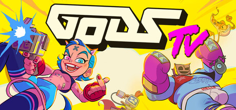
  • Genre Clarity: 8/10 — Action chaos, clear visual energy. The capsule clearly communicates action gameplay through dynamic pose, weapon presence, and energetic cartoon art style. At tiny size, the bright yellow background, aggressive character poses, and weapon silhouettes still read as high-octane action. The chaotic layout and vibrant palette strongly suggest indie action with personality, though the rogue-lite mechanic is not explicitly visual.
  • Title Readability: 7/10 — Logo reads well, tagline unclear tiny. The 'GODS TV' logo in white with pink/magenta accent is bold, geometric, and maintains good contrast against yellow at all sizes. At small and tiny sizes the logo remains legible. However, the 'TV' suffix and overall wordmark design compress well but the stylized font at full size could be sharper; the tagline text is illegible at tiny size.
  • Contrast & Color: 8/10 — Vibrant high-saturation pop. The capsule uses intense primary and secondary colors—bright yellow background, hot pink/magenta accents, blues, reds, and oranges on character silhouettes—creating strong value separation against the dark Steam background. At tiny size the overall brightness and saturation still read loudly. The grayscale test shows distinct tonal layers between foreground characters and background, though some mid-tone flesh tones blend slightly.
  • Uniqueness & Polish: 7/10 — Distinctive indie cartoon style. The art direction is cohesive and memorable with a bold, intentional cartoon aesthetic featuring expressive character design, sharp outlines, and playful poses that communicate personality over generic action. The 'TV show' framing and broadcast aesthetic (tagline 'TV' logo treatment) adds conceptual distinctiveness. However, the composition feels somewhat scattered and lacks a clear singular hook or visual mechanic storytelling that would elevate it to premium polish.
  • Brand Consistency: 6/10 — Cartoon style consistent, no icon. The rendering style is internally cohesive—consistent outlines, bright saturated palette, expressive proportions across all visible character elements. The art direction clearly belongs to one game. However, there is no iconic character, symbol, or signature motif that would make this capsule immediately recognizable on its own; the 'GODS TV' branding is functional but not yet a distinctive identity signal.
  • Composition: 6/10 — Busy layout, unclear focal point. The capsule arranges multiple characters and elements across the frame with roughly equal visual weight, creating a scattered composition that lacks a clear primary focal point or depth hierarchy. At tiny size, the overlapping characters and logo placement compete for attention rather than guide the eye. The logo sits center-right over busy detail, and there is no clear safe margin; important character elements hug the left edge and may be cropped on some Steam displays.

What works

  • Bold readable logo treatment. The white 'GODS TV' wordmark with pink accent maintains excellent contrast and legibility even at tiny sizes due to geometric letterforms and strategic outline.
  • High-energy color palette. Vibrant saturated yellows, magentas, blues, and reds create immediate visual impact against dark Steam background and read clearly at all viewing sizes.
  • Genre-appropriate art style. The cartoon expressive aesthetic with dynamic poses and exaggerated proportions clearly communicates indie action with personality and visual confidence.

What hurts the capsule

  • Scattered focal point hierarchy. Multiple characters and elements have roughly equal visual weight, creating a chaotic composition that lacks a clear primary subject or reading order.
  • Poor safe margins and edge hugging. Important character silhouettes sit very close to left and right edges, risking crop loss on Steam display variations and safe margin violations.
  • No iconic brand symbol. While the cartoon style is consistent, there is no memorable character, mascot, or signature symbol that would make this capsule instantly recognizable as GodsTV on repeat viewing.
  • Tagline illegible at small sizes. Small text elements below or near the logo become unreadable at tiny viewport sizes, reducing communication clarity during quick scroll.

Priority fixes

  1. [composition] Establish a single primary character or focal point at screen center and push supporting elements to frame edges with clear depth separation to guide the eye at tiny size.
  2. [composition] Increase safe margins around all character silhouettes by at least 15% from edges to prevent crop loss and improve perceived balance across Steam display sizes.
  3. [brand_consistency] Design or highlight a single iconic character, color motif, or symbol (e.g., a recurring character pose or logo mascot) that becomes the visual signature for GodsTV across all marketing.
  4. [title_readability] Remove or relocate tagline text from the capsule entirely; rely on the logo alone for legibility at all sizes, moving descriptive text to the Steam store page.

Related guides

Steam app ID: 2626570 · Tags: Action, Cyberpunk, Parody, Action Roguelike, Character Action Game