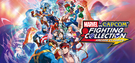
MARVEL vs. CAPCOM Fighting Collection: Arcade Classics scores 85/100 — better than 97% of Action capsules (n=9,722).

Quick text summary

MARVEL vs. CAPCOM Fighting Collection: Arcade Classics scored 85/100 on Steam Analyzer — Excellent for a Action capsule. Top priority fix: [genre_clarity] Add a subtle UI element or gameplay cue (e.g., health bar, versus indicator) to reinforce the competitive fighting mechanic at tiny size

Capsule scores by dimension

  • Genre Clarity: 9/10 — Fighting game, clear crossover premise. Multiple dynamic character silhouettes in combat poses, bright energy effects, and iconic Marvel and Capcom character designs immediately signal a fighting game. At tiny size, the energetic central cluster and action-oriented composition still read as competitive fighting, with clear character variety reinforcing the crossover concept.
  • Title Readability: 8/10 — Logo readable, tagline works at scale. The MARVEL vs. CAPCOM logo on the right with FIGHTING COLLECTION subtitle is positioned on a controlled background with good contrast against the purple-blue gradient. The yellow ARCADE CLASSICS tagline reads clearly at small and tiny sizes due to warm color separation and bold weight, though at tiny size the full text compresses slightly but remains legible.
  • Contrast & Color: 9/10 — Vibrant palette pops on dark background. Warm orange-pink gradients, cool blue character silhouettes, and bright yellow energy effects create strong value separation against the dark Steam background. The lighting in the character cluster has clear foreground-to-background depth, with saturated reds, blues, and golds maintaining readability even when squinted or viewed at tiny size.
  • Uniqueness & Polish: 8/10 — Premium anthology presentation, cohesive style. The capsule uses a polished, high-energy composition that communicates legacy and variety through layered character stacking and dynamic lighting effects rather than a single flat scene. The execution feels intentional and arcade-authentic with strong visual storytelling about collection scope, though it follows expected crossover fighting game visual language without radical uniqueness.
  • Brand Consistency: 8/10 — Strong Marvel-Capcom visual identity. The composition reinforces the crossover brand through balanced character representation and iconic silhouettes recognizable to fighting game fans. The warm-cool color palette, energetic pose language, and logo treatment create internal cohesion that signals a premium arcade collection, with consistent rendering style across all visible character groups.
  • Composition: 9/10 — Layered depth, clear focal hierarchy. The central character cluster creates a natural focal point with supporting elements (energy effects, background glow) guiding attention without competing. Foreground characters are vivid and large, midground elements add dynamic motion, and background gradients provide atmospheric depth; the logo placement on the right preserves balance and avoids Steam crop hazards at all sizes.

What works

  • Strong contrast and color separation. Vibrant oranges, blues, and yellows pop clearly against the dark Steam background and maintain readability at tiny thumbnail size.
  • Effective character silhouette variety. Multiple recognizable character poses layered together communicate the crossover concept and fighting game genre instantly.
  • Well-positioned logo with supporting tagline. MARVEL vs. CAPCOM branding and ARCADE CLASSICS subtitle are placed on controlled background space and remain legible at all scales.
  • Clear depth layering and composition. Foreground, midground, and background elements are balanced to create visual interest while maintaining a clear focal point.

What hurts the capsule

  • High visual density may reduce immediate clarity. The packed character arrangement, while energetic, could benefit from slightly more breathing room to prevent a cluttered read at small sizes.
  • Generic arcade crossover aesthetic. While well-executed, the composition follows expected fighting game visual conventions without a distinctive signature element beyond character stacking.

Priority fixes

  1. [genre_clarity] Add a subtle UI element or gameplay cue (e.g., health bar, versus indicator) to reinforce the competitive fighting mechanic at tiny size
  2. [uniqueness_polish] Introduce a signature visual motif or color accent specific to this collection (e.g., arcade cabinet frame or era-specific badge) to increase memorability

Store copy priority fixes

  1. [hook_strength] Replace the duplicate opening with a single, more specific hook in the short description that leads with the collection's core appeal: 'Seven legendary arcade fighters reunited—tag-team chaos, rare beat 'em up content, and rollback netcode for the first time.' This avoids redundancy and prioritizes what is new about this re-release.
  2. [uniqueness] Add a sentence in the detailed description explaining the collection's restoration or emulation philosophy and why these specific seven games form a cohesive package—for example: 'Restored from original arcade hardware and featuring rollback netcode, this is the definitive way to experience the evolution of Marvel vs. Capcom across the 1990s.'
  3. [feature_communication] Include a short sentence explaining core fighting mechanics or character appeal—e.g., 'Master tag-team combat with 50+ characters spanning Marvel and Capcom universes, or jump into The Punisher's arcade beat 'em up for a different flavor of action.' This gives fighting game fans a reason to care beyond feature lists.
  4. [tone_match] Reframe section headers to feel more authentic to arcade culture—e.g., replace 'No Experience? No Problem!' with 'Beginners Welcome: One-Button Specials, Training Modes & Adjustable Difficulty' to reduce corporate tone while maintaining friendliness.

Related guides

Steam app ID: 2634890 · Tags: Action, 2D Fighter, Multiplayer, Beat 'em up, Singleplayer