Scoring genre clarity...
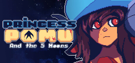
Paint without T is PAIN! Princess Pomu just lost her Kingdom and her family was captured, and now she's possesed by an evil spirit! Master the simple but satisfying combo system, get more abilites, pick up weapons and explore the surreal world of Illeh in this cute metroidvania with a violent twist.
$11.99Positive(27)
MetroidvaniaActionPixel Graphics
Pixel DominusJun 26, 2025