Quick text summary
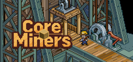
Core Miners scored 77/100 on Steam Analyzer — Good for a Casual capsule. Top priority fix: [uniqueness_polish] Introduce a distinctive visual hook—such as a unique character, mascot, or signature UI element—that visually communicates the AFK/idle progression loop and differentiates the game from generic mining titles.
Capsule scores by dimension
- Genre Clarity: 8/10 — Mining idle game visually clear. Isometric pixel art mining environment with visible ore deposits, industrial scaffolding, and mining equipment immediately communicates a mining/resource extraction game. At TINY size, the industrial setting and resource-focused layout remain readable, though the specific AFK/idle mechanic is not visually obvious from the aesthetic alone.
- Title Readability: 9/10 — Bold yellow title excellent contrast. Large, solid yellow-gold title 'Core Miners' positioned prominently in the left-center area with strong contrast against the teal and brown isometric environment. The letterforms remain crisp and fully readable at SMALL and TINY sizes due to bold weight and clean sans-serif style with no decorative elements.
- Contrast & Color: 8/10 — Warm gold against cool teal backdrop. The golden-yellow title and machinery components pop distinctly against the cool blue-teal structural framing and darker shadows in the isometric scene. Strong value separation between warm highlights (gold ore, machinery) and cool background (steel supports, ground) maintains clarity even in grayscale; silhouettes remain sharp at TINY size.
- Uniqueness & Polish: 7/10 — Competent pixel art with solid craft. The isometric pixel-art style is executed cleanly with consistent dithering, layered depth, and intentional color palette management typical of indie mining games. While the visual execution is solid and polished, the scene composition and art direction are fairly archetypal for the mining-game subcategory, lacking a strong distinctive hook or unique visual storytelling that would elevate it to 8+.
- Brand Consistency: 6/10 — Generic mining aesthetic, limited identity. The isometric mining environment and industrial color scheme are cohesive internally but lack memorable iconography or signature visual elements that would create strong brand recall. No character, mascot, or unique motif is present to establish a distinctive identity separate from other idle/mining games; the capsule relies on competent execution rather than a memorable visual identity.
- Composition: 8/10 — Strong focal hierarchy, balanced layout. Title anchors the left-center region with the isometric mining structure filling the right and background, creating clear visual hierarchy without clutter. The composition maintains good depth layering (foreground machinery, midground platforms, background scaffolding) and the title placement avoids edge-hugging; at SMALL and TINY sizes, the primary focal point (title + central mining structure) reads immediately.
What works
- Bold readable title with excellent contrast. Golden-yellow 'Core Miners' text maintains legibility across all sizes due to bold weight, clean letterforms, and strong value contrast against the cool-toned environment.
- Clear genre communication via setting. The isometric mining environment with visible ore, scaffolding, and industrial equipment immediately signals a mining/extraction game to the viewer.
- Balanced composition with strong hierarchy. Title placement and isometric scene layering create a clear focal point without clutter or awkward empty zones at any viewing size.
- Consistent pixel-art craft and polish. Dithering, color palette, and isometric perspective are executed with clean, intentional detail throughout the scene.
What hurts the capsule
- Generic mining-game aesthetic lacks identity. The isometric pixel-art environment is competent but archetypal; no distinctive character, mascot, or unique visual hook differentiates it from other idle/mining titles.
- AFK/idle mechanic not visually communicated. The capsule emphasizes the mining setting but does not visually hint at the casual progression or AFK gameplay that is core to the game's appeal.
- Limited brand consistency and memorability. No iconic visual motif, signature palette accent, or recognizable symbol present that would enable brand recall after quick scrolling.
Priority fixes
- [uniqueness_polish] Introduce a distinctive visual hook—such as a unique character, mascot, or signature UI element—that visually communicates the AFK/idle progression loop and differentiates the game from generic mining titles.
- [brand_consistency] Establish a memorable brand identity signal (e.g., an iconic mining bot, a unique ore type, or a signature color accent) that can anchor future store screenshots and create visual recognition.
- [genre_clarity] Add a subtle visual cue (e.g., an idle notification, progress bar, or passive-income indicator) that hints at the AFK/continuous-progression mechanic without cluttering the composition.
Store copy priority fixes
- [uniqueness] Replace 'mysterious ores' and 'rare ores let you strike it rich' with a specific, differentiating mechanic or system—e.g., 'craft hybrid ores by combining elements' or 'discover boss-tier ores with unique passive bonuses' that signals this is not a generic idle clone.
- [feature_communication] Add concrete details to the 'strategic combinations' claim—e.g., 'assign miners to different shafts for focused ore production' or 'combine miner skills to unlock multiplier bonuses,' so players understand what strategy actually means.
- [hook_strength] Rewrite the short description to lead with the hook rather than a descriptor—e.g., 'Build a mining empire that grows while you sleep—unlock rare ores and strike it rich with zero grind' to create emotional pull.
Related guides
Steam app ID: 2644280 · Tags: Casual, Pixel Graphics, Mining, 2D, Idler