Scoring genre clarity...
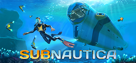
Subnautica capsule

Subnautica

Descend into the depths of an alien underwater world filled with wonder and peril. Craft equipment, pilot submarines and out-smart wildlife to explore lush coral reefs, volcanoes, cave systems, and more - all while trying to survive.

7,49€Overwhelmingly Positive(5,135)
Open World Survival CraftSurvivalHorror
Unknown Worlds Entertainment23 Jan, 2018

Subnautica scores 87/100 — better than 99% of Open World Survival Craft capsules (n=133).

Overwhelmingly Positive (5,135 reviews) · 7,49€ · Released 23 Jan, 2018 · By Unknown Worlds Entertainment

Quick text summary

Subnautica scored 87/100 on Steam Analyzer — Excellent for a Open World Survival Craft capsule. Top priority fix: [composition] Ensure title safe-margin clearance by moving SUBNAUTICA up 10-15 pixels to guarantee full visibility across all Steam crop variations

Capsule scores by dimension

  • Genre Clarity: 9/10 — Underwater exploration immediately recognizable. The diver in wetsuit with submarine, bioluminescent fish, coral environment, and air bubbles instantly communicate underwater exploration gameplay. At tiny size, the aquatic setting and protagonist pose remain unmistakable, clearly positioning this as an ocean-based adventure game with survival mechanics.
  • Title Readability: 9/10 — Bold title holds legibility across all sizes. SUBNAUTICA uses a thick, all-caps sans-serif font in warm orange-yellow that contrasts sharply against the cool blue background. The title placement in the lower third on a relatively clear water backdrop ensures it remains readable even at tiny thumbnail size without degradation.
  • Contrast & Color: 9/10 — Strong value separation and silhouettes throughout. The warm orange diver suit and yellow title pop distinctly against the cool cyan-blue water gradient, creating excellent value contrast. The submarine's dark silhouette reads clearly in grayscale, and the bioluminescent fish add bright accent points that guide the eye without muddying the composition.
  • Uniqueness & Polish: 8/10 — Polished sci-fi underwater aesthetic with purpose. The capsule demonstrates high production craft with coherent lighting, particle effects (air bubbles, light rays), and a distinctive visual style that avoids generic underwater templates. The submarine design and diver pose communicate the game's core mechanic of piloting vessels and exploring alien oceans, setting it apart from generic adventure imagery.
  • Brand Consistency: 8/10 — Recognizable identity through color and setting. The signature cyan-blue underwater palette, the iconic submarine vessel, and the exploration-focused composition align with Subnautica's visual identity seen across promotional materials. The bioluminescent fish and crystalline water effects create a memorable aesthetic distinctive to this franchise.
  • Composition: 9/10 — Excellent hierarchy with clear focal progression. The diver is the primary focal point in the center-left, the submarine commands secondary attention in the upper right, and smaller fish create depth guides. The foreground-to-background layering (diver, submarine, fish, coral blur) creates depth hierarchy that reads clearly at small and tiny sizes with no clutter or dead zones.

What works

  • Immediate genre communication. Diver, submarine, alien fish, and bioluminescent ocean setting unmistakably signal underwater exploration adventure at all sizes.
  • Title legibility across scales. Bold orange-yellow sans-serif text maintains clarity and impact from full header down to tiny thumbnail without loss of readability.
  • Premium visual craft and effects. Particle effects, lighting rays, and polished rendering create a high-fidelity appearance that stands out above generic indie adventure capsules.
  • Strong color-contrast palette. Warm and cool color separation ensures the design pops against Steam's dark background and maintains legibility in grayscale squint tests.

What hurts the capsule

  • Minor title placement risk at edges. While readable, the title extends into lower margins and could lose clarity if Steam crops the bottom edge on some placements.
  • Fish details blur at tiny scale. Small bioluminescent fish on the left and right edges become indistinct at thumbnail size, reducing compositional clarity slightly.

Priority fixes

  1. [composition] Ensure title safe-margin clearance by moving SUBNAUTICA up 10-15 pixels to guarantee full visibility across all Steam crop variations
  2. [contrast_color] Add subtle outline or glow to smaller accent fish on left edge to maintain visual separation at tiny sizes

Store copy priority fixes

  1. [feature_communication] Add a 1-2 sentence explanation of how story progression works: e.g., 'Follow distress signals and alien structures to uncover the planet's secrets and unlock your escape,' to show how mystery-unraveling connects to core gameplay loops.
  2. [audience_targeting] Include a brief note on difficulty options or accessibility: e.g., 'Play at your own pace with customizable difficulty, or enable Creative Mode for relaxed exploration,' to signal inclusivity for different skill levels.
  3. [hook_strength] Trim or relocate the developer biography to the 'About This Game' section; it competes for attention on a space-constrained store page and doesn't influence purchase intent for most players.
  4. [uniqueness] Add one sentence contrasting this game's approach to survival: e.g., 'Unlike land-based survival games, you must adapt to alien ocean pressure, oxygen depletion, and an unfamiliar ecosystem,' to reinforce differentiation.

Related guides

Steam app ID: 264710 · Tags: Open World Survival Craft, Survival, Horror, Underwater, Open World