Scoring genre clarity...
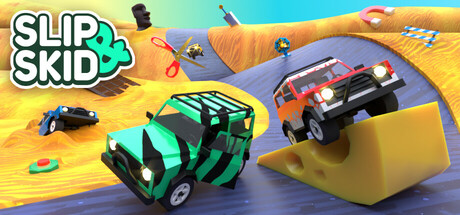
Slip & Skid capsule

Slip & Skid

Race against your friends and alter the track by placing obstacles after each lap. Change the rules mid-game with roguelike modifiers. Shove your opponents off the track, drift, boost and jump. Up to 4 players online and local split-screen.

$12.99Very Positive(17)
MultiplayerFunnyParty Game
NHOGS InteractiveJun 3, 2026

Slip & Skid scores 87/100 — better than 94% of Multiplayer capsules (n=4,023).

Very Positive (17 reviews) · $12.99 · Released Jun 3, 2026 · By NHOGS Interactive

Quick text summary

Slip & Skid scored 87/100 on Steam Analyzer — Excellent for a Multiplayer capsule. Top priority fix: [brand_consistency] Introduce a signature character, mascot, or unique visual motif that appears consistently across promotional materials to increase brand recall and differentiation.

Capsule scores by dimension

  • Genre Clarity: 9/10 — Vibrant arcade racing instantly clear. The capsule immediately communicates a colorful, casual racing game through multiple racing-specific cues: four distinct vehicles navigating a dynamic track, bright toy-like car designs, and an energetic obstacle course environment. At tiny size, the bold vehicles and track geometry remain unmistakable, clearly signaling arcade/casual racing rather than simulation.
  • Title Readability: 9/10 — Bold white title stands firm. The 'SLIP & SKID' logo uses thick white letters with a black outline positioned in the upper left against the bright yellow background, ensuring strong contrast and legibility at all sizes. Even at tiny thumbnail size, the chunky letterforms and outline remain readable and don't collapse into illegibility.
  • Contrast & Color: 9/10 — Vivid color separation excellent. The capsule uses a striking gradient from warm yellow to cool cyan-blue, creating strong value separation against the Steam dark background #1b2838. The neon-bright vehicles (lime green, red, blue) have clean silhouettes that pop in grayscale and maintain visual punch even during quick scroll, with no muddy mid-tones or blend issues.
  • Uniqueness & Polish: 8/10 — Premium toy-like polish stands out. The rendering shows polished 3D models with clean reflections, shadow work, and a cohesive toy-car aesthetic that feels intentional and craft-aware rather than generic. The dynamic track composition and multi-vehicle setup communicate the core multiplayer chaos mechanic, setting it apart from standard racing game templates, though it shares visual DNA with other colorful indie racers.
  • Brand Consistency: 8/10 — Recognizable style, consistent palette. The capsule uses a distinctive warm-to-cool color gradient, chunky bold typography, and a playful toy-car rendering style that aligns with the game's casual, fun identity and likely appears across other promotional materials. The vibrant lime-green and red vehicles paired with clean geometric track shapes create a memorable visual signature, though without an iconic character mascot it relies on color and shape vocabulary.
  • Composition: 9/10 — Clear hierarchy, balanced focal points. The four vehicles are distributed across the frame with strong depth layering: foreground vehicles compete for attention but the lime-green car in the center-left commands the primary focal point. The title anchors cleanly in the upper left safe margin without edge-cutting, and the gradient background supports rather than competes with the subject, leaving no dead space or distracting clutter.

What works

  • Title legibility at all sizes. The thick outlined 'SLIP & SKID' logo maintains perfect readability even at tiny thumbnail, with no letterform collapse or contrast loss.
  • Strong genre communication. Multiple racing-specific visual cues (vehicles, track, obstacles, speed-implied motion) instantly clarify the arcade racing category without ambiguity.
  • Vibrant color contrast pop. The warm yellow-to-cool cyan gradient and neon vehicle colors create excellent separation from the Steam dark background in both color and grayscale modes.
  • Cohesive toy-like aesthetic. The polished 3D rendering and playful vehicle design communicate premium casual production values that feel intentional and distinctive.

What hurts the capsule

  • Limited character identity. The capsule relies on color and shape language rather than a memorable mascot or iconic symbol that could anchor brand recognition across touchpoints.
  • Generic casual racer composition. While well-executed, the multi-vehicle track scene is a familiar composition template common across many indie and mobile racing games, reducing long-term memorability.

Priority fixes

  1. [brand_consistency] Introduce a signature character, mascot, or unique visual motif that appears consistently across promotional materials to increase brand recall and differentiation.
  2. [uniqueness_polish] Emphasize the roguelike modifier and obstacle placement mechanics more visually in future capsule iterations to highlight what makes Slip & Skid mechanically distinct from standard racers.

Store copy priority fixes

  1. [audience_targeting] Move the matchmaking limitation ("Friend lobbies only") to the multiplayer section in the short description or early detailed description to set expectations upfront and avoid late-stage disappointment.
  2. [feature_communication] Expand the SINGLE PLAYER section with 1-2 sentences explaining time trial mechanics, how ghost racing works, and what unlocking accessories motivates, making solo play more appealing.
  3. [uniqueness] Add a comparative line explicitly stating what makes track modification different from other party racers, e.g., "Unlike other racing games, every player actively reshapes the course each round."

Related guides

Steam app ID: 2651350 · Tags: Multiplayer, Funny, Party Game, PvP, Local Multiplayer