Scoring genre clarity...
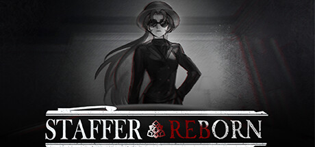
Staffer Reborn capsule

Staffer Reborn

Staffer Reborn is a game of supernatural abilities and logical deduction set in 1960s America. It tells the story of a man trapped in a cycle of death and resurrection caused by his supernatural ability and the investigator who was recruited to help.

$2.94Overwhelmingly Positive(12)
AdventureInvestigationStory Rich
Team TetrapodApr 26, 2024

Staffer Reborn scores 63/100 — better than 7% of Adventure capsules (n=8,231).

Overwhelmingly Positive (12 reviews) · $2.94 · Released Apr 26, 2024 · By Team Tetrapod

Quick text summary

Staffer Reborn scored 63/100 on Steam Analyzer — Solid for a Adventure capsule. Top priority fix: [genre_clarity] Add visual hints of supernatural elements—glowing eyes, temporal distortion effects, or a second figure silhouette—to communicate the core time-loop and investigative mechanics at tiny size.

Capsule scores by dimension

  • Genre Clarity: 5/10 — Ambiguous genre signals. The silhouette of a stylized character in formal 1960s attire with a cape suggests noir or supernatural mystery, but the visual cues don't clearly establish adventure, simulation, or investigative gameplay. At tiny size, the character reads as generic mystery/drama rather than conveying the logical deduction or supernatural ability mechanics central to the game.
  • Title Readability: 7/10 — Clear with minor contrast issues. The title 'STAFFER REBORN' is legible at full and small sizes with clean white serif typography and red accent text. However, at tiny size the ampersand and 'REBORN' lose some clarity due to thin letterforms, and the decorative underline elements don't hold their visual impact when scaled down.
  • Contrast & Color: 7/10 — Strong grayscale separation. The character silhouette provides clear value separation against the dark gradient background, and the white title bar creates sharp contrast. The red accent in 'REBORN' adds visual pop against the monochromatic palette and reads at small sizes, though the overall dark-on-dark background reduces some mid-tone depth.
  • Uniqueness & Polish: 6/10 — Competent noir aesthetic. The 1960s noir styling and character design show intentional art direction, but the execution feels like a competent application of a familiar aesthetic rather than a distinctive hook. The character pose and lighting are well-rendered but don't communicate the unique supernatural mechanics or time-loop narrative that differentiates this game.
  • Brand Consistency: 6/10 — Consistent but generic identity. The black-and-white color palette, serif typography, and noir character silhouette are internally cohesive and suggest a recognizable visual language. However, these elements lack a memorable distinctive motif or signature visual hook beyond applying the 1960s noir genre template, limiting long-term brand recall.
  • Composition: 7/10 — Clear hierarchy with safe margins. The character occupies the upper center focal point with the title anchored below in a clean horizontal band, creating clear visual hierarchy and balance. The composition maintains safe margins away from edge cropping, though the large empty space in the lower half and the centered vertical alignment feel slightly static at small sizes.

What works

  • Strong value contrast. White title and character silhouette separate cleanly from the dark background in grayscale, maintaining readability across all viewing sizes.
  • Readable title typography. Clean serif letterforms and the red 'REBORN' accent remain legible even at small capsule size without decorative collapse.
  • Safe composition margins. Elements are well-positioned away from edges, ensuring nothing gets clipped during Steam crop/resize operations.

What hurts the capsule

  • Generic noir presentation. The visual treatment relies on familiar 1960s mystery tropes without communicating the game's unique supernatural mechanics or logical deduction gameplay.
  • Weak gameplay clarity. The silhouette and pose don't hint at the supernatural abilities, time-loop mechanics, or investigative deduction that define the experience, reading more as generic mystery drama.
  • Static composition balance. Large empty space in the lower half and centered vertical axis create a somewhat static, symmetrical layout that lacks visual energy or dynamic flow at small sizes.

Priority fixes

  1. [genre_clarity] Add visual hints of supernatural elements—glowing eyes, temporal distortion effects, or a second figure silhouette—to communicate the core time-loop and investigative mechanics at tiny size.
  2. [uniqueness_polish] Introduce a distinctive visual motif or signature element (iconic symbol, color accent, or compositional device) that telegraphs 'Staffer Reborn' specifically rather than generic noir.
  3. [composition] Reposition elements to create asymmetrical balance or introduce supporting visual elements in the lower space to reduce static empty areas and improve dynamic visual flow at small sizes.

Store copy priority fixes

  1. [hook_strength] Rewrite the short description to lead with an active verb and emotional stakes: 'Uncover the supernatural curse trapping a man in a deadly 15-minute cycle—and help him escape it' instead of starting with exposition.
  2. [feature_communication] Specify how deduction works in practice: add a sentence like 'Piece together clues through dialogue and environmental investigation, then solve logic puzzles to uncover the truth' to make the core challenge concrete.
  3. [audience_targeting] Add a sentence signaling scope and player expectations: 'A story-rich mystery game for fans of supernatural detective fiction, playable in a single sitting or across multiple investigations.'

Related guides

Steam app ID: 2658920 · Tags: Adventure, Investigation, Story Rich, Visual Novel, Cartoon