Scoring genre clarity...
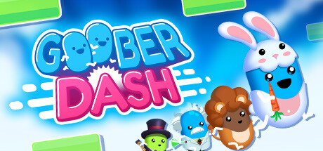
Goober Dash: A 2D platformer battle royale where Goobers Run, Jump & Dash to victory! Customize your Goober, dash to outmaneuver opponents, create your own levels, and compete in global time trials. Unlock exclusive skins and celebrate your wins in this action-packed multiplayer Race Royale!
Free to PlayVery Positive(149)
ActionBattle RoyaleCasual
Winterpixel Games Inc.Nov 27, 2025