Scoring genre clarity...

Supermarket Simulator capsule

Supermarket Simulator

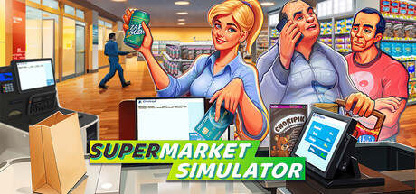
Run your own supermarket! Stock shelves, set your prices, take payments, hire staff, expand your store, handle shoplifters, and design your layout. Purchase goods from online or local markets around town, and personally deliver online orders to your customers.

$11.99Very Positive(638)
SimulationManagementMultiplayer
Nokta GamesJun 19, 2025

Supermarket Simulator scores 73/100 — better than 51% of Simulation capsules (n=5,328).

Very Positive (638 reviews) · $11.99 · Released Jun 19, 2025 · By Nokta Games

Quick text summary

Supermarket Simulator scored 73/100 on Steam Analyzer — Good for a Simulation capsule. Top priority fix: [contrast_color] Darken or deepen the store background environment so the characters and title gain stronger separation from the light midtones during quick scroll on Steam's dark UI.

Capsule scores by dimension

  • Genre Clarity: 9/10 — Supermarket simulation instantly clear. The checkout counter, POS terminal, product shelves in the background, and a cashier holding a can all immediately communicate a retail/supermarket management simulation. Even at tiny size the checkout desk and store environment remain recognizable genre cues. The genre is unambiguous and specific, not just broadly 'simulation.'
  • Title Readability: 8/10 — Bold title reads well at small. The white bold sans-serif text for 'SUPERMARKET SIMULATOR' on a semi-transparent dark banner has strong contrast and clean letterforms that hold up at small sizes. At tiny size the text compresses but remains legible due to the high weight and clean stroke. The word 'SUPER' in green creates a subtle hierarchy accent that works at full size but slightly loses distinction at tiny.
  • Contrast & Color: 7/10 — Bright characters pop on store background. The cartoon-style characters with saturated skin tones and bright clothing separate reasonably well from the lighter store interior. However, the background is a relatively light retail environment rather than a dark scene, which means the image doesn't gain as much from Steam's dark #1b2838 border as darker-themed capsules do. In grayscale, the characters still read clearly against the shelving background, maintaining adequate silhouette separation.
  • Uniqueness & Polish: 6/10 — Competent but genre-typical presentation. The cartoon art style is clean and professional, and the characters are expressive and clearly communicate their roles. However, compared to top-performing capsules in the genre like DAVE THE DIVER or Go-Go Town!, there is no strong unique visual hook or distinctive art direction choice that sets it apart. The layout reads as a competent, functional simulator capsule without a memorable stylistic identity or clever visual storytelling moment.
  • Brand Consistency: 7/10 — Cohesive cartoon retail identity. The bright cartoon rendering style, green accent color in the logo, and cheerful character designs form a coherent internal visual language. The green 'SUPER' text and the store environment reinforce a consistent palette. The cashier character is prominent enough to potentially serve as a mascot figure, giving a small identity anchor that could carry recognition across store presence.
  • Composition: 7/10 — Clear foreground subjects, balanced layout. The two main characters are placed in the left and right foreground as natural focal anchors, with the checkout counter as a strong compositional centerpiece. The title banner sits centrally in the lower-middle area on a controlled dark strip, keeping readability safe. At small size the composition holds well with the two character faces drawing the eye, though the right-side customer character is slightly cropped at the edge, which becomes more of a concern at tiny size.

What works

  • Instant genre recognition. The checkout counter, POS screen, store shelves, and product can combine to make the supermarket simulation genre unmistakable even at tiny size.
  • High-contrast readable title. The bold white sans-serif title on a dark semi-transparent bar maintains legibility at small and tiny viewing sizes.
  • Expressive character staging. The two foreground characters are posed naturally within the store environment, communicating a lively and approachable simulation tone.
  • Coherent cartoon art style. The clean cartoon rendering is consistent across characters and environment, creating a polished and internally cohesive visual identity.

What hurts the capsule

  • No strong unique visual hook. The capsule communicates the game clearly but offers no distinctive stylistic moment or clever visual storytelling that differentiates it from other simulator capsules.
  • Light background reduces Steam dark contrast gain. The bright retail interior doesn't benefit from the dark Steam background and can feel flat during quick scroll compared to capsules with darker, punchier backgrounds.
  • Right character edge crops awkwardly. The customer on the right side hugs the edge and appears partially cropped, which worsens at small and tiny sizes reducing compositional balance.
  • Green logo accent loses distinction at tiny size. The 'SUPER' green highlight merges visually with the white text at tiny size, losing the intended typographic hierarchy.

Priority fixes

  1. [contrast_color] Darken or deepen the store background environment so the characters and title gain stronger separation from the light midtones during quick scroll on Steam's dark UI.
  2. [composition] Pull the right-side customer character inward from the edge to prevent cropping at small and tiny sizes and improve overall balance.
  3. [uniqueness_polish] Introduce a single distinctive visual hook such as a chaotic moment, a comedic product highlight, or a more stylized framing to differentiate from generic simulator capsules.
  4. [title_readability] Increase the weight or outline thickness of the green 'SUPER' letterforms so the two-color title hierarchy remains visible at tiny size.

Store copy priority fixes

  1. [uniqueness] Add a sentence to the short or opening paragraph that highlights what is unique to Supermarket Simulator—e.g., 'the most detailed first-person retail experience' or 'build and manage every detail from floor layout to security systems in real-time,' to differentiate from other management sims.
  2. [hook_strength] Mention the first-person perspective in the short description (e.g., 'Run your own supermarket in first-person—stock shelves, scan items, and...') to strengthen the immersive hook and clarify the gameplay angle upfront.
  3. [uniqueness] Replace the generic closing question with a specific, concrete aspiration tied to the game's core appeal, such as 'Transform your modest shop into a thriving retail empire by balancing customer satisfaction, staff management, and smart pricing.'

Related guides

Steam app ID: 2670630 · Tags: Simulation, Management, Multiplayer, Economy, Singleplayer