Scoring genre clarity...
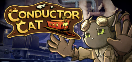
Conductor Cat capsule

Conductor Cat

Conductor Cat is an adventure game about rebuilding a broken world. Gather scrap, build machines, and restore a dying canyon as Griffin the cat. He's journeying home aboard his train, racing to see his father one last time.

AdventureStory RichSteampunk
Grimm Tales LLCTo be announced

Conductor Cat scores 77/100 — better than 83% of Adventure capsules (n=8,243).

Released To be announced · By Grimm Tales LLC

Quick text summary

Conductor Cat scored 77/100 on Steam Analyzer — Good for a Adventure capsule. Top priority fix: [uniqueness_polish] Introduce a distinctive visual signature or memorable motion element (e.g., emphasized scrap particles, signature mechanic icon, or unique color accent) to create stronger differentiation from comparable indie adventure capsules.

Capsule scores by dimension

  • Genre Clarity: 8/10 — Clear adventure platformer with character focus. The anthropomorphic cat protagonist with expressive green eyes and resourceful pose signals adventure-platformer immediately, reinforced by the train imagery and industrial scrap aesthetic. At tiny size, the character silhouette and train car icon remain instantly recognizable, though the specific genre (3D platformer with building mechanics) is implied rather than explicitly communicated through UI or gameplay iconography.
  • Title Readability: 8/10 — Bold logo with strong contrast and hierarchy. The yellow-gold 'CONDUCTOR CAT' logotype with red accent train window sits in prime upper-left territory with clean outline and spacing that survives the tiny thumbnail test. The serif-influenced letterforms maintain clarity at small size, though at tiny size the subtitle train details become unreadable but the main title holds strong due to heavy weight and saturation.
  • Contrast & Color: 8/10 — Strong value separation with warm cohesion. The tan-brown cat and blue-purple background create clear silhouette separation against the Steam dark background, while the golden logo pops with high saturation and luminosity. In grayscale mental test, the character and logo maintain distinct tonal separation from the mid-tone background, ensuring legibility even at thumbnail size, though some midtone details in the background infrastructure blend slightly.
  • Uniqueness & Polish: 7/10 — Charming character with solid craft execution. The capsule demonstrates intentional character design with the expressive cat personality, coherent art style in muted earth tones, and thematic visual storytelling through the train conductor setup. While the execution is polished and the character compelling, the overall composition leans toward established indie adventure conventions rather than a singular striking hook that immediately distinguishes it from peers like Balatro or DAVE THE DIVER at first glance.
  • Brand Consistency: 7/10 — Recognizable character and cohesive aesthetic. Griffin the cat with distinctive green eyes, neutral fur palette, and confident pose creates an iconic character silhouette that would be memorable across promotional materials and the store screenshots. The tan-and-blue color story and mechanical/industrial theme (train, scrap, engineering) establish internal consistency, though the design does not yet demonstrate a signature visual motif as distinctive as top-tier indie brands in the reference set.
  • Composition: 8/10 — Well-balanced layout with clear primary focus. Griffin occupies right-center stage with natural eye contact and forward-facing pose that commands attention, while the logo anchors top-left with breathing room and secondary train details fill right background without competing. The layout respects safe margins, survives Steam cropping scenarios, and maintains clear hierarchy at small and tiny sizes where the character and logo remain the unambiguous focal points rather than distributed elements.

What works

  • Golden logo with strong pop and legibility. The yellow 'CONDUCTOR CAT' text with red accent and outline maintains excellent readability at tiny thumbnail size due to high saturation, weight, and strategic placement on a controlled background zone.
  • Expressive protagonist with instant character recognition. Griffin's confident pose, distinctive green eyes, and anthropomorphic appeal create an immediately recognizable and memorable character that communicates personality and resourcefulness at all viewing sizes.
  • Clear value contrast supporting silhouette separation. The tan-brown character and blue-purple background environment maintain distinct tonal separation in grayscale, ensuring the subject reads clearly even at tiny size against the Steam dark background.
  • Cohesive thematic visual language. The muted earth tone palette, industrial train aesthetic, and scrap-collecting props create a unified art direction that communicates the core adventure-engineering premise without confusion.

What hurts the capsule

  • Generic indie adventure positioning. While well-executed, the capsule follows familiar indie adventure conventions (expressive character, industrial setting, warm tones) without a striking visual hook that immediately distinguishes it from comparable titles like Jusant or Pacific Drive.
  • Background infrastructure competes for attention. The blue-toned train/machinery details in the background, while thematically appropriate, create mid-tone visual noise that slightly dilutes the primary focus on Griffin at small viewing sizes.
  • Limited iconic brand identity across capsule. While the character is charming, the capsule lacks a signature visual symbol, distinctive UI treatment, or memorable color accent (beyond the standard red train window) that would create immediate brand recall against reference titles.

Priority fixes

  1. [uniqueness_polish] Introduce a distinctive visual signature or memorable motion element (e.g., emphasized scrap particles, signature mechanic icon, or unique color accent) to create stronger differentiation from comparable indie adventure capsules.
  2. [contrast_color] Reduce mid-tone background machinery complexity or push it further back in atmospheric blur to strengthen Griffin as the unambiguous focal point at small and tiny sizes.
  3. [brand_consistency] Develop a repeatable iconic symbol or visual motif tied to the conductor/scrap-engineering theme that could anchor the brand identity across all promotional materials and store page graphics.

Store copy priority fixes

  1. [feature_communication] Clarify the gameplay loop in one sentence: explain how scavenging during platforming feeds directly into building solutions that progress the train journey (e.g., 'Gather scrap while platforming, craft upgrades in your train car, use them to overcome environmental obstacles and advance further home').
  2. [hook_strength] Replace 'the canyon rails aren't what they used to be, and there's not much time left' with a more vivid, direct statement of the central challenge (e.g., 'The tracks are falling apart, and Griffin must engineer his way forward before his father passes').
  3. [uniqueness] Add one sentence in the short description that signals what is distinctly Conductor Cat (e.g., 'Every obstacle can be solved with the right scrap and ingenuity' or 'Your train is both shelter and workshop—constantly evolving as you repair the world around you').
  4. [audience_targeting] Explicitly mention that the game blends heartfelt storytelling with hands-on puzzle-solving to signal it appeals to narrative-focused players who also enjoy crafting and exploration.

Related guides

Steam app ID: 2671980 · Tags: Adventure, Story Rich, Steampunk, Cats, Trains