Error_Boy.exe scores 72/100 — better than 43% of Action Roguelike capsules (n=1,675).

Quick text summary

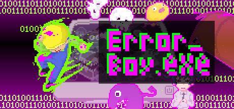
Error_Boy.exe scored 72/100 on Steam Analyzer — Good for a Action Roguelike capsule. Top priority fix: [uniqueness_polish] Strengthen a signature brand motif or iconic character silhouette that differentiates Error_Boy from generic glitch-aesthetic indie games

Capsule scores by dimension

  • Genre Clarity: 7/10 — Chaotic indie game energy clear. The pixel art style, bright neon colors, and glitchy aesthetic immediately signal indie action game with a comedic or surreal tone. The mix of characters and visual chaos at full size reads as bullet hell or action roguelike, though at TINY size the genre becomes less specific—it reads as 'colorful indie action' but loses the roguelike depth cue. The magenta creature and retro sprite mix communicate gameplay fusion concept effectively.
  • Title Readability: 8/10 — Bold neon title highly legible. The bright magenta and neon green 'Error_Boy.exe' text uses extreme value contrast against the dark background and maintains clean letterforms across all sizes. At SMALL and TINY sizes, the title remains fully readable due to weight and saturation; the pixelated serif treatment fits the theme without sacrificing clarity. The .exe suffix reinforces the game-glitch concept and is legible at all scales.
  • Contrast & Color: 8/10 — Strong neon pop against dark. Magenta and neon green create vivid separation from the dark purple background (#1b2838 equivalent), with excellent value contrast that survives grayscale test. The bright yellow and lime sprites read clearly in silhouette even at tiny size, and the color saturation ensures elements don't muddy into background mids. Only minor softening of edges on some sprite details at extreme zoom reduces the score slightly.
  • Uniqueness & Polish: 7/10 — Distinctive glitch aesthetic cohesive. The 'error as design feature' approach—binary code borders, corrupted UI look, mixed sprite styles—communicates a unique selling point (game fusion mechanic) rather than generic action scene. The neon + pixel art + glitch effects combo feels intentional and premium for indie. However, execution relies heavily on trend-following vaporwave/glitch aesthetics that are becoming familiar in indie space, limiting distinctiveness to 7 rather than 9.
  • Brand Consistency: 6/10 — Consistent glitch theme, identity unclear. Internal cohesion is strong—the binary code, neon palette, pixel art, and error-state visual language align throughout and feel intentionally designed as a package. However, without reference to store screenshots, there is no iconic character, symbol, or motif that would be instantly recognizable as 'Error_Boy' brand in a field of similar capsules. The aesthetic is consistent but not yet distinctive enough to stand alone as a signature identity.
  • Composition: 7/10 — Clear focal point, slight edge risk. The neon title anchors the center-right with the lime character on left creating balance and leading the eye inward. At SMALL size, hierarchy remains clear—title dominates, character supports. At TINY size, the composition holds but the small character on the far left edges toward crop zone risk. Binary code border adds visual interest but is decorative and doesn't aid primary read at small scales.

What works

  • Extreme color contrast. Magenta and neon green title pops aggressively against dark background, maintaining perfect legibility at all sizes including TINY thumbnails.
  • Genre concept clarity. Visual chaos, mixed character sprites, and glitch framing immediately convey 'error-themed action game' at full size, communicating core mechanic premise.
  • Cohesive visual language. Binary code, neon palette, pixel art, and corrupted UI elements all reinforce the game-error theme as an intentional aesthetic package, not random effects.

What hurts the capsule

  • Commodity glitch aesthetic. Neon + pixel + binary code + vaporwave styling leans heavily on trending indie visual tropes, reducing memorability in a field of similar capsules.
  • Character silhouette complexity. At TINY size, the lime character on the left loses fine detail distinction and merges slightly with background, reducing silhouette clarity versus single bold focal point.
  • Brand icon absence. No iconic symbol, recognizable character design, or unique motif emerges that would signal 'Error_Boy' specifically at a glance on a library shelf.

Priority fixes

  1. [uniqueness_polish] Strengthen a signature brand motif or iconic character silhouette that differentiates Error_Boy from generic glitch-aesthetic indie games
  2. [composition] Simplify or enlarge the left-side character to maintain crisp silhouette definition at TINY size and reduce edge crop risk
  3. [brand_consistency] Introduce a repeatable symbol or color accent that reinforces Error_Boy identity across store pages and future marketing materials

Store copy priority fixes

  1. [hook_strength] Rewrite the short description opening to lead with a concrete action verb and emotional hook: 'Master weapons from mismatched worlds to fight through a glitched reality in this 2D bullet hell roguelike' or similar.
  2. [feature_communication] Add a 1-2 sentence gameplay loop explanation after the premise: clarify what 'Debug' means (targeted attacks, resource management?), how items are acquired (runs, shops?), and what progression looks like.
  3. [audience_targeting] Insert a brief line addressing difficulty and player type: 'Designed for bullet hell fans seeking fresh weapon variety' or 'Perfect for roguelike veterans looking for a creative twist' to narrow and clarify audience expectations.
  4. [tone_match] Maintain the playful error-correction tone throughout the detailed description by reframing stage names with humorous descriptions that reinforce the meta-mashup identity rather than neutral summaries.

Related guides

Steam app ID: 2683360 · Tags: Action Roguelike, Shoot 'Em Up, Bullet Hell, Dungeon Crawler, Beat 'em up