Scoring genre clarity...

Planet Coaster 2 capsule

Planet Coaster 2

Build and customise thrilling roller coasters and incredible water slides, manage the ultimate theme park experience, and share your epic creations. Are you ready to ride the wave? 

$49.99Mostly Positive(242)
SimulationSandboxStrategy
Frontier DevelopmentsNov 6, 2024

Planet Coaster 2 scores 85/100 — better than 94% of Simulation capsules (n=6,501).

Mostly Positive (242 reviews) · $49.99 · Released Nov 6, 2024 · By Frontier Developments

Quick text summary

Planet Coaster 2 scored 85/100 on Steam Analyzer — Excellent for a Simulation capsule. Top priority fix: [composition] Ensure the largest coasters and water slides remain the dominant focal points by slightly increasing their scale relative to background structures, improving clarity at TINY size.

Capsule scores by dimension

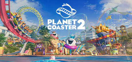
  • Genre Clarity: 9/10 — Theme park builder instantly recognizable. The capsule communicates sim/strategy through multiple clear visual cues: vibrant roller coasters, colorful water slides, themed attractions, and a bustling park full of rides and landscaping. At TINY size, the bright coasters and distinctive park silhouette immediately signal a management/building game, and the sequel number removes ambiguity about what franchise this is.
  • Title Readability: 9/10 — Title bold, central, highly legible. PLANET COASTER 2 is rendered in large, clean white sans-serif text with a strong planet logo above it, positioned in the center-upper portion against the bright blue sky background. The text remains fully readable at SMALL and TINY sizes due to generous size, high contrast with the sky, and minimal competing elements nearby.
  • Contrast & Color: 9/10 — Vibrant colors pop against dark. The bright blue sky, vivid primary-color roller coasters (reds, yellows, greens, teals), and colorful park structures create excellent saturation and value separation against Steam's #1b2838 background. Even at TINY size, the high chroma and light-to-dark distinction between the park scene and the dark Steam interface ensure the capsule stands out in scroll, with clear silhouettes of the coasters and attractions maintained even in grayscale.
  • Uniqueness & Polish: 8/10 — Premium showcase of creative builds. The image is a polished, aspirational render of multiple completed theme park attractions with layered depth, lighting, and environmental detail that communicates the creative potential and scale of the game. The cohesive art style, professionally composed scene, and variety of colorful rides and environments convey a higher production quality than generic management sims, though it leans slightly toward a marketing render rather than a uniquely memorable hook.
  • Brand Consistency: 8/10 — Consistent franchise visual identity. The capsule aligns with Planet Coaster's established brand: bright, saturated colors, playful cartoonish aesthetic, diverse roller coaster designs, and a colorful water park setting. The planet logo and title treatment are consistent with franchise branding, and the visual style clearly connects to the original game's identity while feeling polished for a sequel release.
  • Composition: 8/10 — Well-layered, hierarchical park scene. The composition uses depth effectively: foreground water and park ground, midground colorful attractions (coasters, water slides, shops), background landscape and sky. The title is anchored in the center-upper safe zone with the planet logo, and the eye is guided through multiple attractions without overwhelming clutter or dead zones. At SMALL and TINY sizes, the broad strokes of coasters and waterslides remain clear, though some fine details in the midground structures lose definition.

What works

  • Instant genre and franchise recognition. The vibrant roller coasters, water park setting, and colorful themed attractions immediately communicate a theme park builder, with the title and logo removing any ambiguity about which franchise this is.
  • Exceptional color contrast and vibrancy. The bright, saturated primary colors and high-value sky create strong visual pop against the Steam dark background, ensuring the capsule dominates in scrolling and maintains clarity at thumbnail size.
  • Clear, legible title placement. The bold white sans-serif title and planet logo are centered in a non-competing sky area, remaining fully readable at all scales down to TINY without loss of letterform or contrast.
  • Professional render quality and polish. The scene is a cohesive, well-lit 3D render showing multiple completed attractions with intentional depth, lighting, and environmental variety that signals a premium production experience.

What hurts the capsule

  • Busy midground details collapse at TINY. While the broad coasters and waterslides remain readable, the smaller park structures, shops, and landscaping in the center midground lose definition and merge into visual noise at TINY thumbnail size.
  • Generic aspirational marketing angle. The image is a beautiful showcase scene but does not highlight a specific unique mechanic, signature feature, or distinctive gameplay hook that differentiates Planet Coaster 2 from competitor tycoon games in this capsule alone.

Priority fixes

  1. [composition] Ensure the largest coasters and water slides remain the dominant focal points by slightly increasing their scale relative to background structures, improving clarity at TINY size.
  2. [uniqueness_polish] Consider overlaying a brief iconic gameplay element or signature customization feature (e.g., a UI snippet of the coaster editor or a unique ride mechanic visual) to reinforce what makes this game distinct from other sims.

Store copy priority fixes

  1. [hook_strength] Replace 'Are you ready to ride the wave?' with a concrete statement about what makes this sequel essential (e.g., 'Build interconnected coaster and water parks with unparalleled control—now with collaborative multiplayer').
  2. [uniqueness] Add a 1-2 sentence comparison to the original or competitors: explain specifically what changed, what's new in scope, or what makes this the definitive coaster simulator in a crowded market.
  3. [tone_match] Reduce exclamation marks and marketing adjectives by ~40%; replace 'jaw-dropping,' 'epic,' and 'unparalleled' with concrete details (e.g., 'With 9,000+ themed customizable pieces' instead of 'thousands of themed customisable pieces').
  4. [audience_targeting] Add a sentence explicitly addressing the player type: 'Perfect for sandbox creators, competitive empire-builders, and social park explorers' or similar to clarify who benefits most from each mode.

Related guides

Steam app ID: 2688950 · Tags: Simulation, Sandbox, Strategy, Building, City Builder