Scoring genre clarity...

Cuphead capsule

Cuphead

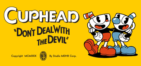
Cuphead is a classic run and gun action game heavily focused on boss battles. Inspired by cartoons of the 1930s, the visuals and audio are painstakingly created with the same techniques of the era, i.e. traditional hand drawn cel animation, watercolor backgrounds, and original jazz recordings.

$13.99Overwhelmingly Positive(4,154)
DifficultCartoonCo-op
Studio MDHR Entertainment Inc.Sep 29, 2017

Cuphead scores 87/100 — better than 97% of Difficult capsules (n=1,099).

Overwhelmingly Positive (4,154 reviews) · $13.99 · Released Sep 29, 2017 · By Studio MDHR Entertainment Inc.

Quick text summary

Cuphead scored 87/100 on Steam Analyzer — Excellent for a Difficult capsule. Top priority fix: [title_readability] Consider increasing the subtitle font size or removing it entirely at smaller capsule formats so it does not read as unresolved clutter at tiny size

Capsule scores by dimension

  • Genre Clarity: 7/10 — Cartoon style implies action platformer. The two cartoon characters with expressive poses and the 1930s rubber hose animation style immediately communicate a stylized action game, though the genre could read as platformer or run-and-gun rather than specifically boss-rush. At tiny size the bold character silhouettes still read as an action game with a unique cartoon aesthetic. The subtitle 'Don't Deal With The Devil' adds thematic context but is unreadable at tiny size.
  • Title Readability: 9/10 — Bold title reads at all sizes. The CUPHEAD logotype uses large, chunky white letterforms with a thick black outline on the high-contrast yellow background, making it exceptionally legible even at tiny thumbnail size. The subtitle in quotation marks is readable at full size but collapses into unreadable small text at tiny size, though this is acceptable as it functions as a tagline. The title placement in the top-left third with generous white space ensures it is never obscured by the character art.
  • Contrast & Color: 8/10 — Vibrant yellow pops against Steam dark UI. The saturated golden yellow background creates an immediate and strong separation from Steam's dark #1b2838 interface, making this capsule highly visible during quick scroll. The character silhouettes benefit from strong black outlines typical of the art style, ensuring clean separation even in grayscale. The red shoes and accents provide additional punch, though the mid-value blue on the characters blends slightly with the yellow at tiny size.
  • Uniqueness & Polish: 10/10 — Iconic 1930s cartoon style stands alone. This capsule is immediately and unmistakably distinct from every other game on Steam, communicating a singular and fully realized visual identity that no competitor replicates. The hand-drawn cel animation aesthetic, the MCMXXX copyright gag, the Studio MDHR Corp watermark, and the rubber hose character design all signal exceptional craft and intentionality. Compared to genre benchmarks like HELLDIVERS 2 or Hades II, Cuphead's capsule achieves a higher memorability score because the art style itself is the unique selling point.
  • Brand Consistency: 10/10 — Perfectly cohesive iconic visual identity. Every element including the logotype, character designs, yellow palette, black outlines, retro copyright text, and MDHR logo badge operates as a single coherent system drawn directly from the 1930s cartoon pastiche that defines the game. The two protagonist characters are immediately recognizable as brand icons across all marketing materials. There are no inconsistencies in rendering style, tone, or palette, and the identity is so distinctive it could be recognized from a tiny fragment of the image alone.
  • Composition: 8/10 — Clean hierarchy with strong focal anchor. The layout divides cleanly into left-side typographic content and right-side character art, creating a natural left-to-right reading flow from title to characters. The two characters form a strong grouped silhouette in the right third that anchors the composition without competing with the title. At small and tiny sizes the title and character group both remain visible without cropping issues, though the lower third copyright text becomes dead weight at reduced sizes and creates slight vertical imbalance.

What works

  • Unmistakable visual identity. The 1930s rubber hose animation style makes this capsule instantly recognizable and completely distinct from any other game on the platform.
  • Title legibility at all sizes. The chunky white CUPHEAD logotype with black outline reads clearly even at 120x45 thumbnail size against the yellow background.
  • Strong contrast against Steam UI. The saturated yellow background creates maximum separation from Steam's dark #1b2838 background, ensuring visibility during quick scroll.
  • Character silhouette clarity. The bold black outlines on both characters maintain clean readable silhouettes even in grayscale and at tiny sizes.

What hurts the capsule

  • Subtitle unreadable at tiny size. The 'Don't Deal With The Devil' subtitle in quotation marks collapses to unreadable at 120x45 and adds visual noise without contributing at small sizes.
  • Genre ambiguity at tiny size. The cartoon characters could suggest a platformer, puzzle game, or animated adventure rather than specifically a run-and-gun boss-rush at the smallest viewing size.
  • Dead weight lower third. The copyright and studio text in the bottom left adds authentic charm at full size but becomes visual clutter that slightly destabilizes the composition at reduced sizes.
  • Blue tones lose separation at tiny size. The mid-value blue details on the characters can blend slightly with the yellow background at tiny size in low-attention quick-scroll conditions.

Priority fixes

  1. [title_readability] Consider increasing the subtitle font size or removing it entirely at smaller capsule formats so it does not read as unresolved clutter at tiny size
  2. [genre_clarity] Introduce a subtle visual cue such as a projectile, explosion, or weapon element near the characters to more explicitly signal the run-and-gun action genre at tiny size
  3. [composition] Reduce the visual weight of the copyright and studio text in the lower third or push it closer to the edge to reclaim vertical balance in the composition
  4. [contrast_color] Add a very subtle warm-to-deep yellow vignette or gradient behind the characters to improve foreground-background separation at tiny sizes

Store copy priority fixes

  1. [genre_clarity] Lead the short description with 'Master challenging boss battles in this hand-drawn run-and-gun' to prioritize gameplay over art production while still embedding the visual hook.
  2. [audience_targeting] Add one sentence explicitly acknowledging difficulty: 'Master demanding boss encounters with pixel-perfect timing' or similar to set expectations for the hardcore action audience.
  3. [feature_communication] Expand briefly on weapon and super move variety—e.g., 'Unlock diverse weapons and devastating super moves tailored to each boss's weaknesses' to communicate systems depth.

Related guides

Steam app ID: 268910 · Tags: Difficult, Cartoon, Co-op, Platformer, Local Co-Op