Scoring genre clarity...
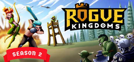
Classic tower defense meets roguelike adventure where you control the hero! Dive into procedurally generated levels filled with unique waves of enemies. Create powerful synergies with a variety of game-changing skills, relics, weapons, and traits to defend your kingdom. Every run is a new challenge!
$9.99Mixed(20)
Tower DefenseStrategyRoguelike
Drac Blau StudioMay 5, 2025