Scoring genre clarity...
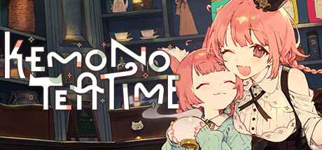
Relax in the world of Kemono Teatime, where animal ears are a normal part of everyday life. Here in Melodius, you can whip up whatever blends of tea you desire in your favorite cafe as you play through an adorable story. Come now and live out your bestest and cutest life—down to the last drop.
$12.99Overwhelmingly Positive(85)
Pixel GraphicsSimulationAdventure
Studio Lalala, Kotoneiro, WHO YOUSep 3, 2025