Megalotrain scores 72/100 — better than 42% of Bullet Hell capsules (n=1,285).

Quick text summary

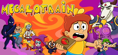
Megalotrain scored 72/100 on Steam Analyzer — Good for a Bullet Hell capsule. Top priority fix: [uniqueness_polish] Recompose to emphasize the train or magical escape element—consider showing a stylized train car, portal, or adventure hook rather than generic character grouping.

Capsule scores by dimension

  • Genre Clarity: 7/10 — Action adventure with colorful charm. The capsule communicates an action-adventure indie game through the protagonist's dynamic pose with a gun, enemy silhouettes, and vibrant magical train setting. At tiny size, the character-forward composition and weapon visibility still read as action-oriented, though the exact train/adventure specifics blur slightly. The colorful art style and multiple character types on screen support the indie adventure genre expectation.
  • Title Readability: 8/10 — Bold yellow text reads clearly. The title 'MEGALOTRAIN' uses large, thick yellow letterforms with purple/dark outline that contrasts well against the orange-to-purple gradient background. Even at tiny size, the chunky letter spacing and high saturation maintain legibility, though fine outline details soften. The text placement in the upper half prevents edge crop issues and keeps focus clear.
  • Contrast & Color: 8/10 — Vibrant gradient with strong silhouettes. The warm orange-to-purple radial gradient creates excellent value separation from the Steam dark background, with the yellow title popping distinctly. Character silhouettes read clearly even at small size due to high saturation and purposeful color blocking—no muddy mid-tones obscure the figures. The purple cow and dark enemy shapes maintain strong edges and visual separation in grayscale conversion.
  • Uniqueness & Polish: 6/10 — Competent cartoon style without standout hook. The capsule uses a polished, cohesive cartoon art style with clean character rendering and intentional color palette choices. However, the visual composition reads as a generic 'gather heroes and action elements' layout rather than communicating a unique selling point like the train concept, top-down exploration, or escape narrative. The craft is solid but the design doesn't tell a distinctive story that sets it apart from other colorful indie action games.
  • Brand Consistency: 7/10 — Consistent cartoon aesthetic, recognizable cast. The capsule establishes a clear internal brand identity through consistent character design, warm vibrant palette, and playful cartoon rendering across all visible figures. The protagonist's design, cow character, and enemy silhouettes would likely be recognizable in additional materials. The style feels cohesive and intentional, though without iconic branding motifs or signature visual hooks that anchor long-term memory.
  • Composition: 7/10 — Clear focal point, good depth layering. The main character's exaggerated pose and central-left placement creates a strong primary focal point, with supporting characters layered at different depths to guide the eye without competing. The composition uses background swirl effects, midground characters, and foreground protagonist effectively to create visual hierarchy. At tiny size, the arrangement still reads as organized despite busy elements, though the supporting cast approaches visual clutter on the right edge.

What works

  • Title stands out at all sizes. Yellow 'MEGALOTRAIN' with dark outline maintains excellent legibility from full header to tiny thumbnail due to thick letterforms and high contrast against gradient.
  • Strong color-background separation. Vibrant warm orange-purple gradient with saturated character colors pop clearly against Steam's dark background in both quick scroll and squint tests.
  • Coherent visual style. Cartoon character design, consistent rendering, and intentional palette create professional internal cohesion across all elements in the composition.

What hurts the capsule

  • Generic composition layout. The 'heroes assembled' arrangement doesn't communicate the unique train-exploration or escape narrative that differentiates Megalotrain from standard action-adventure titles.
  • Right-side character crowding. Multiple supporting characters cluster near the right edge where Steam may crop on small displays, creating potential information loss on mobile or sidebar views.
  • Lacks memorable brand hook. While the art is clean and competent, there are no iconic symbols, distinctive visual motifs, or signature elements that would stand out in recognition tests versus competitor capsules.

Priority fixes

  1. [uniqueness_polish] Recompose to emphasize the train or magical escape element—consider showing a stylized train car, portal, or adventure hook rather than generic character grouping.
  2. [composition] Shift right-side characters leftward to create safer margins and ensure all important elements remain visible even with Steam's responsive cropping on smaller viewports.
  3. [brand_consistency] Introduce a distinctive visual motif or icon (e.g., stylized train wheel, magical rune, or character signature) that becomes recognizable across other marketing materials.

Store copy priority fixes

  1. [hook_strength] Rewrite the short description to open with a specific, evocative hook like 'Dodge, loot, and survive a sentient train full of eccentric horrors' rather than restating the title.
  2. [genre_clarity] Add explicit mention of 'bullet hell' or 'dodge and shoot' mechanics in the opening lines to align copy with the Shooter and Bullet Hell tags.
  3. [audience_targeting] Insert a sentence clarifying the intended player: 'Perfect for action fans who love quirky humor and surreal worlds' or similar, to help self-selection.
  4. [uniqueness] Integrate the surreal elements into the core pitch rather than scattering them, e.g., 'Face absurd bosses like a vampire talk-show host and battle a giant duck in zero gravity' as part of the main value proposition.

Related guides

Steam app ID: 2701190 · Tags: Bullet Hell, Shooter, Arcade, Action-Adventure, 2D