Scoring genre clarity...

Dungeon Twist capsule

Dungeon Twist

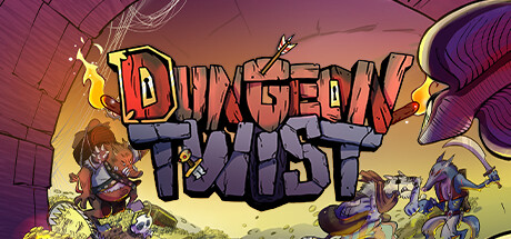
Dungeon Twist is a turn-based tactical game focused on free-for-all PvE matches.Join a gang of filthy rogues and manipulate the Shifting Dungeon, an ever-changing maze full of loot and hazards.Trick your opponents, grab the Treasure… and get out alive!

$4.99
StrategyBoard GameCard Game
Magari GamesMay 24, 2026

Dungeon Twist scores 75/100 — better than 69% of Strategy capsules (n=5,103).

$4.99 · Released May 24, 2026 · By Magari Games

Quick text summary

Dungeon Twist scored 75/100 on Steam Analyzer — Good for a Strategy capsule. Top priority fix: [contrast_color] Increase silhouette clarity of right-side characters by adding stronger outline definition or adjusting overlap layering to prevent muddy blending at small sizes.

Capsule scores by dimension

  • Genre Clarity: 7/10 — Tactical roguelike with clear character focus. The capsule effectively communicates a turn-based tactical game through the visible party of distinct character classes in combat poses around a central explosion or hazard. Multiple colorful character silhouettes and action-oriented staging make the gameplay type readable at full size. At tiny size, the character grouping and fantasy combat setting remain recognizable, though individual character roles become harder to distinguish.
  • Title Readability: 8/10 — Bold title with strong contrast and presence. The 'DUNGEON TWIST' text uses a thick, outlined geometric font in orange and dark gray positioned prominently at top center against a controlled radial gradient background. The letterforms maintain legibility at small size due to the bold stroke weight and high-contrast outline. At tiny size the title remains readable as a cohesive unit, though individual letters show minor softening.
  • Contrast & Color: 8/10 — Vibrant warm palette with strong value separation. The capsule uses a warm orange-to-purple gradient background with bright yellow accents and vivid character colors that pop distinctly against the dark Steam background. Characters are lit from above with strong warm highlights that create clear silhouettes even at small sizes. The radial light fall-off from center outward maintains readability and guides the eye effectively in grayscale.
  • Uniqueness & Polish: 7/10 — Polished cartoon style with cohesive energy. The art direction shows consistent hand-painted cartoon rendering with clean outlines, vibrant color choices, and deliberate lighting effects that feel intentional rather than generic. The central explosion/hazard effect and scattered loot visuals communicate the 'shifting dungeon' mechanic without heavy-handed UI overlay. While the style is polished, the composition feels somewhat conventional for casual strategy games, placing it solidly above baseline but not distinctively memorable.
  • Brand Consistency: 7/10 — Consistent cartoon aesthetic across visible elements. The capsule shows internal visual cohesion with matching art style, consistent character design language, and a recognizable color palette of warm oranges against cool purples. The ornate serif-styled title treatment with orange flame accents creates a memorable visual hook tied to dungeon/adventure themes. However, without reference to the six store screenshots, it is difficult to confirm whether this palette and style appear consistently across all marketing materials.
  • Composition: 8/10 — Clear focal point with balanced layering. The composition uses effective depth layering: background dungeon architecture, midground characters in active poses around a central explosion, and foreground visual effects that naturally guide the eye inward. The title sits securely at top center with breathing room from edges, and the character grouping creates a strong focal point without scattering attention. At small and tiny sizes, the central character cluster and explosion effect remain the dominant read, though some peripheral character detail softens appropriately.

What works

  • Strong title contrast and readability. The bold outlined 'DUNGEON TWIST' logo maintains clear letterforms and legibility across full, small, and tiny sizes against the controlled background gradient.
  • Effective warm-cool color contrast. The orange and yellow character highlights and title pop vividly against the purple and dark background, creating excellent value separation in both color and grayscale.
  • Clear central focal point and depth. The composition naturally guides the eye to the central explosion and character grouping through layering and lighting, avoiding scattered attention.
  • Genre communication through visual staging. Multiple character classes in combat poses and the central hazard immediately signal turn-based tactical gameplay without relying on explicit UI elements.

What hurts the capsule

  • Right-side character silhouettes lose detail at small sizes. The rightmost purple-winged character becomes visually muddy and difficult to parse as a distinct unit when the capsule shrinks to small or tiny dimensions.
  • Generic cartoon style without standout hook. While competently executed, the visual style does not communicate a unique selling point or core mechanic beyond 'colorful party in a dungeon,' making it less distinctive than top-performing genre peers.
  • Subtle dungeon architecture easy to miss. The brick and architectural elements in the background are visually secondary and may not clearly communicate the 'shifting maze' mechanic at quick-scroll speeds.

Priority fixes

  1. [contrast_color] Increase silhouette clarity of right-side characters by adding stronger outline definition or adjusting overlap layering to prevent muddy blending at small sizes.
  2. [genre_clarity] Add a subtle loot or treasure visual element (chest, coins, gems) in the composition to explicitly reinforce the 'grab the Treasure' core mechanic.
  3. [uniqueness_polish] Integrate a recognizable recurring symbol or character motif (e.g., a rogue emblem, treasure marker, or signature magic effect) that could anchor brand identity across marketing materials.

Store copy priority fixes

  1. [hook_strength] Replace 'free-for-all PvE matches' with 'matches against up to 4 AI opponents' in the short description to eliminate jargon and clarify scope immediately.
  2. [feature_communication] Add a sentence explaining the win condition and turn structure, e.g., 'First player to escape with the Treasure wins, but the dungeon collapses once they leave—can you survive the collapse?'
  3. [audience_targeting] Add a note about match length (e.g., 'Perfect for 15–30 minute sessions') to set player expectations and signal fit for casual audiences.
  4. [uniqueness] Expand the Shifting Dungeon description with one sentence explaining why player-driven map changes create emergent gameplay, e.g., 'Every tile you place or remove reshapes opponent strategy in real-time.'

Related guides

  • Steam page optimisationCapsule, copy, screenshots, tags — the full Steam page conversion stack.
  • Steam tags guideTag selection, ordering, and how it shapes Steam's recommendation rails.

Steam app ID: 2706030 · Tags: Strategy, Board Game, Card Game, Tabletop, Turn-Based Tactics