Scoring genre clarity...

SubwaySim 2 capsule

SubwaySim 2

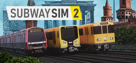
Explore the three most picturesque underground lines in Germany! The Berlin U1/U3 and the Hamburg U3 are waiting for you.  Immerse yourself in everyday life in the two German metropolises and discover famous sights such as Hamburg's harbour or Berlin's Oberbaum Bridge. 

$34.99Very Positive(43)
SimulationRealisticTrains
Simuverse InteractiveApr 29, 2025

SubwaySim 2 scores 78/100 — better than 79% of Simulation capsules (n=5,188).

Very Positive (43 reviews) · $34.99 · Released Apr 29, 2025 · By Simuverse Interactive

Quick text summary

SubwaySim 2 scored 78/100 on Steam Analyzer — Good for a Simulation capsule. Top priority fix: [uniqueness_polish] Introduce a stylized visual treatment, signature color accent (e.g., neon or metallic highlight), or branded UI element to create visual distinctiveness within the simulation genre

Capsule scores by dimension

  • Genre Clarity: 9/10 — Transit simulation instantly recognizable. The capsule immediately communicates a public transit simulation through the prominent display of two distinct subway train models positioned on elevated tracks against a recognizable cityscape. The yellow and red/burgundy train liveries, realistic train proportions, and the infrastructure setting make the genre unmistakable even at tiny size, with the bold 'SUBWAY SIM 2' title removing any ambiguity about the simulation focus.
  • Title Readability: 9/10 — Bold legible title with numeric clarity. The 'SUBWAY SIM 2' text is rendered in large, clean sans-serif typeface with strong white and yellow color separation that stands out sharply against the sky background and train subjects. At full, small, and tiny sizes, the title remains perfectly legible due to its generous sizing, high contrast, and placement in the lower third on a controlled background region without competing visual clutter.
  • Contrast & Color: 8/10 — Strong value separation with saturated accents. The composition leverages clear light-to-dark contrast between the bright sky (light blue), vibrant train colors (yellow, red), architectural elements (gray/green), and darker foliage (deep green). The yellow train and white title text pop distinctly against the Steam dark background, though the overall palette is slightly cool-toned which softens some impact compared to warmer alternatives.
  • Uniqueness & Polish: 7/10 — Polished presentation, recognizable but not distinctive. The capsule demonstrates clean photographic rendering of real-world train models and Berlin landmarks (Brandenburg Gate visible), with professional composition and clear visual hierarchy. However, the approach is relatively straightforward documentation of game assets without a unique visual hook or stylized art direction that distinguishes it from other transit or city simulation capsules in the genre.
  • Brand Consistency: 6/10 — Competent but lacks memorable identity signature. The capsule presents a cohesive visual identity built around realistic transit vehicles and German cityscape imagery, which aligns with game content but lacks a distinctive brand icon, signature color palette, or recognizable motif that would enable instant recognition in a lineup. The realistic photographic style is consistent with simulation game conventions but not uniquely identifiable to SubwaySim 2 specifically.
  • Composition: 8/10 — Strong focal hierarchy with layered depth. The composition uses excellent depth layering with foreground trains commanding primary attention, midground architectural landmarks providing context, and background sky creating separation. The title placement at bottom-right maintains safe margins and doesn't obscure critical elements, and the two-train comparison creates natural visual interest that guides eye movement from left to right.

What works

  • Instant genre recognition. The subway trains and track infrastructure immediately signal transit simulation without requiring text, making the game type obvious even at thumbnail size.
  • Excellent title contrast and legibility. Bold white and yellow text on sky background maintains perfect readability across all sizes with no letterform collapse or obscuration issues.
  • Effective depth and spatial composition. Layered foreground trains, midground landmarks, and background sky create visual hierarchy that naturally guides focus and communicates scale and context.

What hurts the capsule

  • Generic visual presentation. The straightforward documentation of trains and landmarks lacks distinctive visual treatment, art direction, or stylization that differentiates from other simulation genre capsules.
  • No memorable brand identity motif. The capsule relies entirely on literal asset representation without an iconic character, symbol, or signature visual element that could serve as brand recognition cue.
  • Cool-toned palette reduces pop. While yellow trains provide warmth, the dominant blue sky and gray architecture create a cool overall tone that doesn't maximize visual impact against Steam's dark background.

Priority fixes

  1. [uniqueness_polish] Introduce a stylized visual treatment, signature color accent (e.g., neon or metallic highlight), or branded UI element to create visual distinctiveness within the simulation genre
  2. [brand_consistency] Develop a recognizable icon or visual motif (e.g., stylized transit map, numbered line badge, or character mascot) that can serve as brand identity across marketing materials
  3. [contrast_color] Warm the overall palette or add a vibrant orange or red accent strip to increase visual pop against the Steam dark background without losing the realistic train aesthetic

Store copy priority fixes

  1. [hook_strength] Rewrite the short description opening to lead with a core gameplay verb and immediate stakes: 'Master three German subway lines from the operator's seat: keep passengers safe and on time while managing real-world disruptions, delays, and system failures.'
  2. [uniqueness] Add a sentence explicitly stating what differentiates SubwaySim 2 from competitors: 'The most detailed recreation of real German U-Bahn networks ever modeled in a game, with 41 km of authentic track and 51 individually recreated stations' or similar.
  3. [audience_targeting] Clarify the target player in a one-sentence addition: 'Perfect for train enthusiasts, simulation fans, and anyone curious about daily life as a subway operator' or equivalent.
  4. [feature_communication] Remove or replace generic marketing terms ('unparalleled,' 'brand-new') with concrete comparisons or technical specifics (e.g., instead of 'improved graphics,' state 'Unreal Engine 5 rendering with 4K detail on vehicles and stations').

Related guides

Steam app ID: 2707070 · Tags: Simulation, Realistic, Trains, First-Person, 3D