Scoring genre clarity...

Farmer's Diary capsule

Farmer's Diary

There is a lot of work to be done on this farm, a long-term adventure awaits you where you can take farming, orcharding and animal husbandry to the next level with your friends.

Early AccessCasualSimulation
FiftyEight StudiosComing soon

Farmer's Diary scores 77/100 — better than 77% of Early Access capsules (n=3,143).

Released Coming soon · By FiftyEight Studios

Quick text summary

Farmer's Diary scored 77/100 on Steam Analyzer — Good for a Early Access capsule. Top priority fix: [uniqueness_polish] Introduce a distinctive visual hook such as a signature character, unique art style flourish, or iconic motif that differentiates this farm from generic farming sims—consider whether a farmer character or farm mascot could anchor brand identity.

Capsule scores by dimension

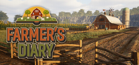
  • Genre Clarity: 9/10 — Farm simulation immediately recognizable. The capsule communicates farm life with unmistakable iconography: red barn, silo, wooden fence, sunflower field, and pastoral landscape. At tiny size, the barn silhouette and golden field remain clearly legible, establishing this as a farming/agriculture game without ambiguity. The visual language matches the top-performing Lightyear Frontier and Techtonica in genre signaling clarity.
  • Title Readability: 8/10 — Title legible with strong outline. FARMER'S DIARY uses bold orange and olive lettering with dark drop shadow on a light sky background, ensuring readability at full size and small size. At tiny size, the title remains distinguishable though fine serifs lose definition. The logo placement above provides visual anchor and does not interfere with text clarity.
  • Contrast & Color: 8/10 — Strong warm palette with good separation. The warm orange-gold sky, golden field, and russet barn create rich value separation against the Steam dark background. The barn has clear silhouette definition, and the warm earth tones contrast effectively with cool blue sky. At tiny size, the warm mid-ground and cool sky still read as distinct layers with no muddy blending.
  • Uniqueness & Polish: 7/10 — Competent pastoral aesthetic, lacks standout hook. The composition is clean and thematically coherent with proper depth layering (sky, trees, field, barn), but the visual presentation follows familiar farming game conventions without a distinctive art style or unique mechanic hint. The illustrated aesthetic is competent but not premium—it reads as serviceable rather than memorable compared to standout indie titles like Tiny Glade or Snufkin.
  • Brand Consistency: 6/10 — Coherent farm theme, no signature identity. The capsule maintains consistent rural illustration style and earthy palette internally, but offers no iconic character, symbol, or distinctive visual motif that would be uniquely recognizable as Farmer's Diary versus other farming sims. The barn and fence are generic farming elements rather than branded identity hooks.
  • Composition: 8/10 — Clear hierarchy, well-balanced depth layers. The composition establishes strong focal hierarchy: title at top center, barn in mid-ground right-of-center, field and trees create depth recession. The barn naturally draws the eye and sits in safe margins. At small and tiny sizes, the barn silhouette remains the primary subject and the composition does not collapse, though some fine fence detail becomes unclear at extreme reduction.

What works

  • Genre immediately clear at all sizes. Barn, silo, sunflower field, and pastoral setting communicate farming simulation without ambiguity, even at tiny thumbnail.
  • Strong depth layering and composition. Sky, trees, field, and barn create clear visual recession with the barn as strong focal point, avoiding scattered attention.
  • Readable title with effective contrast. Orange and olive lettering with dark shadow sits on light sky background, remaining legible across small to full sizes.

What hurts the capsule

  • Generic aesthetic within farming genre. The pastoral illustration style is competent but lacks distinctive visual personality compared to standout indie titles, feeling more serviceable than premium.
  • No memorable brand identity cues. Barn and field are standard farming iconography; there is no unique character, symbol, or signature palette element that would make Farmer's Diary instantly recognizable in retrospect.
  • Fine detail loses clarity at tiny size. Fence posts and some landscape texture become indistinct at extreme reduction, slightly reducing icon clarity despite strong overall composition.

Priority fixes

  1. [uniqueness_polish] Introduce a distinctive visual hook such as a signature character, unique art style flourish, or iconic motif that differentiates this farm from generic farming sims—consider whether a farmer character or farm mascot could anchor brand identity.
  2. [brand_consistency] Develop a recognizable color palette or visual signature across the capsule and secondary assets that would make Farmer's Diary instantly identifiable, moving beyond standard pastoral conventions.
  3. [genre_clarity] Strengthen the cooperative/multiplayer aspect visually—add subtle cues like multiple farmer silhouettes or shared tools to better communicate the 'with your friends' gameplay promise mentioned in the description.

Store copy priority fixes

  1. [hook_strength] Rewrite the short description to lead with an active gameplay verb and emotional appeal: 'Restore a neglected farm to prosperity by growing crops, raising animals, and building thriving orchards—alone or with friends in this cozy farming simulation.'
  2. [uniqueness] Add 1–2 sentences explaining what differentiates Farmer's Diary: e.g., 'Customize your character, manage a dynamic farm economy, and unlock production mechanics as you progress,' or a comparison point if applicable.
  3. [feature_communication] Expand the Multiplayer section or add a new paragraph explaining co-op mechanics: shared farm or separate farms, async vs synchronous play, and how budget/progression works with other players.
  4. [audience_targeting] Add a sentence clarifying the intended audience: 'Perfect for players seeking a relaxed, long-term farming experience with friends' or highlight casual/hardcore positioning.

Related guides

Steam app ID: 2715880 · Tags: Early Access, Casual, Simulation, Multiplayer, Online Co-Op