Scoring genre clarity...

Releaseburg capsule

Releaseburg

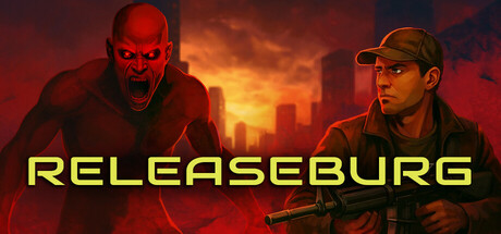
Battle relentless zombie hordes in this rogue-like shooter. Surviving enemy encounters demands you to focus, concentrate and act with precision and strategic thinking. Brace yourself for intense violence and blood as you travel through the post-apocalyptic city.

$9.996 user reviews
Action RoguelikeActionRoguelike
SteadyBoarOct 31, 2025

Releaseburg scores 77/100 — better than 79% of Action Roguelike capsules (n=1,675).

6 user reviews · $9.99 · Released Oct 31, 2025 · By SteadyBoar

Quick text summary

Releaseburg scored 77/100 on Steam Analyzer — Good for a Action Roguelike capsule. Top priority fix: [uniqueness_polish] Introduce a distinctive visual element or color accent (e.g., a unique mechanic indicator, environmental detail, or character silhouette quirk) that differentiates Releaseburg from standard zombie shooters and creates memorable brand recognition.

Capsule scores by dimension

  • Genre Clarity: 8/10 — Zombie action shooter clearly communicated. The demonic red-faced zombie on the left and armed survivor on the right immediately signal post-apocalyptic action horror. The fiery cityscape background and character positioning reinforce combat-focused gameplay. At tiny size, the red antagonist and weapon silhouette remain readable, though the genre reads as action-horror rather than rogue-like specifically.
  • Title Readability: 9/10 — Bold yellow title dominates clearly. RELEASEBURG in bright yellow sans-serif font sits centered on a dark background band, providing excellent contrast and legibility at all sizes. The letterforms are clean and spaced well, maintaining full readability even at tiny thumbnail scale without any outline loss or collapse.
  • Contrast & Color: 8/10 — Strong warm-cool separation works well. The bright yellow title pops distinctly against the dark purple-brown background. Red zombie and orange-lit city create warm value separation from the darker sky, while the survivor's tan clothing reads clearly against the background. Grayscale conversion maintains strong silhouette separation and subject clarity at all scales.
  • Uniqueness & Polish: 7/10 — Polished but leans on genre tropes. Professional rendering with cohesive lighting, atmospheric fire effects, and clean character art. The composition feels cinematic and premium, though zombie-shooter imagery is familiar territory in action-horror. The execution is solid craft without a distinctive hook that separates it from other zombie games visually.
  • Brand Consistency: 6/10 — Generic post-apocalyptic horror palette. The warm orange-red-black color scheme and zombie-survivor dynamic are consistent with the store description but offer no distinctive brand identity cue. There is no iconic character design, symbol, or signature motif visible that would make Releaseburg recognizable on sight compared to other zombie shooters.
  • Composition: 8/10 — Clear hierarchy with balanced focal points. The zombie and survivor are positioned left and right with the yellow title anchoring the center, creating strong balance and two engaging subjects. The title sits safely within margins and will not crop off on Steam's display. The depth layering (foreground characters, mid-ground fire effects, background cityscape) guides the eye effectively at all sizes.

What works

  • Title legibility at all scales. Bold yellow sans-serif maintains full clarity from full header to tiny thumbnail without any collapse or outline loss.
  • Strong value contrast and silhouette. Red zombie and warm lighting create clear separation against the dark background, reading distinctly even in grayscale and at small sizes.
  • Professional cinematic presentation. Cohesive lighting, atmospheric effects, and clean character art convey premium polish and action-horror tone effectively.

What hurts the capsule

  • Lacks distinctive brand identity. Generic zombie-shooter imagery and warm-dark palette offer no memorable icon or signature visual that differentiates Releaseburg from competitors.
  • Rogue-like genre mechanic not visually evident. The capsule communicates action-horror but does not hint at the rogue-like progression or strategic depth claimed in the description.
  • Relies on familiar horror tropes. While well-executed, the zombie-survivor-apocalypse composition follows established genre conventions without a unique visual hook or surprising angle.

Priority fixes

  1. [uniqueness_polish] Introduce a distinctive visual element or color accent (e.g., a unique mechanic indicator, environmental detail, or character silhouette quirk) that differentiates Releaseburg from standard zombie shooters and creates memorable brand recognition.
  2. [genre_clarity] Add a subtle rogue-like visual cue such as UI elements, progression markers, or run-based environment hint to communicate the specific gameplay loop beyond generic action-horror.
  3. [brand_consistency] Develop a signature color accent or character detail visible across store screenshots that creates iconic recognition and internal cohesion with broader game branding.

Store copy priority fixes

  1. [feature_communication] Add a 1-2 sentence mechanical explanation of the 'release-based shooting mechanic' immediately after it is introduced—what does the player do differently with this mechanic compared to standard shooting?
  2. [uniqueness] Replace one instance of generic descriptors (e.g., 'relentless,' 'intense') with a concrete statement of what makes this game different from other zombie roguelikes (e.g., 'Unlike traditional roguelikes, every shot's timing and release determines damage and accuracy').
  3. [audience_targeting] Add a sentence in the detailed description that explicitly names the intended audience (e.g., 'Built for players who relish punishing difficulty and precision-based combat systems').

Related guides

Steam app ID: 2717150 · Tags: Action Roguelike, Action, Roguelike, Difficult, Roguelite