Scoring genre clarity...

Black Border 2 capsule

Black Border 2

Black Border 2 is an intense border patrol simulator where you inspect documents and use special tools to detect forgeries and stop smugglers.

$1.99Mixed(16)
SimulationCasualPoint & Click
BitzoomaNov 27, 2025

Black Border 2 scores 78/100 — better than 79% of Simulation capsules (n=5,188).

Mixed (16 reviews) · $1.99 · Released Nov 27, 2025 · By Bitzooma

Quick text summary

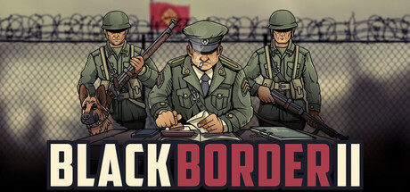
Black Border 2 scored 78/100 on Steam Analyzer — Good for a Simulation capsule. Top priority fix: [contrast_color] Increase rim lighting or add subtle highlights on officer shoulders and arms to boost value separation and visual pop at thumbnail size.

Capsule scores by dimension

  • Genre Clarity: 8/10 — Strong simulation authority signaling. The three uniformed border patrol officers with military-style gear and the chain-link fence with barbed wire clearly communicate border control and inspection themes. At TINY size, the silhouettes of armed officials and institutional setting immediately convey law enforcement simulation, though the specific document-inspection mechanic is not visually obvious.
  • Title Readability: 9/10 — Excellent legibility across all sizes. The title 'BLACK BORDER II' uses bold white sans-serif lettering with a red accent on 'BORDER,' creating strong contrast against the image and dark Steam background. The text remains fully readable even at TINY thumbnail size due to large letterforms, strategic placement on a neutral lower band, and excellent value separation.
  • Contrast & Color: 8/10 — Strong separation with effective lighting. The uniformed figures in tan and olive tones stand out clearly against the darker fence and sky background, with rim lighting adding definition. The pale foreground transitions to darker tones toward the edges, creating depth, though the mid-tone dominance in the character clothing could be slightly brighter for maximum pop at TINY size.
  • Uniqueness & Polish: 7/10 — Professional but familiar simulation theme. The capsule features clean illustrative character art with authentic period-appropriate military uniforms and realistic document/inspection elements that reflect actual gameplay. The execution is polished and thematically cohesive, though the border patrol setting shares visual DNA with competitors like Contraband Police, preventing it from feeling wholly distinctive.
  • Brand Consistency: 7/10 — Coherent military inspection identity. The art style, color palette of military greens and tans, and focus on uniformed officials create a recognizable and consistent brand voice that aligns with simulation game conventions. The aesthetic should be memorable across marketing materials, though without unique character silhouettes or a signature motif, it relies on the setting rather than iconic visual identity.
  • Composition: 8/10 — Balanced focal hierarchy with clear subjects. The three officers are arranged with the center-left figure slightly forward, creating a natural focal point and depth layering against the fence background. The title placement at the bottom ensures text safety and does not compete with the characters; the composition remains effective at SMALL and TINY sizes with no awkward cropping or dead space.

What works

  • Readable title at all sizes. Bold white lettering with red accent maintains clarity from full header down to tiny thumbnail without loss of legibility.
  • Strong genre communication. Military uniforms, institutional fencing, and border setting immediately signal authority and inspection simulation to viewers in under one second.
  • Clean composition hierarchy. Three figures positioned to create clear focal depth with title safely placed below, avoiding visual competition and maintaining safe margins.

What hurts the capsule

  • Limited visual distinctiveness. The setting and art style are competent but share strong similarities with competing border/inspection simulators, reducing memorable differentiation.
  • Character clothing mid-tone dominance. The tan and olive uniforms are in the middle value range, which slightly reduces pop and silhouette clarity against the background at TINY sizes.
  • No iconic brand motif or symbol. The capsule lacks a signature character, logo, or visual symbol that would make the brand instantly recognizable on repeat exposure.

Priority fixes

  1. [contrast_color] Increase rim lighting or add subtle highlights on officer shoulders and arms to boost value separation and visual pop at thumbnail size.
  2. [uniqueness_polish] Introduce a signature visual element such as a distinctive patch, color accent, or character pose that differentiates this entry from similar border simulator competitors.
  3. [brand_consistency] Develop and prominently feature a recognizable icon or motif (such as a border official emblem or inspection stamp) that can serve as a consistent brand identifier across all marketing materials.

Store copy priority fixes

  1. [tone_match] Remove or minimize emoji usage; rewrite the opening paragraph to establish procedural tension and bureaucratic weight without relying on visual decoration. Lead with a single vivid scenario rather than cheerful emoji.
  2. [uniqueness] Add a paragraph explaining what Black Border 2 adds to or changes from the original Papers Please—new mechanics, branching narrative consequences, agency systems, or thematic depth unique to this sequel.
  3. [feature_communication] Expand the detailed description to 200–250 words and add information about game length, difficulty progression, failure states, and how decisions compound across a shift or career.
  4. [audience_targeting] Clarify whether the game targets hardcore simulation enthusiasts, casual puzzle players, or both; use language and framing that speaks directly to the primary audience rather than splitting messaging.

Related guides

Steam app ID: 2719640 · Tags: Simulation, Casual, Point & Click, Puzzle, Political Sim