Scoring genre clarity...

HER TREES : THE PUZZLE HOUSE capsule

HER TREES : THE PUZZLE HOUSE

HER TREES : THE PUZZLE HOUSE is a unique point-and-click puzzle game where you move and combine objects to solve puzzles.Uncover the mysteries of this peculiar room.

$1.99Overwhelmingly Positive(77)
PuzzleEscape RoomPoint & Click
StoneFeb 29, 2024

HER TREES : THE PUZZLE HOUSE scores 72/100 — better than 44% of Puzzle capsules (n=4,541).

Overwhelmingly Positive (77 reviews) · $1.99 · Released Feb 29, 2024 · By Stone

Quick text summary

HER TREES : THE PUZZLE HOUSE scored 72/100 on Steam Analyzer — Good for a Puzzle capsule. Top priority fix: [composition] Increase left and right margin safety zones by 10–15 pixels to ensure no objects are cropped in Steam thumbnail displays and maintain full visibility of table edge vessels.

Capsule scores by dimension

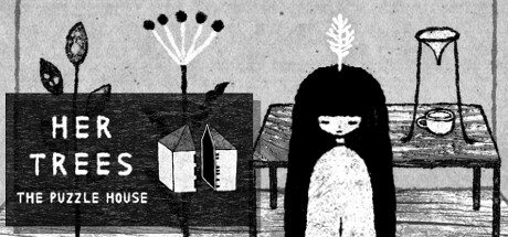
  • Genre Clarity: 7/10 — Indie puzzle game, clear intent. The monochromatic illustrative style and still-life arrangement of objects (books, plants, vase, containers on a wooden table) immediately signal a puzzle or narrative-driven indie game rather than action or adventure. The centered female figure with long black hair and contemplative pose reinforces an introspective, story-focused experience. At TINY size, the silhouettes of objects and figure remain legible enough to communicate a mysterious domestic puzzle setting, though fine detail is lost.
  • Title Readability: 6/10 — Readable but placement competes. The title 'HER TREES' and subtitle 'THE PUZZLE HOUSE' are rendered in clean, sans-serif white lettering placed on a dark horizontal wood-grain bar in the left-center area. At FULL size, both lines read clearly with strong contrast. However, at SMALL and TINY sizes, the subtitle becomes tight and may lose clarity due to the wood texture background behind it, and the overall title block competes visually with the central character figure for attention.
  • Contrast & Color: 8/10 — High-contrast monochromatic design. The black-and-white palette creates excellent value separation against the Steam dark background (#1b2838). The stark silhouettes of the figure, furniture, plants, and objects all read cleanly with crisp edges and no muddy mid-tones. In grayscale stress test and at TINY size, the composition maintains strong silhouette clarity—the figure's black hair and dress contrast sharply against the light interior, and the dark wood bar anchors the title legibly.
  • Uniqueness & Polish: 8/10 — Distinctive illustrative aesthetic. The hand-drawn monochromatic illustration style and carefully composed still-life arrangement of symbolic objects (books, plants, vessels) create a memorable and cohesive visual identity that stands apart from typical puzzle game marketing. The art direction communicates a thoughtful, artistic sensibility aligned with indie games like *Chants of Sennaar* and *Harold Halibut*. The deliberate staging of objects and figure suggests narrative depth and craft, not a generic template.
  • Brand Consistency: 7/10 — Consistent illustration style, recognizable. The monochromatic line-art illustration style and the central figure archetype (contemplative woman with long black hair) serve as consistent identity markers across the capsule. The palette and rendering technique appear intentional and signature-like, supporting brand recall. However, without cross-referencing the 13 available store screenshots, it is difficult to confirm whether all supporting brand elements (UI style, object palette, color treatment) align consistently—the capsule alone shows strong internal cohesion but lacks obvious branded iconography or motif beyond the figure itself.
  • Composition: 7/10 — Strong focal point, minor edge risk. The central female figure commands clear hierarchy and serves as the primary focal point at all sizes. The arrangement of objects around and above her creates balanced depth layering—foreground figure, midground table with objects, and background suggested by vertical wood panels and negative space. The title bar sits in the left-center and does not overwhelm the figure. At TINY size, the composition reads cleanly with the figure dominating attention. A minor concern: the top-right corner (water glass/vessel) and far right edge sit close to potential Steam crop boundaries, which could lose subtle detail in thumbnails.

What works

  • Monochromatic contrast clarity. Black-and-white palette ensures every element reads sharply against the Steam dark background with zero muddiness, maintaining silhouette legibility even at TINY size.
  • Distinctive illustrative identity. Hand-drawn art style and symbolic object staging create a premium, artisanal feel that signals indie craft and mystery without relying on generic templates.
  • Clear visual hierarchy at scale. The centered figure dominates focal attention at all viewing sizes, while the title bar and surrounding objects support without competing for primary focus.

What hurts the capsule

  • Subtitle clarity at small sizes. 'THE PUZZLE HOUSE' text becomes cramped and slightly harder to parse cleanly when compressed to SMALL or TINY dimensions, especially over the wood-grain texture.
  • Edge safety margins unclear. Top-right and far-right objects (water glass, rightmost vessels) sit dangerously close to frame edges and may be cropped or lost in Steam's thumbnail view.
  • Limited color differentiation. While monochromatic design is intentional and effective, the absence of color accent means no warmth or secondary focal draw to highlight puzzle-specific mechanics or unique gameplay hooks.

Priority fixes

  1. [composition] Increase left and right margin safety zones by 10–15 pixels to ensure no objects are cropped in Steam thumbnail displays and maintain full visibility of table edge vessels.
  2. [title_readability] Increase subtitle font weight or letter spacing slightly to improve SMALL and TINY size legibility, or reposition subtitle to sit fully on the dark wood bar without texture interference.
  3. [genre_clarity] Consider adding a subtle visual accent (small icon or highlight detail) that explicitly signals the puzzle mechanic (e.g., a highlighted book spine, puzzle piece motif, or interactive glow on one object) to strengthen gameplay clarity at TINY size.

Store copy priority fixes

  1. [hook_strength] Replace 'Uncover the mysteries of this peculiar room' with an atmospheric opening that evokes the surreal, dark mood—e.g., 'Step into a monochrome dreamworld where nothing is as it seems. Solve hand-drawn puzzles that blur reality and illusion.'
  2. [uniqueness] Replace 'A new puzzle experience unlike any other game' with a specific differentiator—e.g., 'Every puzzle evolves from the environment itself, creating a seamless narrative flow without tedious inventory busywork.'
  3. [tone_match] Revise the feature list to match the atmospheric tone—use narrative framing instead of bullet points for gameplay and aesthetic, or restructure to lead with atmosphere before mechanics.
  4. [audience_targeting] Add an explicit audience signal such as 'Perfect for players who love atmospheric escape rooms and environmental storytelling' to immediately clarify who will love this game.

Related guides

Steam app ID: 2725090 · Tags: Puzzle, Escape Room, Point & Click, Short, Hand-drawn