Scoring genre clarity...

Scarred Mansion capsule

Scarred Mansion

Unleash your tactical prowess in this hauntingly innovative deck-building strategy game. Craft cards with unique components to solve puzzles on your journey to escape the spooky house you're stuck in!

$7.991 user reviews
StrategyDeckbuildingRoguelike
Focal Point Game StudioApr 7, 2025

Scarred Mansion scores 73/100 — better than 57% of Strategy capsules (n=5,103).

1 user reviews · $7.99 · Released Apr 7, 2025 · By Focal Point Game Studio

Quick text summary

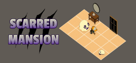
Scarred Mansion scored 73/100 on Steam Analyzer — Good for a Strategy capsule. Top priority fix: [genre_clarity] Add a visible card or deck visual element to communicate the deck-building core mechanic alongside puzzle strategy.

Capsule scores by dimension

  • Genre Clarity: 7/10 — Strategy puzzle game evident. The isometric grid floor and character placement clearly signal strategy and puzzle-solving mechanics. The haunted mansion setting (visible door, antenna) establishes the spooky theme well. At tiny size, the grid and character silhouette remain readable, though the deck-building aspect is not visually communicated.
  • Title Readability: 8/10 — Clear bold title, excellent contrast. The purple-shadowed 'SCARRED MANSION' text sits on clean gray background with strong value separation and readable letterforms. The scratch effect above reinforces the horror theme without compromising legibility. Title remains identifiable even at tiny size due to bold weight and high contrast.
  • Contrast & Color: 8/10 — Strong value separation throughout. Purple title pops clearly against gray background, and the warm tan isometric floor creates excellent contrast against the neutral gray surround. Character and props read distinctly in the composition. Grayscale test confirms solid silhouette separation across all elements.
  • Uniqueness & Polish: 7/10 — Charming art style, solid craft. The isometric perspective and minimalist character design give it a distinctive indie feel that stands out from typical horror game capsules. The haunted house props (satellite dish, window, lamp) show intentional art direction, though the overall scene feels somewhat simple and could benefit from stronger visual storytelling that hints at deck-building gameplay.
  • Brand Consistency: 6/10 — Cohesive but generic aesthetic. The warm tan floor, muted palette, and cute character style create internal consistency across visible elements. However, without reference to the 12 store screenshots, the identity lacks a memorable signature motif or distinctive brand hook that would make this capsule instantly recognizable as 'Scarred Mansion' alone.
  • Composition: 8/10 — Balanced layout, clear hierarchy. Title dominates the left third with strong visual weight, while the isometric house scene occupies the right with good depth and focal point clarity. The character sits naturally in the grid center, creating a pleasing balance. At small and tiny sizes, the composition remains readable with no critical elements touching unsafe edges.

What works

  • Bold readable title with horror accent. Purple lettering with scratch effect above reads clearly at all sizes and immediately signals the spooky theme.
  • Strong color contrast against dark background. Warm tan floor and purple title create excellent value separation that makes the capsule pop on Steam's dark page.
  • Isometric perspective signals strategy gameplay. Grid floor and overhead view clearly communicate puzzle-solving and tactical positioning mechanics.

What hurts the capsule

  • Deck-building mechanic not visually communicated. The capsule shows strategy and horror but fails to hint at the core deck-building system that defines the game.
  • Generic indie aesthetic without brand signature. While charming, the minimalist style lacks a memorable identity hook or iconic visual that would make the game instantly recognizable.
  • Character scale feels small in composition. The protagonist is a supporting element rather than a focal point, reducing emotional connection at quick glance.

Priority fixes

  1. [genre_clarity] Add a visible card or deck visual element to communicate the deck-building core mechanic alongside puzzle strategy.
  2. [uniqueness_polish] Introduce a distinctive character pose, expression, or thematic prop that creates a memorable visual signature for brand recognition.
  3. [composition] Increase character size or reposition to act as primary focal point rather than supporting element in the scene.

Store copy priority fixes

  1. [audience_targeting] Clarify whether this is a relaxing, puzzle-first experience or a challenging strategy game by adding a sentence like 'Perfect for casual players who love turn-based puzzles' or 'For strategy enthusiasts seeking roguelike replayability' to align with the Casual tag and player expectations.
  2. [feature_communication] Replace vague claims ('groundbreaking,' 'innovative') with concrete gameplay examples, such as 'Combine component types to unlock card abilities—equip a Shield component to gain defense, or a Poison component to damage enemies over time.'
  3. [uniqueness] Add a direct comparison to strengthen differentiation, such as 'Unlike roguelike deck-builders where you draft new cards, here you keep the same cards and evolve them through component discovery.'

Related guides

  • Steam page optimisationCapsule, copy, screenshots, tags — the full Steam page conversion stack.
  • Steam tags guideTag selection, ordering, and how it shapes Steam's recommendation rails.

Steam app ID: 2729550 · Tags: Strategy, Deckbuilding, Roguelike, Casual, Singleplayer