Scoring genre clarity...

Too Small To Matter capsule

Too Small To Matter

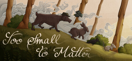
Journey of animals trying to survive a War. An emotional tale where you'll decide the fate of all who embark on this journey.

$3.994 user reviews
Choose Your Own AdventureSide ScrollerInteractive Fiction
André Antunes, Beatriz Azevedo, Diogo Pires, Gonçalo Goulão, Rita Torres, Sofia RibeiroMar 8, 2025

Too Small To Matter scores 67/100 — better than 24% of Choose Your Own Adventure capsules (n=951).

4 user reviews · $3.99 · Released Mar 8, 2025 · By André Antunes

Quick text summary

Too Small To Matter scored 67/100 on Steam Analyzer — Solid for a Choose Your Own Adventure capsule. Top priority fix: [title_readability] Enlarge the banner logo and reposition the title text to the upper portion of the capsule or increase font size significantly to remain readable at SMALL and TINY sizes.

Capsule scores by dimension

  • Genre Clarity: 7/10 — Adventure with animal protagonist. The illustrated animal characters (dog, rabbit) in a pastoral landscape immediately signal a narrative adventure game with whimsical or emotional tone. At TINY size, the silhouettes of the animals remain readable and the landscape setting is still discernible, though the specific narrative stakes (war theme) are not visually apparent without context. The art style suggests indie adventure rather than action or puzzle game.
  • Title Readability: 6/10 — Readable at full size only. The banner logo 'Too Small To Matter' is placed in the bottom-left corner with white text on a green ribbon with decorative swirls. At full header size it reads clearly with good contrast against the background. However, at SMALL size (231x87) the text becomes compressed and harder to parse, and at TINY size (120x45) the banner and text collapse into illegibility. The placement away from center helps avoid overlap with the main image but sacrifices prominence.
  • Contrast & Color: 7/10 — Good value separation with warm palette. The composition uses a warm beige and olive-green palette with distinct silhouettes for the animals and trees against the pale sky. The brown animals read clearly against the green hill at all sizes due to value contrast. At TINY size the overall composition remains coherent in grayscale, though some mid-tone details in the background clouds lose definition. The green ribbon banner has adequate contrast with the landscape but the text within it is small.
  • Uniqueness & Polish: 7/10 — Charming illustration style, light theme execution. The hand-drawn aesthetic with soft brushwork and character animation poses conveys premium indie craft and emotional storytelling. The scene composition—animals in motion across a verdant hillside with stylized trees—feels intentional and branded. However, the pastoral, whimsical tone contrasts with the stated 'war' theme, creating a slight disconnect between visual presentation and narrative context that reduces the unique hook.
  • Brand Consistency: 6/10 — Consistent art direction, limited iconic motifs. The illustration style, color palette, and character design are internally coherent and suggest a recognizable visual identity for the game. The banner logo with swirl motif provides a subtle brand marker. However, without multiple touchpoints visible in this single capsule, it is difficult to assess whether there are iconic symbols, recurring motifs, or a signature palette that would make the game instantly recognizable across marketing materials. The art is consistent but not yet distinctive enough to be a standout identity marker.
  • Composition: 7/10 — Clear hierarchy, well-balanced layout. The focal point is the moving animals on the grassy hill in the center-right, with supporting landscape elements (trees, background clouds) framing the scene naturally. The banner logo is positioned low-left, avoiding competition with the primary subject and staying within safe margins. At SMALL and TINY sizes the layout remains readable with the animals and hill still clear. The depth layering (foreground hill, midground animals, background sky) creates good visual hierarchy, though at TINY size some definition is lost in the background cloud texture.

What works

  • Charming hand-drawn aesthetic. The illustration style conveys premium indie craft with intentional brushwork and a warm, cohesive color palette that feels distinct from generic asset-based designs.
  • Strong silhouette clarity. Animal characters and landscape elements maintain readable silhouettes across all sizes due to clean value separation and careful color choices that work in grayscale.
  • Balanced composition with clear focal point. The moving animals on the hill draw the eye naturally, supported by background elements that frame without cluttering, and the banner logo avoids competing for attention.

What hurts the capsule

  • Title text illegible at TINY size. The banner logo and 'Too Small To Matter' text collapse into an unreadable blur at thumbnail (120x45) resolution, losing the game's name at the moment of discovery.
  • Visual-narrative disconnect. The whimsical, pastoral aesthetic (bright animals, soft colors, serene landscape) conflicts with the stated narrative theme of war and survival, creating tonal confusion about the game's actual emotional content.
  • Limited brand distinctive motifs. While the art direction is cohesive, there are no standout iconic symbols or signature visual markers that would make the game immediately recognizable on sight alone compared to benchmarks like DAVE THE DIVER or ANIMAL WELL.

Priority fixes

  1. [title_readability] Enlarge the banner logo and reposition the title text to the upper portion of the capsule or increase font size significantly to remain readable at SMALL and TINY sizes.
  2. [genre_clarity] Add subtle visual cues (torn landscape, muted color shift, or character expressions) that hint at the war/survival theme to align the whimsical aesthetic with the emotional narrative stakes.
  3. [uniqueness_polish] Introduce a signature visual motif or character pose that appears consistently across marketing materials to build a stronger, more distinctive brand identity.

Store copy priority fixes

  1. [hook_strength] Rewrite the short description to open with a specific, visceral image or emotional stake: e.g., 'Lead a desperate mouse and his companion away from war's destruction—your choices determine whether they find peace or perish trying.'
  2. [uniqueness] Add a sentence explicitly contrasting this game's hybrid mechanic or narrative scope: e.g., 'Unlike typical choice-driven narratives, your story decisions directly impact the river-navigation challenges you'll face.'
  3. [feature_communication] Clarify the connection between visual novel choices and river scrolling in a new sentence under or between those sections to eliminate mechanic confusion.
  4. [audience_targeting] Add a brief sentence identifying the core audience: e.g., 'Perfect for players seeking meaningful branching narratives with replayable mechanics and a touching story about survival.'

Related guides

Steam app ID: 2730010 · Tags: Choose Your Own Adventure, Side Scroller, Interactive Fiction, Visual Novel, 2D