Scoring genre clarity...
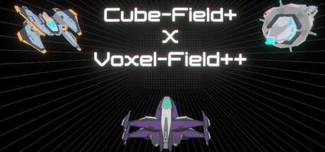
Inspired by the classic browser game. Race through a 3D field of cubes in Cube-Field+, a fast-paced endless runner with incremental mechanics. Or Fly through a Voxel field filled with enemies, powerful pickups and items. Discover new items and synergies
$2.99Positive(11)
ActionIndieAction Roguelike
Cool Birb StudioJun 12, 2025