Scoring genre clarity...
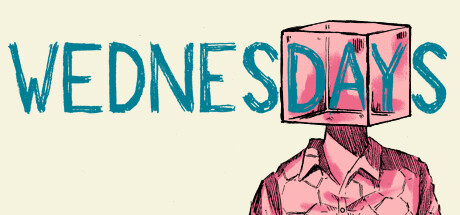
"The hardest part is not to speak up. It’s being heard." Part video game, part graphic novel, Wednesdays seeks to raise awareness about child sexual abuse through a surprisingly hope-filled story.
$9.99Very Positive(284)
Visual NovelInteractive FictionComic Book
Pierre Corbinais, The Pixel Hunt, exaheva, Christophe GalatiMar 25, 2025