Imaginytes scores 72/100 — better than 42% of Early Access capsules (n=3,067).

Quick text summary

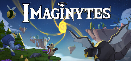
Imaginytes scored 72/100 on Steam Analyzer — Good for a Early Access capsule. Top priority fix: [composition] Move the right-side tower element slightly inward to ensure safe margin clearance and prevent accidental cropping on narrow viewports.

Capsule scores by dimension

  • Genre Clarity: 7/10 — Tower defense creatures, clear theme. The capsule communicates a fantasy creature-collection tower defense game through visible creatures (stylized fantasy beings), magical effects (yellow swirl), and tower/maze-building UI hints on the right side. At tiny size, the fantastical setting and creature focus remain readable, though the specific deckbuilder roguelite mechanics are not immediately obvious from visuals alone. The colorful, whimsical art style clearly signals casual indie adventure rather than hardcore strategy.
  • Title Readability: 8/10 — Bold serif title, strong legibility. The IMAGINYTES title uses a clean, bold serif font with white fill that contrasts sharply against the blue sky background, positioned in the upper-center area with consistent spacing. The logo remains clearly readable at small and tiny sizes due to thick letterforms and high contrast. The small UFO icon above the title adds visual interest without compromising text clarity.
  • Contrast & Color: 8/10 — Bright sky, vivid creatures pop well. The blue gradient sky provides strong value separation from white title text and vibrant creature colors (purples, yellows, greens). Foreground creatures on the left and right have distinct saturation and light values that separate them from the mid-tone background, with the yellow magical swirl acting as a focal point bright accent. At tiny size, the silhouettes remain defined and the overall composition reads clearly against Steam's dark #1b2838 background.
  • Uniqueness & Polish: 7/10 — Whimsical art style, competent execution. The capsule features hand-drawn-style creature illustrations with a charming, indie-game aesthetic that feels intentional and cohesive rather than templated. The art direction is consistent and polished, with clear lighting and character personality evident in poses and proportions. However, the composition—while pleasant—follows familiar casual indie patterns without a distinctive hook or mechanic showcase that would elevate it to premium polish.
  • Brand Consistency: 6/10 — Generic fantasy palette, no signature motif. The color palette (cool blues, warm creature tones, yellow accents) and art style are internally consistent with clear rendering throughout. However, there are no immediately iconic brand elements, recurring character designs, or memorable visual motifs visible that would distinguish Imaginytes from other casual fantasy titles. The whimsical creatures themselves lack a signature design language that would be recognizable in future marketing.
  • Composition: 7/10 — Balanced layout, clear focal areas. The composition uses left-right creature framing with the yellow swirl as a central focal point, creating natural depth and visual flow across the canvas. The title sits in the upper-safe zone, and the tower/UI element on the right provides secondary focus without overwhelming the primary creature subjects. At small and tiny sizes, the layout remains legible; however, the right-edge tower element approaches the safe margin and could risk cropping issues on narrower viewports.

What works

  • Strong title contrast and readability. White bold serif IMAGINYTES text stands out crisply against the blue sky at all sizes, including tiny, with the UFO icon adding recognizable branding.
  • Cohesive whimsical art direction. Creature designs, color palette, and lighting are polished and intentional, creating a premium indie feel that matches the casual RPG tower defense theme.
  • Effective depth and focal hierarchy. The yellow swirl naturally draws the eye to the center, while left and right creatures frame the composition with clear foreground-background layering.

What hurts the capsule

  • No signature brand identity visible. The creatures and style, while pleasant, lack distinctive visual motifs or iconic elements that would make Imaginytes immediately recognizable in future marketing.
  • Unclear core mechanic communication. While genre is clear, the deckbuilder and roguelite mechanics are not visually prominent; the capsule does not showcase what makes the tower defense unique.
  • Right-edge tower element margin risk. The UI tower on the right sits close to the safe margin and could be cropped or clipped on narrower Steam layouts.

Priority fixes

  1. [composition] Move the right-side tower element slightly inward to ensure safe margin clearance and prevent accidental cropping on narrow viewports.
  2. [uniqueness_polish] Add a subtle mechanic visual (e.g., card silhouettes, maze patterns, or creature evolution glow) to differentiate the deckbuilder tower defense from generic fantasy themes.
  3. [brand_consistency] Introduce a recurring color accent or creature design pattern that could serve as a recognizable brand signature across future promotional materials.

Store copy priority fixes

  1. [feature_communication] Restructure the detailed description with subheadings or bullet points to break up the wall of text: e.g., 'Core Mechanics,' 'Collection & Progression,' 'Synergies & Deck Crafting,' 'Unique Time System'—this will improve scannability and retention.
  2. [uniqueness] Add 2–3 sentences after the time mechanic explanation that articulate *why* the time system changes strategy differently than standard tower defense; for example, 'Unlike typical tower defense, time pressure forces you to commit to creatures early, creating risk-reward tension in every placement.'
  3. [hook_strength] Replace the closing paragraph with a player-focused call-to-action that reinforces the time mechanic or synergy discovery rather than generic 'awaken your imagination' phrasing; e.g., 'Master the clock, discover impossible synergies, and uncover the dreamscape. Each run is a new puzzle to solve.'
  4. [audience_targeting] Add a sentence early in the detailed description that explicitly addresses the intended audience, e.g., 'Perfect for players who love strategic deck crafting but want the flexibility to play at their own pace—no twitch reflexes required.'

Related guides

Steam app ID: 2749690 · Tags: Early Access, Strategy, Deckbuilding, Tower Defense, Roguelite