Scoring genre clarity...

Fine Work: Act I capsule

Fine Work: Act I

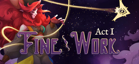
Fine Work: Act 1 is a charming fantasy fiction with dreamy characters, interwoven storylines, and breathtaking rhythmic gameplay. Meet your clientele, shape artifacts from their memories, and explore the city of Gleamhold in this unique Visual Novel X Rhythm Game fusion.

$9.99Positive(21)
Visual NovelRhythmInteractive Fiction
Tethys GamesNov 25, 2025

Fine Work: Act I scores 67/100 — better than 28% of Visual Novel capsules (n=1,147).

Positive (21 reviews) · $9.99 · Released Nov 25, 2025 · By Tethys Games

Quick text summary

Fine Work: Act I scored 67/100 on Steam Analyzer — Solid for a Visual Novel capsule. Top priority fix: [title_readability] Increase title font weight and simplify letterforms to ensure the 'FINE WORK' logo remains legible as a small, solid silhouette at 120x45 pixels; consider a bolder sans-serif or icon-based approach.

Capsule scores by dimension

  • Genre Clarity: 7/10 — Fantasy visual novel with rhythm hints. The red character silhouette, ornate gold bow, and glowing star elements clearly signal a fantasy adventure aesthetic. The purple and gold UI treatment suggests narrative-driven gameplay. However, at tiny size, the rhythm game component is not visually apparent—the capsule reads as pure fantasy adventure without clear indication of the rhythm fusion mechanic that defines the core experience.
  • Title Readability: 6/10 — Title legible at full, struggles tiny. The 'FINE WORK' title uses a bold purple outline font with gold accents that reads clearly at full header size against the dark background. At tiny size (120x45), the decorative serif letterforms collapse and become fuzzy; the 'Act I' subtitle becomes nearly illegible. The logo survives small size reasonably but loses presence and clarity at thumbnail scale.
  • Contrast & Color: 7/10 — Strong warm-cool separation works well. The red and orange character elements pop distinctly against the deep purple-to-black gradient background, with bright gold accents providing additional value separation. The silhouette of the figure maintains clear edges at small sizes due to warm-cool chromatic contrast. At tiny size, the warm focal elements still register, though fine gold detail threads become indistinct.
  • Uniqueness & Polish: 7/10 — Charming art with moderate originality. The character design is appealing and hand-crafted looking, with layered fabric folds and expressive pose that suggest personality and narrative depth. The gold ornamental elements and star motif create a whimsical premium feel. However, the composition follows familiar indie game capsule conventions—centered character with gradient background and title overlay—without a standout visual hook that immediately communicates the game's unique rhythm-visual novel fusion identity.
  • Brand Consistency: 6/10 — Cohesive but generic fantasy palette. The purple-gold-red color scheme, script title font, and ornate design language are internally consistent and create a unified fantasy aesthetic. The palette and treatment feel premium and intentional across visible elements. However, without access to the full game's UI and branding, there are no clear iconic motifs or signature visual elements that would make this capsule distinctly recognizable as 'Fine Work' versus other indie fantasy titles; the identity is competent but not memorably distinctive.
  • Composition: 7/10 — Clear hierarchy, centered focus works. The character occupies the primary focal point in the left-center area, drawing the eye immediately, while the title anchors the right side with the gold star providing a secondary accent point. The gradient background creates depth layering that separates the figure from the void. Composition remains readable at small size, though at tiny size the supporting star detail competes slightly with title clarity; margins are safe and the layout resists aggressive Steam cropping well.

What works

  • Warm-cool color contrast. Red and orange character elements pop clearly against the cool purple-black gradient, maintaining silhouette clarity even at tiny thumbnail sizes.
  • Appealing character expression. The central figure has expressive pose and hand-crafted detail that signals narrative and personality, elevating the visual above generic fantasy stock.
  • Strong value separation. The layered background gradient and illuminated title create depth that helps the composition read clearly across all viewing sizes.

What hurts the capsule

  • Title legibility at tiny size. The decorative serif 'FINE WORK' font and 'Act I' subtitle become fuzzy and difficult to parse at 120x45 pixel thumbnail scale, harming discoverability.
  • Rhythm game mechanic invisible. The capsule communicates fantasy adventure clearly but gives no visual hint of the rhythm game fusion that is core to the experience, potentially misleading genre expectations.
  • Generic indie fantasy composition. The centered character with gradient background and decorative title follows familiar conventions without a distinctive visual hook that makes this specific game memorable or unique.

Priority fixes

  1. [title_readability] Increase title font weight and simplify letterforms to ensure the 'FINE WORK' logo remains legible as a small, solid silhouette at 120x45 pixels; consider a bolder sans-serif or icon-based approach.
  2. [genre_clarity] Add a subtle visual cue indicating the rhythm game mechanic—such as musical note motifs, a rhythm indicator, or a small instrument element—to communicate the visual novel × rhythm fusion identity.
  3. [uniqueness_polish] Introduce a distinctive visual signature such as a recurring motif, icon, or color accent that becomes recognizable across marketing materials to differentiate Fine Work from other fantasy indie titles.

Store copy priority fixes

  1. [feature_communication] Expand the 'Weave the Dream' section to explicitly describe the rhythm gameplay loop: how timing inputs correspond to artifact creation, what feedback the player receives, and how musical style varies by client—e.g., 'Tap to the beat of foley-driven electronica to shape one client's memory into a music box.'
  2. [hook_strength] Strengthen the opening line of the detailed description by leading with action: 'Craft bespoke artifacts by solving rhythm puzzles drawn from your clients' memories' rather than starting with the series name and vague mood-setting.
  3. [uniqueness] Add a sentence in the short description or opening that explicitly contrasts this game against pure visual novels or pure rhythm games—e.g., 'Unlike traditional VNs, your choices shape both relationships and the artifacts you create through music.'

Related guides

Steam app ID: 2752240 · Tags: Visual Novel, Rhythm, Interactive Fiction, Romance, Life Sim