TOREROWA scores 72/100 — better than 46% of Action capsules (n=8,534).

Quick text summary

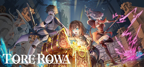
TOREROWA scored 72/100 on Steam Analyzer — Good for a Action capsule. Top priority fix: [uniqueness_polish] Add a distinctive visual hook such as a signature UI element, character pose, or thematic symbol that signals TOREROWA's unique identity and differentiates it from generic anime RPGs in the browsing feed.

Capsule scores by dimension

  • Genre Clarity: 7/10 — Action RPG party combat clear. Multiple characters with weapons and magical effects clearly communicate action RPG gameplay, and the party composition of 3-4 visible heroes directly supports the dungeon-crawling premise. At TINY size, the silhouettes and glowing spell effects still read as fantasy action combat, though specific roguelike mechanics are not visually obvious.
  • Title Readability: 8/10 — Logo readable, clean placement. The TOREROWA title uses a clean, cyan-outlined font positioned in the lower left with strong contrast against the dark background, and letterforms remain legible at SMALL and TINY sizes. The logo placement avoids character overlap and maintains clarity through intentional spacing and color choice.
  • Contrast & Color: 8/10 — Strong warm-cool separation. The composition uses warm golden-orange glows from the central character and spells contrasted against cool cyan and magenta accents, creating clear value separation against the dark #1b2838 background. Silhouettes remain distinct in grayscale, and the bright spell effects cut through the mid-tone character rendering effectively.
  • Uniqueness & Polish: 7/10 — Polished anime art, solid execution. The capsule demonstrates professional illustration with coherent character rendering, layered depth, and intentional lighting that elevates it above generic fantasy RPG templates. However, the composition and character poses follow familiar anime game conventions without a standout mechanical hook or unique visual storytelling that distinguishes it from competing action RPGs like Persona or Metaphor.
  • Brand Consistency: 6/10 — Coherent but generic anime style. The art style is internally consistent with unified character design, color palette, and rendering approach that signals a cohesive game world. Without reference to additional store assets, the visual identity reads as standard anime RPG aesthetic rather than a distinctive branded look that would be instantly recognizable as TOREROWA specifically.
  • Composition: 7/10 — Clear focal point, balanced layering. The central character with golden glow creates a strong primary focal point, supported by surrounding party members that frame without competing for attention, and the foreground-midground-background layering reads effectively. At SMALL and TINY sizes the composition collapses slightly with characters blending together, but the central glow and title positioning maintain hierarchy.

What works

  • Strong contrast against dark background. Warm golden glows and cool magenta/cyan spell effects pop clearly against #1b2838, maintaining silhouette clarity even at tiny thumbnail size.
  • Title legibility and placement. The TOREROWA logo uses clean cyan outline with intentional spacing in the lower left, readable at all viewing sizes without competing with character art.
  • Party composition communicates gameplay. Multiple characters with distinct weapons and magical effects immediately signal cooperative dungeon combat without requiring text explanation.

What hurts the capsule

  • Generic anime RPG aesthetic. The visual style follows familiar anime game conventions without a distinctive branded hook or unique visual identity that differentiates from competitors like Persona 3 Reload or Metaphor.
  • Roguelike identity not visually clear. While party combat reads well, specific roguelike mechanics such as procedural elements, progression loops, or dungeon structure are not communicated through the capsule visuals.
  • Character overlap reduces clarity at small sizes. At SMALL and TINY viewing sizes, the four-character composition creates visual density where individual silhouettes merge and become harder to parse quickly.

Priority fixes

  1. [uniqueness_polish] Add a distinctive visual hook such as a signature UI element, character pose, or thematic symbol that signals TOREROWA's unique identity and differentiates it from generic anime RPGs in the browsing feed.
  2. [composition] Reduce character density by repositioning one character further back or to the edge, creating clearer silhouette separation at SMALL and TINY thumbnail sizes while maintaining the party theme.
  3. [genre_clarity] Incorporate one subtle roguelike-specific visual cue such as a procedural grid pattern, progression indicator, or dungeon entrance silhouette to reinforce the roguelike dungeon crawler hook.

Store copy priority fixes

  1. [hook_strength] Rewrite the short description to lead with a specific hook: 'Team up with 2 friends and raid dungeons—but watch out for rival parties hunting the same treasure.' This clarifies the core tension and competitive element immediately.
  2. [uniqueness] Add a sentence differentiating the five-party simultaneous dungeon mechanic as the core feature: 'What sets TOREROWA apart is its dynamic multiplayer dungeons where you must balance cooperation with your party against the threat of rival teams.' Pitch this in the opening.
  3. [feature_communication] Expand the equipment/appraisal section with a concrete example: 'Treasures are appraised into rare equipment, materials, or gold—craft and upgrade your build between runs to tackle harder content.' This clarifies strategic progression.
  4. [audience_targeting] Clarify the intended player base early in the detailed description: 'Designed for players who love short dungeon runs (5-15 min) with friends and don't mind PvP risk' or similar, to set expectations.

Related guides

Steam app ID: 2753740 · Tags: Action, Action Roguelike, Action-Adventure, Battle Royale, Roguelike