Scoring genre clarity...

Dark Sword: The Light of Ainn capsule

Dark Sword: The Light of Ainn

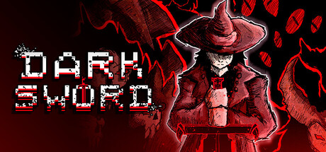
Dark Sword is a frenetic action game that mixes bullet-hell and hack-n-slash in the midst of a devastating and dark open world with a tragic backstory, where the player must immerse himself in order to defeat the powerful guardians that guard it.

$3.99Very Positive(61)
Bullet HellTop-Down ShooterHack and Slash
MrDothFeb 22, 2025

Dark Sword: The Light of Ainn scores 73/100 — better than 53% of Bullet Hell capsules (n=1,285).

Very Positive (61 reviews) · $3.99 · Released Feb 22, 2025 · By MrDoth

Quick text summary

Dark Sword: The Light of Ainn scored 73/100 on Steam Analyzer — Good for a Bullet Hell capsule. Top priority fix: [composition] Shift the character silhouette slightly left to create safe margin from right edge and improve crop resilience across Steam platform variants.

Capsule scores by dimension

  • Genre Clarity: 8/10 — Dark action RPG clearly communicated. The red-cloaked figure with wide-brimmed hat and imposing silhouette immediately signals a dark fantasy action game, reinforced by the electrical/magical aura and dramatic pose. The pixel-art style title and moody color palette align well with indie action-RPG expectations. At tiny size, the character silhouette and red color palette still read as a serious action title.
  • Title Readability: 7/10 — Readable pixel title with minor wear. The white pixelated 'DARK SWORD' text sits clearly against the dark background on the left side, using good contrast and clean letterforms typical of retro-style action games. The title holds legibility down to small size, though at tiny size the pixel breaks become slightly softer due to compression. Placement on a darker region avoids competing with the busy red background texture.
  • Contrast & Color: 8/10 — Strong red-white separation reads well. The deep red electrical effects and character costume create excellent value separation against the dark Steam background #1b2838, with white title text providing clear contrast. The white title pops decisively in grayscale, and the red-tinted figure maintains silhouette clarity even at tiny sizes. The design leverages saturated red effectively without becoming muddy or blending into background.
  • Uniqueness & Polish: 7/10 — Polished dark fantasy with style. The capsule demonstrates competent craft with intentional lighting effects (electrical aura), a distinctive character design (wide hat, long coat, gaunt face), and cohesive visual storytelling that communicates a dark, gothic tone. The execution feels professional and deliberate rather than templated, though the core concept (dark swordsman in red lighting) is a familiar trope in action games. It successfully stands out within indie action but does not reach the premium distinctiveness of top-tier AAA entries.
  • Brand Consistency: 7/10 — Consistent dark gothic visual identity. The capsule establishes a recognizable brand identity through consistent use of the red-and-dark palette, the iconic hat-and-coat silhouette, and the electrical effect motif that appears to be a signature visual element. The pixel-art title treatment matches the indie action aesthetic and could be recognized on future marketing. Without access to the six store screenshots, internal cohesion appears strong, though brand signature relies heavily on the character design rather than unique UI or symbol language.
  • Composition: 7/10 — Clear focal point, slight edge tension. The character occupies the right two-thirds of the frame as the primary focal point, with the title anchored on the left in a classic split composition. The red electrical effects and character silhouette guide attention effectively at all sizes, creating clear depth layering between background glow, character, and title. At tiny size, the composition still reads as coherent, though the character sits slightly close to the right edge, risking minor cropping on platform variations.

What works

  • Strong color-contrast hierarchy. Red and white elements pop decisively against the dark Steam background, maintaining clarity at tiny thumbnail sizes through saturation and value separation.
  • Iconic character silhouette. The wide-hatted, coated figure is distinctive and memorable, immediately signaling a dark fantasy protagonist without requiring text.
  • Coherent dark aesthetic. Electrical effects, gothic costume, and muted tone establish a unified visual identity aligned with the game's tragic, devastating world premise.
  • Readable title placement. Pixelated 'DARK SWORD' text sits on a controlled dark region with sufficient contrast, avoiding competition with busy background textures.

What hurts the capsule

  • Character sits near right edge. The figure is positioned close to the frame boundary, risking unwanted cropping on certain platform display ratios.
  • Limited unique visual hook. While well-executed, the dark-swordsman-in-red-light concept is a familiar genre trope that doesn't strongly differentiate from competitors like Lies of P or similar dark action titles.
  • Subline or tagline absence. No visible gameplay descriptor ('hack-n-slash bullet-hell' or 'open world') is communicated, relying solely on title and silhouette to convey scope.

Priority fixes

  1. [composition] Shift the character silhouette slightly left to create safe margin from right edge and improve crop resilience across Steam platform variants.
  2. [uniqueness_polish] Consider adding a subtle UI or symbol element (e.g., sword glow, aura motif) that reinforces the 'bullet-hell meets hack-n-slash' hybrid mechanic visually, not just the dark tone.
  3. [title_readability] Test pixel rendering at actual 120×45 tiny thumbnail size in Steam client to confirm no unintended blur or letterform collapse.
  4. [genre_clarity] If necessary, add minimal visual indicator of the open-world or bullet-hell elements (particle field, environmental detail) to strengthen mechanic clarity beyond silhouette alone.

Store copy priority fixes

  1. [hook_strength] Rewrite the short description opening to lead with the core moment of gameplay friction (e.g., 'Survive the inferno: bullets rain, your sword slashes, one dodge keeps you alive—face brutally difficult guardians in a dark open world'). This replaces the generic 'frenetic action game that mixes' with a visceral, specific hook.
  2. [uniqueness] Add a 1-2 sentence statement explaining the *design intent* of the bullet-hell/hack-n-slash fusion (e.g., 'The fusion forces constant micro-decisions: dodge through bullet patterns while closing gaps to slash, creating a dual-rhythm combat style no other game in the genre demands'). This transforms a genre claim into a genuine differentiator.
  3. [feature_communication] Expand each feature bullet to 2-3 sentences with concrete player impact (e.g., for Big Arsenal: 'Discover 15+ weapons and power-ups that fundamentally alter how you face each boss—a fire-sword builds attack speed but locks dodge range, forcing playstyle choices'). This replaces vague lists with decision-rich mechanics.
  4. [audience_targeting] Add a single sentence early in the detailed description that clarifies audience intent (e.g., 'Built for players who thrive on pattern-memorization and reflex-testing combat, with metroidvania progression rewards exploration and mastery'). This helps the intended player immediately recognize themselves.

Related guides

Steam app ID: 2755520 · Tags: Bullet Hell, Top-Down Shooter, Hack and Slash, Souls-like, PvE