Scoring genre clarity...

No Man's Sky capsule

No Man's Sky

No Man's Sky is a game about exploration and survival in an infinite procedurally generated universe.

$23.99Very Positive(2,623)
Open WorldSpaceOpen World Survival Craft
Hello GamesAug 12, 2016

No Man's Sky scores 75/100 — better than 71% of Open World capsules (n=1,551).

Very Positive (2,623 reviews) · $23.99 · Released Aug 12, 2016 · By Hello Games

Quick text summary

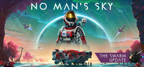
No Man's Sky scored 75/100 on Steam Analyzer — Good for a Open World capsule. Top priority fix: [title_readability] Add a stronger drop shadow or subtle dark gradient panel behind the 'NO MAN'S SKY' wordmark to improve contrast and legibility at tiny thumbnail size.

Capsule scores by dimension

  • Genre Clarity: 8/10 — Sci-fi exploration survival clear. The central astronaut suit figure, alien planet landscape with pink/red exotic flora, and spacecraft elements immediately communicate sci-fi survival exploration. At tiny size the spacesuit silhouette and alien environment still read as science fiction, though the specific survival-exploration subgenre nuance is partially lost. The flying ships in the background reinforce a space-faring adventure genre distinctly.
  • Title Readability: 7/10 — Readable at full, soft at tiny. The white serif-style title 'NO MAN'S SKY' sits at the top center against a relatively clean teal sky gradient, giving it reasonable contrast at full size. At tiny thumbnail size the letterforms begin to blur and the title becomes difficult to parse clearly, though the overall word shape is still recognizable to returning players. The 'Remnant Update' badge in the lower right is essentially unreadable below small size.
  • Contrast & Color: 7/10 — Warm alien palette pops well. The warm magenta and orange alien foliage contrasts effectively against the cool teal sky and the Steam dark background, creating strong overall silhouette separation from #1b2838. The central astronaut figure has good value separation from the midground landscape due to its lighter suit tones and the glowing circular portal element behind it. In grayscale the mid-range values of the vehicle in the foreground risk blending into the darker landscape elements, slightly reducing foreground clarity.
  • Uniqueness & Polish: 7/10 — Distinctive style, somewhat familiar layout. The composition uses No Man's Sky's recognizable aesthetic of lush alien biomes with signature magenta flora and a lone explorer, which is a strong and distinctive visual brand. However the central hero-character-in-landscape layout is a common capsule format and doesn't push creative boundaries when compared to top-tier benchmarks like Ghost of Tsushima or Black Myth: Wukong. The 'Remnant Update' badge feels like a small sticker addition rather than an integrated design element, which slightly cheapens the overall polish.
  • Brand Consistency: 9/10 — Strong recognizable NMS identity. No Man's Sky has a very well-established visual language of exotic alien biomes, lone astronaut figures, stylized spacecraft, and the signature teal-to-warm color palette, and this capsule executes all of those identity cues cohesively. The glowing circular motif behind the figure and the recognizable exosuit design are iconic brand signals that returning players will immediately associate with the franchise. Internal art direction is consistent with no conflicting visual styles, rendering a unified and confident brand presentation.
  • Composition: 7/10 — Clear hierarchy with minor clutter. The vertical hierarchy flows well from title at top, to the focal astronaut figure in center, to the large freighter ship in the lower foreground, creating a layered depth read of background, midground, and foreground. At small size the lower freighter ship competes somewhat with the astronaut as a focal point, splitting attention and reducing compositional clarity. The 'Remnant Update' badge in the lower right corner is slightly edge-hugging and at small sizes risks being cut or ignored entirely, wasting that prime real estate.

What works

  • Strong brand iconography. The lone astronaut figure, alien flora palette, and glowing circular portal are immediately recognizable No Man's Sky identity markers that reward returning players.
  • Effective color contrast against Steam background. The warm magenta alien landscape creates strong saturation contrast against Steam's #1b2838 dark background, ensuring the capsule pops during quick scroll.
  • Clear sci-fi genre signal. Spacesuit, alien biome, and visible spacecraft communicate space exploration survival genre reliably even at small viewing sizes.
  • Well-layered depth composition. Background sky, midground landscape and astronaut, and foreground freighter ship create convincing depth that gives the image a cinematic quality at full size.

What hurts the capsule

  • Title softens at tiny size. The 'NO MAN'S SKY' wordmark at the top loses crispness at 120x45 and the spacing makes individual letters hard to distinguish under blur.
  • Remnant Update badge feels unintegrated. The bottom-right update badge reads as an afterthought sticker rather than a designed element, reducing overall polish when compared to top genre benchmarks.
  • Foreground ship competes with hero figure. At small sizes the large freighter ship in the lower foreground draws equal or more attention than the astronaut figure, creating a split focal point that weakens compositional hierarchy.
  • Midtones risk blending in grayscale. The vehicle and lower landscape share similar mid-gray values in grayscale, reducing silhouette separation and clarity during the mental grayscale stress test.

Priority fixes

  1. [title_readability] Add a stronger drop shadow or subtle dark gradient panel behind the 'NO MAN'S SKY' wordmark to improve contrast and legibility at tiny thumbnail size.
  2. [composition] Reduce the visual scale or brightness of the foreground freighter ship so the central astronaut figure becomes the unambiguous single focal point at small and tiny sizes.
  3. [uniqueness_polish] Replace or redesign the 'Remnant Update' badge as an integrated design element with consistent typography and framing rather than an overlaid sticker graphic.
  4. [contrast_color] Brighten or add a subtle rim light to the astronaut suit figure to increase its value separation from the midground landscape in both color and grayscale views.

Store copy priority fixes

  1. [feature_communication] Replace the update list with 2–3 sentences explaining the core survival loop: resource gathering, environmental hazards, ship/suit upgrades, and how death mechanics create meaningful stakes. This will ground the game in actionable gameplay rather than version history.
  2. [uniqueness] Add 1–2 sentences differentiating No Man's Sky's procedural universe from competitors: e.g., 'With over 18 quintillion planets and a shared, evolving galaxy shaped by player actions, No Man's Sky offers a scale and persistence no other open-world game matches.' Anchor to concrete numbers and features.
  3. [hook_strength] Rewrite the opening line to lead with the emotional or mechanical hook rather than definition: e.g., 'Pilot your way across an infinite universe of uncharted worlds, where every discovery is unique and survival depends on the choices you make.' This moves from 'what is it' to 'why you want it.'
  4. [feature_communication] Expand the survival section to clarify core mechanics: mention specific threats (radiation, extreme temperatures, aggressive fauna), what resources players gather, and how upgrades directly improve survival odds. This answers 'what will I actually *do* to stay alive?'

Related guides

Steam app ID: 275850 · Tags: Open World, Space, Open World Survival Craft, Exploration, Sci-fi