Quick text summary
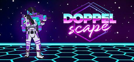
Doppelscape scored 78/100 on Steam Analyzer — Good for a Deckbuilding capsule. Top priority fix: [title_readability] Remove or enlarge the italic 'scape' tagline to maintain legibility at SMALL size, or integrate it into the main logo glyph.
Capsule scores by dimension
- Genre Clarity: 7/10 — Sci-fi mecha strategy readable. The armored mecha figure with cyan and magenta coloring immediately signals sci-fi combat, and the hex grid floor strongly implies tactical turn-based gameplay. At TINY size, the silhouette and grid remain recognizable, though the specific deckbuilder mechanic is not visually implied—the capsule reads as general strategy/tactics rather than roguelike deckbuilder specifically.
- Title Readability: 8/10 — Bold neon text stands out. The title 'DOPPELSCAPE' uses a thick, glowing cyan-to-magenta gradient with strong value contrast against the dark purple background, and the italic 'scape' tagline reinforces branding. At SMALL and TINY sizes, the main title holds legibility, though the tagline becomes difficult to parse; the core branding survives the scale test well.
- Contrast & Color: 9/10 — Vibrant neon pops clearly. Cyan and magenta neon elements create strong value separation from the dark purple star field and command immediate visual attention against #1b2838. The glowing grid floor and bright character silhouette maintain crisp edges and silhouette clarity even at TINY size, with no muddy mid-tone blending; grayscale test shows excellent light-dark differentiation.
- Uniqueness & Polish: 8/10 — Premium neon synthwave aesthetic. The retro-futuristic vaporwave/synthwave styling with neon glows and geometric shapes feels intentional and distinct from generic sci-fi capsules. The mecha pose and clear visual hierarchy communicate confidence, though the design walks a line between stylish and trendy—it reads as polished and premium without a deeply unique mechanical hook beyond the aesthetic.
- Brand Consistency: 7/10 — Cohesive neon branding established. The cyan-magenta neon palette, hexagon geometry, and mecha figure create a recognizable internal identity with coherent rendering and art direction. However, without reference to other store assets, this capsule alone establishes aesthetic consistency but lacks iconic character or motif recall cues that would guarantee recognition in future materials.
- Composition: 8/10 — Clear focal point with balance. The mecha figure anchors the left-center foreground, while the title and hexagon logo occupy the right, creating good depth layering and balanced visual weight. The title placement on a controlled background region avoids noisy texture interference, and key elements stay safely within margins; the glowing grid provides visual interest without cluttering the focal point hierarchy at any viewing size.
What works
- Neon color contrast excellence. Cyan and magenta glow create exceptional pop against dark purple, with crisp silhouettes that remain readable even at TINY size.
- Strong sci-fi deckbuilder identity. The mecha figure and hex grid floor immediately convey tactical sci-fi gameplay, establishing genre clarity without confusion.
- Balanced composition and hierarchy. The mecha, title, and hexagon logo occupy distinct regions with intentional spacing, maintaining clear focal point across all viewing sizes.
What hurts the capsule
- Tagline legibility fails at small. The italic 'scape' text becomes illegible at SMALL and TINY sizes due to decorative styling and insufficient scale.
- Generic roguelike deckbuilder signals. The visual language does not communicate the specific deckbuilding or synergy mechanic—it reads as general tactics rather than the game's core loop.
- Limited brand recall icons. While the neon aesthetic is cohesive, there are no distinctive character or motif anchors that would enable immediate recognition in future marketing.
Priority fixes
- [title_readability] Remove or enlarge the italic 'scape' tagline to maintain legibility at SMALL size, or integrate it into the main logo glyph.
- [genre_clarity] Add a subtle visual card or deck motif to the mecha's hand or environment to communicate the deckbuilder mechanic more directly.
- [brand_consistency] Establish a recurring character or symbol across future capsules to build strong brand recall tied to 'Doppelscape' identity.
Store copy priority fixes
- [uniqueness] Add 1–2 concrete examples of team synergies or cross-character combos in the Team-based strategy section (e.g., 'Character A pulls enemies into range of Character B's area damage') to show what makes team building distinctive.
- [hook_strength] Rewrite the short description to lead with a player emotion or outcome rather than comp titles (e.g., 'Trap three unique characters in a simulated world. Unlock devastating team combos, reposition enemies into traps, and escape before your synergies collapse') to create curiosity.
- [tone_match] Integrate the sci-fi simulation theme into the feature descriptions (e.g., 'discover location-based bonuses hidden in the simulation's glitched terrain' or rename 'equipment slots' to emphasize the sci-fi aesthetic) to strengthen narrative cohesion.
- [audience_targeting] Add a sentence clarifying difficulty and intended player depth (e.g., 'Perfect for roguelike veterans seeking fresh tactical puzzles' or 'Accessible to new deckbuilders but rewarding for system optimizers') to help self-select the right audience.
Related guides
Steam app ID: 2758970 · Tags: Deckbuilding, Turn-Based Tactics, Team-Based, Hex Grid, Turn-Based Combat