Scoring genre clarity...
Scoring genre clarity...
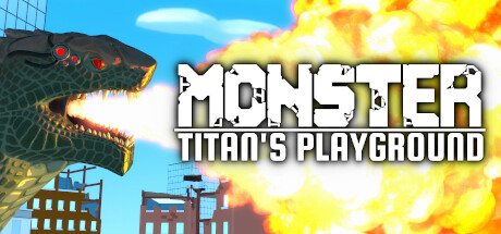
Monster: Titan's Playground scores 83/100 — better than 96% of Action capsules (n=9,073).
Very Positive (11 reviews) · $29.99 · Released Jul 24, 2025 · By Stellar Knights
Monster: Titan's Playground scored 83/100 on Steam Analyzer — Good for a Action capsule. Top priority fix: [brand_consistency] Introduce a distinctive visual trademark or signature weapon effect (e.g., a unique breath color, iconic monster scale mark, or UI element) that appears consistently across all promotional materials to build instant game recognition.
Steam app ID: 2764590 · Tags: Action, VR, Destruction, Indie, Fighting