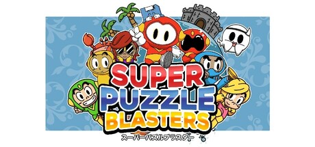
Super Puzzle Blasters scores 83/100 — better than 96% of Indie capsules (n=11,449).

Quick text summary

Super Puzzle Blasters scored 83/100 on Steam Analyzer — Good for a Indie capsule. Top priority fix: [contrast_color] Consider darkening or shifting the background hue (to teal or deeper blue-green) to increase value separation and ensure stronger pop against Steam's #1b2838 background in scroll scenarios.

Capsule scores by dimension

  • Genre Clarity: 8/10 — Bright puzzle action clearly communicated. The capsule immediately signals a casual puzzle game through colorful cartoon characters, playful visual style, and the prominent 'PUZZLE BLASTERS' text. At tiny size, the vibrant red and blue color scheme, cheerful character expressions, and action-oriented poses (characters holding weapons/tools) communicate both puzzle and action elements effectively. The castle icon in the background reinforces an adventure mode expectation.
  • Title Readability: 9/10 — Bold layered text hierarchy excellent. The three-tier title (SUPER in red, PUZZLE in blue, BLASTERS in yellow) uses strong color separation, thick outlined letterforms, and strategic stacking that remains legible at full, small, and tiny sizes. The white outlines and shadow effects ensure the text cuts through the light blue background without losing clarity. Even at tiny size, the distinctive color blocking and word arrangement are instantly recognizable.
  • Contrast & Color: 9/10 — High-saturation palette pops effectively. Bright primary colors (red, blue, yellow, orange, green) with strong value separation create excellent contrast against the light blue background and the assumed dark Steam background. The white character outlines and red title provide clear silhouettes that read well even when squinted or viewed at tiny size. Character fills use warm, saturated tones that maintain distinction from background without muddy mid-tones.
  • Uniqueness & Polish: 8/10 — Distinctive cartoon charm, cohesive style. The capsule demonstrates a polished, distinctive art direction with consistent character design, careful color grading, and intentional visual hierarchy that feels premium rather than template-based. The circular character arrangement, playful personality expressions, and integrated iconography (castle, weapons, power-ups) tell a story about multiplayer action-puzzle gameplay. The craft evident in character proportions, outlines, and layering suggests professional production values above generic casual game fare.
  • Brand Consistency: 8/10 — Recognizable character ensemble identity. The capsule establishes a strong visual identity through a distinctive cast of cartoon characters with unique silhouettes, color schemes, and expressive personalities arranged in a unified composition. The consistent use of bold outlines, warm saturation, and playful proportions across all characters creates a memorable brand signature. The red and blue title colors paired with the character ensemble would be recognizable across marketing materials.
  • Composition: 8/10 — Balanced focal hierarchy, strong arrangement. Characters are arranged in a circular/radial composition with the title positioned centrally, creating natural eye flow and preventing any single element from dominating unfairly. The background castle and decorative elements provide context without competing for attention. At small and tiny sizes, the clustered character arrangement and bold title remain the clear focal point, with supporting elements guiding rather than fragmenting attention.

What works

  • Title readability excellence. Three-tier color-blocked typography with thick outlines and shadows remains sharp and recognizable from full size down to tiny thumbnail.
  • High contrast vibrant palette. Saturated primary colors and strong value separation ensure the capsule pops against both light and dark backgrounds without muddiness.
  • Polished character design consistency. Distinctive cast with unified outline style, proportions, and expressive personalities communicates personality and production quality.
  • Clear genre and gameplay signals. Cartoon style, colorful characters, action poses, and castle backdrop immediately communicate casual puzzle-action adventure gameplay.

What hurts the capsule

  • Light blue background color choice. While readable, the light blue background does not maximize contrast potential and may struggle against Steam's dark UI in quick-scroll scenarios compared to darker or more saturated alternatives.
  • Dense character clustering. The tight circular arrangement of eight characters, while compositionally balanced, creates visual complexity that could feel slightly overwhelming at small sizes for players seeking clarity.

Priority fixes

  1. [contrast_color] Consider darkening or shifting the background hue (to teal or deeper blue-green) to increase value separation and ensure stronger pop against Steam's #1b2838 background in scroll scenarios.
  2. [composition] Test the capsule at 120x45 pixel size with Steam's actual background color to verify title and primary character focal points remain crisp without edge clipping.

Store copy priority fixes

  1. [hook_strength] Rewrite the short description to lead with the local multiplayer experience and the core mechanic: 'Guide a quirky robot through 45+ puzzle levels by placing directional tiles—then watch your solution unfold. Play solo in adventure mode or battle up to 3 friends locally in competitive multiplayer arenas.'
  2. [audience_targeting] Add an explicit sentence early in the detailed description that calls out the local couch co-op audience: 'Perfect for couch co-op fans, Super Puzzle Blasters supports up to 4 players locally with two competitive modes.'
  3. [uniqueness] Insert a clear differentiation statement after the ChuChu Rocket! reference: 'But Super Puzzle Blasters adds X [concrete mechanic], giving you puzzle-solving depth with arcade-style multiplayer chaos.'
  4. [tone_match] Rewrite the CONTROL OPTIONS section to match the charming voice: 'We've got you covered, whether you're team Xbox, PlayStation, or Nintendo—just hit LT/L2 at the title screen to swap button icons and tile colors to match your favorite controller.'

Related guides

Steam app ID: 2765140 · Tags: Indie, Cute, Logic, Puzzle, Sokoban