Scoring genre clarity...
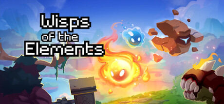
Guide Air, Fire, Stone, and Water through a grid-based rogue-lite, in which every spell can have a huge impact. Your enemies are smart enough to anticipate your moves and exploit their own synergies - can your tactics turn the tide?
$5.99
Turn-Based TacticsDifficultTactical RPG
Benoît KoOct 24, 2025