Scoring genre clarity...
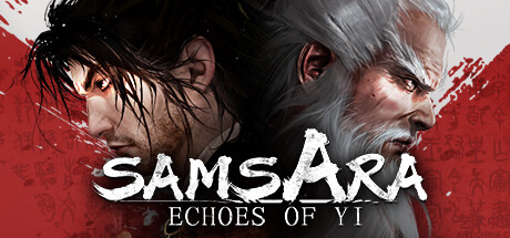
ECHOES of YI: SAMSARA is a dark martial arts action game infused with traditional Chinese culture. Players embody the Sword Saint's first disciple, battling fierce enemies and unraveling the mystery beneath the Jianmu Tree. Will you face the challenges or go with the flow? The choice is yours.
$19.99Mixed(15)
Action-AdventureRPGSouls-like
RunmengApr 17, 2025