Scoring genre clarity...

Grid Warriors: Battles capsule

Grid Warriors: Battles

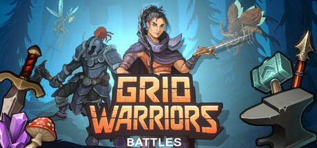
Roguelike auto-battler where you manage a shared grid inventory, equip heroes, and forge uniquely shaped gear. Adapt your loadout to maximize bonuses, explore diverse modes—including friend challenges—and face evolving, handcrafted enemies in auto-combat.

$9.993 user reviews
Auto BattlerAsynchronous MultiplayerPvP
JunjoNov 17, 2025

Grid Warriors: Battles scores 70/100 — better than 28% of Auto Battler capsules (n=469).

3 user reviews · $9.99 · Released Nov 17, 2025 · By Junjo

Quick text summary

Grid Warriors: Battles scored 70/100 on Steam Analyzer — Good for a Auto Battler capsule. Top priority fix: [uniqueness_polish] Add a subtle grid pattern overlay or icon element that hints at the grid inventory mechanic—this immediately differentiates the capsule from generic fantasy peers and communicates the core unique selling point.

Capsule scores by dimension

  • Genre Clarity: 7/10 — Strategy RPG with character focus. The capsule clearly communicates a fantasy strategy game through multiple armed fantasy characters in action poses, magical effects (purple crystals, glowing auras), and equipment-focused visuals. At TINY size, the silhouettes of distinct heroes and their gear remain readable, though the auto-battler / roguelike grid-based mechanic is not visually evident from the characters alone. The presence of multiple heroes and varied equipment suggests team-based strategy gameplay.
  • Title Readability: 8/10 — Bold orange title with excellent contrast. The title 'GRID WARRIORS' in large, bold orange caps sits prominently in the center-right of the composition with strong value separation against the blue background. The secondary text 'BATTLES' in white below maintains excellent legibility at all sizes including TINY. The sans-serif letterforms are sturdy and do not collapse at small sizes; the outline and weight support quick recognition even at 120x45 resolution.
  • Contrast & Color: 8/10 — Warm orange pops against cool blue. The orange title and warm-toned hero equipment (copper, brass details) create strong luminance separation from the cool blue gradient background, meeting Steam dark theme requirements effectively. Character silhouettes are well-lit with distinct edges; the purple crystals and golden armor details add secondary contrast without muddying the primary focal area. In grayscale, the value hierarchy remains clear and readable at small sizes.
  • Uniqueness & Polish: 6/10 — Competent but familiar fantasy execution. The capsule presents professional character art with clean fantasy aesthetics—multiple heroes with distinct silhouettes and colorful equipment—but the visual approach closely follows indie fantasy game conventions seen in peers like Hades and Chants of Sennaar. The composition and lighting are well-executed but do not communicate the distinctive grid inventory or roguelike adaption mechanics that differentiate Grid Warriors; it reads as a generic tactical fantasy lineup rather than emphasizing the unique grid-based gear management hook.
  • Brand Consistency: 6/10 — Consistent art style without iconic motif. The capsule demonstrates coherent character design, consistent rendering quality, and a unified warm-orange/cool-blue palette that should carry across the 11 store screenshots. However, there is no signature visual motif, iconic character, or memorable brand symbol that would make this capsule instantly recognizable as Grid Warriors on a second viewing. The art direction is solid but generic within the strategy RPG space.
  • Composition: 7/10 — Balanced arrangement with clear focal point. The composition uses a horizontal hero lineup with the central character slightly elevated and largest, creating a natural eye-path and primary focal point that reads well at SMALL size. The title anchors the right-center area and does not compete with character silhouettes. At TINY size, the arrangement compresses acceptably and the primary hero silhouette remains distinct. Minor concern: the far-left and far-right characters edge toward screen margins, risking crop in certain Steam layouts.

What works

  • Orange title contrast and legibility. The bold orange 'GRID WARRIORS' text maintains excellent readability from full header down to 120x45 thumbnail size with clean sans-serif letterforms and strong value separation from the blue background.
  • Multi-hero character clarity. Five distinct heroes with varied silhouettes and equipment colors are recognizable even at tiny size, quickly communicating a team-based strategy gameplay focus.
  • Professional lighting and rendering. Character art is polished with consistent lighting, golden and copper accents, and magical glow effects that feel premium and intentional rather than rushed or asset-store generic.

What hurts the capsule

  • Generic fantasy theme without mechanic clarity. The capsule does not visually communicate the core unique hook—grid-based inventory management, roguelike progression, or adaptive gear forging—making it indistinguishable from dozens of fantasy strategy games in the genre.
  • No iconic brand motif or symbol. The capsule lacks a memorable character, logo, or visual signature that would allow players to recognize Grid Warriors later; the visual identity is competent but fully replaceable.
  • Edge characters risk Steam layout cropping. The far-left fighter and far-right staff-wielder sit close to horizontal margins and may be partially clipped depending on Steam's dynamic capsule crop or display context.

Priority fixes

  1. [uniqueness_polish] Add a subtle grid pattern overlay or icon element that hints at the grid inventory mechanic—this immediately differentiates the capsule from generic fantasy peers and communicates the core unique selling point.
  2. [composition] Tighten the hero lineup inward to add safe margin buffer on left and right edges, reducing crop risk while improving perceived density and polish.
  3. [genre_clarity] Introduce a small UI/HUD element or grid-based equipment highlight in the foreground that makes the auto-battler roguelike inventory management visually explicit even at tiny size.

Store copy priority fixes

  1. [hook_strength] Rewrite the opening line of the detailed description to lead with the core tension: 'Arrange Tetris-shaped gear on your party's shared grid to unlock hero bonuses, then watch your auto-battlers execute your strategy' rather than the motivational framing.
  2. [feature_communication] Add 1-2 sentences explaining roguelike meta-progression: what persists between runs (unlocks, hero roster, forge upgrades) vs. what resets, and how this impacts replayability.
  3. [audience_targeting] Insert a brief accessibility statement such as 'Perfect for tactical puzzle lovers and strategy veterans' or 'Approachable for newcomers to auto-battlers' to signal the intended skill floor clearly.

Related guides

Steam app ID: 2783460 · Tags: Auto Battler, Asynchronous Multiplayer, PvP, Strategy, Roguelike