Scoring genre clarity...

Mortal Fight: Lethal Revenge capsule

Mortal Fight: Lethal Revenge

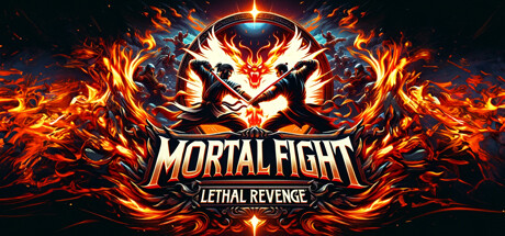
Mortal Fight: Lethal Revenge offers an unforgettable fighting game experience. This epic adventure is filled with a rich story, epic boss battles, and three selectable main characters.

$7.99
Beat 'em upHack and Slash3D Fighter
Kanuni Games OYUN YAZILIM VE PAZARLAMA Ticaret Limited SirketiJun 25, 2025

Mortal Fight: Lethal Revenge scores 78/100 — better than 85% of Beat 'em up capsules (n=392).

$7.99 · Released Jun 25, 2025 · By Kanuni Games OYUN YAZILIM VE PAZARLAMA Ticaret Limited Sirketi

Quick text summary

Mortal Fight: Lethal Revenge scored 78/100 on Steam Analyzer — Good for a Beat 'em up capsule. Top priority fix: [brand_consistency] Introduce a signature visual element—character emblem, distinctive color accent, or unique symbol—that appears consistently across store assets to build recognition

Capsule scores by dimension

  • Genre Clarity: 9/10 — Fighting game instantly recognizable. The dual-wielding martial artist silhouette with crossed weapons, fiery phoenix-like creature overhead, and aggressive combat pose unmistakably signal a fighting game at all sizes. Even at TINY size, the iconic weapon crossing and flame motifs are instantly parseable as action combat. The visual language is pure fighting game—no ambiguity about genre.
  • Title Readability: 8/10 — Strong title with solid contrast. MORTAL FIGHT reads clearly in bold sans-serif with a clean white outline and fire-orange glow effect against the dark background. The tagline LETHAL REVENGE sits cleanly below in smaller text. At TINY size the main title remains legible due to thick letterforms and high contrast; the tagline becomes harder to parse but the primary title survives the reduction well.
  • Contrast & Color: 9/10 — Excellent value and saturation separation. Bright orange and yellow flames pop dramatically against the dark #1b2838 background, while the light cream character silhouette provides strong luminosity separation. The red-eyed creature and white title create clear focal points. In grayscale, the design maintains excellent contrast—flames read as light midtones and the background as deep shadow, ensuring silhouette clarity even at TINY size.
  • Uniqueness & Polish: 7/10 — Polished but genre-conventional approach. The execution is clean with intentional flame effects, glowing text treatment, and a well-rendered central character. However, the design relies heavily on familiar fighting game iconography—fiery backgrounds and martial artist pose are well-trodden territory in action game marketing. The craft is solid and professional, but the visual hook does not clearly differentiate this indie title from blockbuster fighting game marketing.
  • Brand Consistency: 6/10 — Competent but generic fighting aesthetic. The capsule uses consistent rendering of flames, a singular color palette (orange, red, dark blue, white), and coherent art direction. However, there are no signature character details, distinctive motifs, or memorable brand symbols visible that would make this specifically recognizable as Mortal Fight versus other fighting titles. The visual identity is functional but not distinctly memorable.
  • Composition: 8/10 — Clear hierarchy with effective focal point. The phoenix-headed creature dominates the top-center with the dual-wielding fighter below, creating a clear visual pyramid that guides the eye downward to the title. Title placement in the lower-center is safe from edge crop hazard. At SMALL and TINY sizes, the composition remains readable with the creature and character forming one cohesive focal mass and the title anchoring the base. Flame elements frame the composition without creating scattered attention.

What works

  • Instant genre recognition. The crossed weapons, martial artist stance, and fiery Phoenix creature immediately communicate fighting game without ambiguity.
  • Bold, readable title treatment. White text with orange glow and thick sans-serif letterforms remain legible even when scaled down to TINY thumbnail size.
  • Excellent contrast against dark Steam background. Bright flames and light character silhouettes pop cleanly against #1b2838, ensuring visibility in quick scroll and low-attention browsing.
  • Balanced composition with safe margins. Critical elements (creature, character, title) are centered and well-protected from edge cropping across all viewport sizes.

What hurts the capsule

  • Generic fighting game visual language. Fiery backgrounds, martial artists, and phoenix motifs are heavily used across AAA and indie fighting titles, making the capsule feel derivative rather than distinctive.
  • Limited brand identity differentiation. No memorable character traits, signature color palette, or visual motifs that would make this capsule recognizable as uniquely Mortal Fight if the title were removed.
  • Tagline loses clarity at small scale. LETHAL REVENGE becomes difficult to parse at TINY size due to reduced point size, relying solely on the main title for genre signaling.

Priority fixes

  1. [brand_consistency] Introduce a signature visual element—character emblem, distinctive color accent, or unique symbol—that appears consistently across store assets to build recognition
  2. [uniqueness_polish] Add a specific gameplay hook visual cue (e.g., unique weapon design, character silhouette detail, or mechanical indicator) that differentiates this from generic fighting game marketing
  3. [title_readability] Increase tagline font size or integrate it into the title treatment to ensure LETHAL REVENGE remains readable at SMALL capsule size without sacrificing hierarchy

Store copy priority fixes

  1. [hook_strength] Rewrite the opening to lead with a specific, action-verb-driven hook: 'Battle a criminal syndicate with two friends in this co-op beat 'em up. Choose between three martial artists with distinct fighting styles and uncover the conspiracy behind your mentor's death.'
  2. [feature_communication] Add a dedicated paragraph explaining core combat mechanics: attack types, defensive options, character progression, and what makes each character's playstyle distinct. Include a sentence on platforming and level design.
  3. [uniqueness] Replace vague claims with concrete differentiation: specify what makes the boss encounters tactically different (e.g., exploit elemental weaknesses, use co-op combos, environmental hazards) or what visual/art style sets it apart visually.
  4. [tone_match] Remove or reduce overwrought language ('epic,' 'colossal,' 'unforgettable,' 'poignancy unmatched'). Adopt a more grounded, confident indie tone that lets gameplay and story speak for themselves rather than overselling.

Related guides

Steam app ID: 2791800 · Tags: Beat 'em up, Hack and Slash, 3D Fighter, Boxing, Co-op Campaign