Scoring genre clarity...
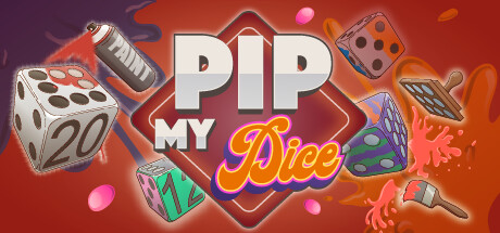
Pip My Dice is a Yahtzee Roguelike experience. Score enough to make it to the next level, customize your dice to score more and collect relics to create unlimited combos! Collect money through the rounds to buy new dice, relics, and customizers to upgrade your dice. Enjoy a different run every time!
$10.99Very Positive(134)
StrategyRoguelike DeckbuilderReplay Value
Diving Swan GamesJul 25, 2025