Scoring genre clarity...
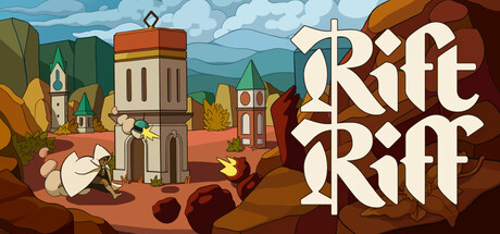
Rift Riff capsule

Rift Riff

Jump a rift, fight off monsters, plunder their world. A strategic mix of juicy tower loadouts, varied monster behaviors, and forgiving mechanics.

$12.99Very Positive(350)
Tower DefenseMinimalistStrategy
Adriaan de Jongh, Sim Kaart, Matthijs Koster, Franz LaZerte, Professional PandaMay 9, 2025

Rift Riff scores 72/100 — better than 51% of Tower Defense capsules (n=685).

Very Positive (350 reviews) · $12.99 · Released May 9, 2025 · By Adriaan de Jongh

Quick text summary

Rift Riff scored 72/100 on Steam Analyzer — Good for a Tower Defense capsule. Top priority fix: [genre_clarity] Add subtle UI elements (tower icons, resource indicators, or strategic overlay hints) to the scene to communicate the 'tower loadout' and strategic layer more visually at small size.

Capsule scores by dimension

  • Genre Clarity: 7/10 — Clear fantasy action, strategy messaging. The medieval fantasy setting with towers, monsters, and combat-ready environment immediately signals action-strategy gameplay. At full size, the tower defense-like architecture and monster silhouettes communicate the core loop. At tiny size, the recognizable castle and colorful scene still read as a fantasy action game, though specific strategy elements become less distinct.
  • Title Readability: 8/10 — Bold, readable, excellent tiny performance. The 'RIFT RIFF' wordmark uses a strong, decorative serif font with excellent contrast against the cream background on the right side of the capsule. The logo remains legible at small size due to thick letterforms and high value separation. At tiny size, the repetition and distinctive shape of the stacked text maintains recognition despite size reduction.
  • Contrast & Color: 8/10 — Strong value separation, vibrant palette. The cream-colored title contrasts sharply against the dark brown earth and building shadows, creating clear silhouettes. Warm oranges, reds, and greens in the scene pop against the blue sky and dark background. The color palette maintains separation across grayscale, with bright sky, mid-tone buildings, and dark foreground elements creating visual depth that survives tiny size viewing.
  • Uniqueness & Polish: 7/10 — Polished illustration with genre identity. The hand-drawn, storybook-like art style differentiates it from photorealistic action competitors and creates a distinctive premium craft feel. The whimsical tower design, character pose on the left, and colorful scene composition signal a unique tone within the action-strategy space. However, the overall composition feels somewhat illustrative rather than revealing a specific unique mechanic or selling point that stands out versus the 'varied monster behaviors' promise.
  • Brand Consistency: 6/10 — Consistent art style, limited identity hooks. The illustration style is cohesive with a unified color palette and consistent hand-drawn rendering throughout the scene. The decorative serif wordmark feels intentional and branded. However, without reference to the 14 additional screenshots, the visual identity lacks a immediately recognizable icon, signature character, or memorable motif that would anchor brand recall versus other indie action titles.
  • Composition: 7/10 — Balanced layout, clear focal points. The capsule uses effective depth layering with background sky, mid-ground buildings, and foreground character, creating a clear hierarchy. The title placement on the right balances the character and tower weight on the left. At small size, the central tower and character silhouettes remain the primary focal point. Safe margins are respected, though the left edge character is close to the edge and could risk crop issues on some platforms.

What works

  • Title legibility at small sizes. The thick serif 'RIFT RIFF' wordmark with cream coloring maintains strong readability even when scaled down, supporting quick recognition during scroll.
  • Color-driven appeal and contrast. Warm oranges, reds, and greens pop distinctly against the dark Steam background and blue sky, creating visual interest without muddiness.
  • Cohesive illustrative craft. The hand-drawn storybook aesthetic feels intentional and polished, differentiating the title from photorealistic action competitors in the genre.
  • Depth and layering structure. Clear background-to-foreground progression with sky, architecture, and character creates visual hierarchy that survives scaling.

What hurts the capsule

  • Unclear gameplay hook at tiny size. While the scene reads as fantasy action, the strategic tower-loading mechanic and specific game loop are not visually communicated, reducing instant understanding of 'what makes this different'.
  • Generic fantasy setting without signature icon. The castle, character, and monster elements feel well-executed but lack a memorable brand motif or unique visual identifier that would enable instant recognition in a crowded store.
  • Left edge character positioning risk. The character on the left sits close to the edge and could be cropped or cut off depending on Steam's dynamic cropping behavior on smaller viewport widths.

Priority fixes

  1. [genre_clarity] Add subtle UI elements (tower icons, resource indicators, or strategic overlay hints) to the scene to communicate the 'tower loadout' and strategic layer more visually at small size.
  2. [brand_consistency] Introduce a distinctive visual motif or icon (e.g., a signature tower design, unique monster mark, or character emblem) that could serve as a visual anchor for repeat brand recognition across marketing materials.
  3. [composition] Reposition or add subtle framing to protect the left-edge character from potential crop, or shift the primary focal point more toward center-right to ensure critical elements survive standard Steam viewport variations.

Store copy priority fixes

  1. [feature_communication] In the Strategic section, explicitly define juice early: 'You start each wave with juice (your building currency), which you spend to place and upgrade towers on fixed map positions.'
  2. [uniqueness] Strengthen the forgiving differentiator by adding a sentence after the Forgiving header: 'This focus on second chances is rare in tower defense and makes Rift Riff accessible to players who typically avoid the genre's punishing difficulty spikes.'
  3. [feature_communication] Clarify the Extractor failure mechanic: change 'Lost your Extractor? Only redo the last wave.' to 'Lose your Extractor and you simply retry that wave—no full scenario reset.'
  4. [feature_communication] Expand the Strategic section to briefly explain what varies between the 25 monster types: 'Monster types differ in attack patterns, speed, and special behaviors—learning to counter each keeps waves fresh and challenging throughout the 20 worlds.'

Related guides

Steam app ID: 2800900 · Tags: Tower Defense, Minimalist, Strategy, Base Building, PvE