Scoring genre clarity...
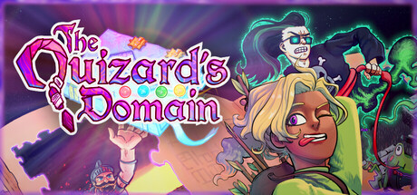
The Quizard's Domain capsule

The Quizard's Domain

Knowing is only half the battle! Pub quiz meets pub brawl in this fast-paced hero-based BATTLE QUIZ for 1-4 players! Knock out friends and foes as you smash your way to the correct answers, in a wide variety of arenas and game modes. Trivia night just got way more intense!

MultiplayerLocal MultiplayerAction
Calm Pewter GamesComing soon

The Quizard's Domain scores 73/100 — better than 49% of Multiplayer capsules (n=3,009).

Released Coming soon · By Calm Pewter Games

Quick text summary

The Quizard's Domain scored 73/100 on Steam Analyzer — Good for a Multiplayer capsule. Top priority fix: [genre_clarity] Integrate a quiz-specific visual cue (e.g., glowing question mark, thought bubble, or answer-choice interface element) into the composition to communicate the trivia mechanic and differentiate from generic party brawlers.

Capsule scores by dimension

  • Genre Clarity: 7/10 — Party action with quiz twist clear. The vibrant cartoon art style and multiple colorful characters in action poses immediately signal a casual, multiplayer-focused game. The chaotic energy and diverse character designs suggest party gameplay, though the quiz mechanic is not visually obvious at first glance. At tiny size, the bright colors and character variety read as 'fun multiplayer game' but the battle-quiz hybrid concept requires prior knowledge to fully understand.
  • Title Readability: 8/10 — Bold title with strong outline contrast. The title 'The Quizard's Domain' uses a thick magenta/pink outline with white fill that stands out well against the multicolored background. The letterforms remain readable at small size due to the bold weight and outline strategy, though the decorative style has moderate complexity. At tiny size the text maintains legibility, though fine serifs and decorative elements blur slightly.
  • Contrast & Color: 8/10 — Vibrant palette with strong value separation. The design uses a rich mix of saturated colors—magenta title, teal/cyan accents, warm yellows, and lime greens—that all contrast well against darker purple/teal background tones. Character silhouettes are bright and clearly separated from background elements, creating strong visual pop even at reduced sizes. The grayscale squint test shows adequate value separation between foreground characters and background, though some mid-tone areas compress slightly.
  • Uniqueness & Polish: 7/10 — Distinctive cartoon style, somewhat generic premise. The art direction is cohesive and playful with a consistent cartoon aesthetic across all visible characters, showing solid craft and intentional style choices. However, the 'colorful characters on gradient background' composition is a familiar template for indie party games, lacking a truly distinctive visual hook or mechanic representation. The execution is polished and appealing, but the concept does not immediately communicate what makes the quiz-battle hybrid unique.
  • Brand Consistency: 7/10 — Consistent character design, recognizable style. The cartoon art style is internally consistent across all visible characters, with matching color saturation, exaggerated proportions, and expressive features that feel like a cohesive cast. The warm/cool color palette (magenta, teal, yellow, green) appears deliberate and repeated, supporting brand recognition potential. Without access to store screenshots, the identity feels solid but somewhat reliant on generic party-game visual language rather than iconic, signature elements.
  • Composition: 7/10 — Layered character arrangement with clear hierarchy. The composition uses depth effectively: darker background zone, mid-tone supporting characters on the right, and a prominent foreground character (blonde woman) in lower left with clear focus. The title placement in upper left avoids key character areas and maintains safe margins from edges. At tiny size, the primary character remains the focal point, though the cluster of supporting characters on the right edge risks appearing muddy and may be partially cropped on some Steam display contexts.

What works

  • Bold, readable title treatment. The magenta outline and white fill create strong contrast that survives at small sizes without losing letterform clarity.
  • Vibrant, cohesive color palette. Saturated colors (magenta, teal, yellow, green) all pop against dark Steam background and maintain value separation in grayscale.
  • Polished cartoon art style. Consistent character design and expressive faces signal quality craft and create an appealing, professional presentation.
  • Clear focal point hierarchy. The foreground blonde character anchors attention while supporting cast guides secondary interest without competing equally.

What hurts the capsule

  • Quiz mechanic not visually communicated. The capsule reads as generic party action game with no visual cues that distinguish the quiz-battle hybrid concept from standard brawlers.
  • Crowded supporting cast on right edge. Multiple background characters cluster densely and approach the edge, risking confusion at tiny size and potential Steam cropping issues.
  • Generic party game template composition. The layout of colorful characters on gradient background is a familiar indie party game formula without distinctive spatial or visual innovation.
  • Limited icon or symbol identity. No recognizable logo, mascot, or signature visual motif that would enable instant brand recall on repeat viewing.

Priority fixes

  1. [genre_clarity] Integrate a quiz-specific visual cue (e.g., glowing question mark, thought bubble, or answer-choice interface element) into the composition to communicate the trivia mechanic and differentiate from generic party brawlers.
  2. [composition] Reduce crowding on the right edge by repositioning or removing 1-2 background characters to improve clarity at tiny size and reduce Steam crop risk.
  3. [uniqueness_polish] Add a distinctive symbol, UI accent, or visual mechanic representation (not just character lineup) to signal the unique battle-quiz hook and increase premium perception.
  4. [brand_consistency] Establish or emphasize an iconic character, mascot, or visual motif that can become a recognizable identity signal across future marketing and related materials.

Store copy priority fixes

  1. [feature_communication] Add 1-2 sentences describing the types of quiz questions or mechanics (multiple choice, fill-in-the-blank, etc.) and how they interact with combat timing and arena navigation.
  2. [hook_strength] Move or condense the Roger Ribbit announcement to a dedicated 'News' or 'Latest Update' section above the main description, and restore the 'About the Game' section as the immediate second read to preserve narrative flow for new players.
  3. [uniqueness] Include a specific statement about what makes this game distinct from other party games or trivia hybrids—e.g., 'the only quiz game where your physical positioning determines your answer priority' or similar concrete differentiator.
  4. [feature_communication] Add 1-2 concrete examples of arena designs and explain how they affect gameplay strategy (e.g., 'narrow bridges reward combat skill over pure speed' or 'lava zones penalize hesitation').

Related guides

Steam app ID: 2802490 · Tags: Multiplayer, Local Multiplayer, Action, Casual, Co-op