Scoring genre clarity...
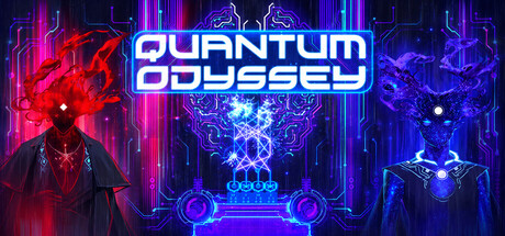
Quantum Odyssey capsule

Quantum Odyssey

See the logic all of us obey. Design, optimize, and reverse-engineer real quantum algorithms in an open-ended Zachlike simulator. Solve 500+ visual puzzles and hack other players’ creations. No coding or physics background required.

$12.59Very Positive(147)
Early AccessHardwareProgramming
Quarks InteractiveJan 29, 2025

Quantum Odyssey scores 75/100 — better than 67% of Early Access capsules (n=3,646).

Very Positive (147 reviews) · $12.59 · Released Jan 29, 2025 · By Quarks Interactive

Quick text summary

Quantum Odyssey scored 75/100 on Steam Analyzer — Good for a Early Access capsule. Top priority fix: [genre_clarity] Integrate a visual hint of the core quantum/puzzle mechanic—such as a stylized qubit symbol, circuit node hierarchy, or algorithmic flow diagram—to clarify the specific gameplay angle beyond generic tech-puzzle.

Capsule scores by dimension

  • Genre Clarity: 7/10 — Tech sci-fi puzzle game clear. The neon circuit board aesthetic with glowing cyan and magenta elements immediately signals a tech-focused, futuristic game. The geometric patterns and tech UI hints suggest a puzzle or simulation game rather than action or narrative-driven title. At tiny size, the electric visual language reads as sci-fi tech, though the specific 'quantum algorithm' angle is not obvious from iconography alone—it reads as generic tech-puzzle rather than distinctly quantum-focused gameplay.
  • Title Readability: 9/10 — Bold neon title excellent clarity. The all-caps white neon text 'QUANTUM ODYSSEY' uses a clean, geometric sans-serif with strong luminous outline effect that ensures legibility at all sizes. The letterforms maintain perfect clarity at full, small, and tiny sizes due to high contrast white-on-dark and consistent stroke weight. The title placement centered on a controlled dark background free of competing visual noise is strategic and highly readable even under quick scroll and squint tests.
  • Contrast & Color: 8/10 — Vibrant neon separation strong. Bright cyan and magenta neon elements create excellent value separation against the dark blue-purple background (#1b2838 approximation), with the white title providing maximum contrast. The glowing effect around circuit elements and text reinforces silhouette clarity and pops distinctly in grayscale. At tiny size, the bright neon core remains separated from the background, though some fine glow detail softens at extreme reduction.
  • Uniqueness & Polish: 7/10 — Polished neon tech aesthetic. The capsule demonstrates high craft quality with consistent neon glow effects, clean circuit board geometry, and intentional color grading that feels premium and purposeful. The visual execution is cohesive and distinct from generic tech-puzzle themes, though neon sci-fi aesthetics are common in indie gaming; the polish elevates it above template-level work. The quantum algorithm gameplay hook is not visually communicated in the capsule itself—it relies on title alone, missing an opportunity for unique visual storytelling.
  • Brand Consistency: 6/10 — Consistent neon style unclear identity. The capsule presents a coherent internal neon tech aesthetic with consistent cyan-magenta palette and circuit board motifs that would be recognizable as 'Quantum Odyssey' style across promotional materials. However, without reference to the 11 screenshots, the visual identity does not yet feel iconic or distinctly memorable—it is well-executed neon but could apply to multiple sci-fi puzzle games. The neon style is consistent but does not yet communicate a signature brand hook or unique character/symbol recall cue.
  • Composition: 8/10 — Centered title strong focal point. The white title commands the center with clear primary hierarchy, while symmetrical neon circuit elements frame it without competing for attention. The layered background (dark base, mid-tone circuit lines, bright neon accents) creates effective depth and guides the eye naturally to the title. The composition holds together well at small and tiny sizes with no critical elements lost to cropping, though the symmetry means the capsule reads well at any crop point.

What works

  • Exceptional title legibility. Bright white neon letterforms with clean outlines maintain perfect readability from full size to tiny thumbnail, ensuring the game name is instantly recognized at all viewing scales.
  • Strong contrast and visual pop. Cyan and magenta neon elements create vivid separation against the dark background, ensuring the capsule stands out in Steam browse lists and remains clear even under grayscale conversion.
  • Polished neon craft and coherence. Consistent glow effects, clean geometric patterns, and intentional color grading demonstrate premium execution that feels deliberate and elevated above generic asset-based work.
  • Stable composition across sizes. Centered hierarchy and balanced framing mean the capsule reads clearly at full, small, and tiny sizes without critical information loss or awkward cropping issues.

What hurts the capsule

  • Generic tech-puzzle aesthetics. Neon circuit board design, while polished, does not uniquely communicate 'quantum algorithm puzzle game'—the visual language applies to many sci-fi tech games and misses the core gameplay hook.
  • No gameplay mechanic visual hint. The capsule shows tech aesthetic but provides no visual cue about optimization, hacking, or puzzle-solving—viewers must rely entirely on the title to understand what makes this game distinct.
  • Missing iconic brand identity cue. No memorable character, symbol, or signature visual motif that would make this capsule instantly recognizable as 'Quantum Odyssey' if the title were removed or blurred.

Priority fixes

  1. [genre_clarity] Integrate a visual hint of the core quantum/puzzle mechanic—such as a stylized qubit symbol, circuit node hierarchy, or algorithmic flow diagram—to clarify the specific gameplay angle beyond generic tech-puzzle.
  2. [uniqueness_polish] Add a subtle but distinctive visual anchor or character element (e.g., a mascot, iconic device, or signature symbol) that becomes synonymous with the Quantum Odyssey brand and differentiates it from other neon sci-fi games.
  3. [brand_consistency] Ensure any new elements align with the neon aesthetic and appear consistently across store screenshots and promotional materials to build a stronger, more recognizable visual identity.

Store copy priority fixes

  1. [hook_strength] After the short description, add one sentence that emphasizes the fun and addictive gameplay (e.g., 'Master quantum phenomena through hundreds of ingenious puzzles that reward creativity and lateral thinking') to hook players on experience, not just mission.
  2. [feature_communication] Add a brief sentence or callout early in the detailed description that quantifies the progression pace (e.g., 'Progress from guiding single qubits to orchestrating multi-algorithm systems over 100+ hours of handcrafted content') to help players gauge time investment.
  3. [uniqueness] Strengthen the differentiator by adding a one-sentence comparison or unique claim (e.g., 'Unlike quantum textbooks or online courses, this game is the only sandbox where you design and test real algorithms used by quantum researchers today') to make the competitive advantage crystal clear.
  4. [tone_match] Remove or reframe the no-AI statement to be briefer and more positive (e.g., 'Crafted entirely by hand by the quantum researchers who pioneered this field') to focus on human expertise rather than what was avoided.

Related guides

Steam app ID: 2802710 · Tags: Early Access, Hardware, Programming, Logic, Puzzle