Kind Heart Survivors scores 73/100 — better than 61% of Exploration capsules (n=4,872).

Quick text summary

Kind Heart Survivors scored 73/100 on Steam Analyzer — Good for a Exploration capsule. Top priority fix: [composition] Shift the right-side character slightly inward or increase right margin buffer to ensure no cropping on mobile/narrow Steam displays

Capsule scores by dimension

  • Genre Clarity: 7/10 — Survival adventure clear at small size. The crashed spacecraft on the left and alien flora establish a survival/exploration setting immediately. The colorful, whimsical art style and friendly character designs (visible left and right edges) signal an accessible indie adventure rather than hardcore survival. At tiny size, the crashed ship silhouette and bright alien environment still read as exploration-focused, though the survival emphasis is less prominent than the cheerful aesthetic.
  • Title Readability: 8/10 — Bold yellow title with solid contrast. The title 'Kind Heart SURVIVORS' uses a bright yellow-orange banner with dark brown/black text that creates excellent contrast against the teal-green background. The text remains readable at small and tiny sizes due to the contained banner treatment and strong value separation. The two-line layout (Kind Heart above, SURVIVORS below) maintains legibility even when scaled down, though the tagline nature of 'Kind Heart' becomes secondary at thumbnail size.
  • Contrast & Color: 8/10 — Strong teal-pink-yellow color separation. The cool teal-green background provides excellent separation from warm yellow title banner and bright pink alien flora, creating distinct value and hue contrast. The gray-blue spacecraft and green ground create mid-tone depth without muddying the composition. At tiny size, the color blocking remains clear with no collapse in silhouette separation or legibility in grayscale comparison.
  • Uniqueness & Polish: 7/10 — Charming art style with cohesive world. The soft, rounded aesthetic with fuzzy pink mushrooms and whimsical character designs creates a distinctive and memorable visual identity distinct from grimdark survival competitors. The crashed spacecraft paired with fantastical alien ecology suggests a unique hook beyond generic survival themes. However, the overall presentation feels somewhat familiar within indie adventure circles and doesn't quite reach the iconic distinctiveness of top benchmarks like DAVE THE DIVER or Hades II.
  • Brand Consistency: 7/10 — Consistent soft art direction internally. The capsule demonstrates internal cohesion with consistent rounded shapes, soft color palette (teal, pink, yellow-orange), and a unified whimsical tone across all visible elements. The character designs, flora, and UI styling all follow the same approachable indie aesthetic. Without access to the full store page, the visible identity feels coherent but relies more on art style consistency than a distinctive branded symbol or motif that would guarantee recognition across multiple capsules.
  • Composition: 7/10 — Clear hierarchy with balanced layout. The crashed spacecraft anchors the left side, alien flora frames the top and right, and the centered yellow title banner establishes clear hierarchy without feeling forced. The ground plane and layered background create depth effectively. At small and tiny sizes, the composition maintains readability with no critical elements pushed to dangerous edges, though the small character on the far right edges toward the margin and could risk partial cropping at extreme thumbnail scaling.

What works

  • Excellent title contrast and legibility. The yellow banner with dark text maintains perfect readability from full size through tiny thumbnail without any legibility collapse.
  • Distinctive color palette and art style. The soft, rounded aesthetic with teal-pink-yellow color blocking creates a memorable and cohesive visual identity that stands apart from typical survival games.
  • Strong environmental storytelling. The crashed spacecraft combined with fantastical alien ecology immediately communicates the survival-adventure premise and unique world without requiring text.

What hurts the capsule

  • Right-edge character placement risk. The small character on the far right side of the composition sits close to the margin and could be partially cropped on certain Steam display sizes or aspect ratios.
  • Generic survival theme within indie context. While well-executed, the core concept of 'stranded on alien planet survive and craft' is a familiar trope in indie games, lacking the immediate hook of top benchmarks like Balatro or DREDGE.
  • Limited branded identity markers. The capsule relies on art style consistency rather than an iconic character, symbol, or signature visual motif that would enable instant recognition across multiple marketing materials.

Priority fixes

  1. [composition] Shift the right-side character slightly inward or increase right margin buffer to ensure no cropping on mobile/narrow Steam displays
  2. [uniqueness_polish] Introduce a distinctive visual hook or branded symbol (character icon, resource element, or UI pattern) that would be instantly recognizable in store lists and social media
  3. [genre_clarity] Consider adding subtle UI elements (resource icons, crafting table hint, or thermometer) in a corner to strengthen survival-mechanics signaling without cluttering the scene

Store copy priority fixes

  1. [hook_strength] Replace "
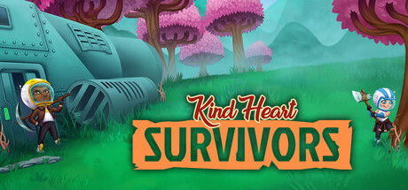
Kind Heart Survivors is a space survival adventure that challenges you" with a verb-led hook that hints at the emotional core: e.g., "Crash-land on an alien planet and uncover the mystery of a broken heart as you fight to survive the galaxy's harshest world."
  2. [uniqueness] Add 1-2 sentences explaining what the "original twist" is—whether it's the emotional narrative, a specific mechanic, or a unique tone—immediately after the short description.
  3. [audience_targeting] Clarify in the opening of the detailed description whether this is a relaxing casual survival game or a challenging one, and align the language throughout (remove competitive/hero language if casual).
  4. [tone_match] Either develop the broken heart metaphor as a central story element with concrete narrative beats, or remove it and focus the copy on mechanical clarity and exploration.

Related guides

Steam app ID: 2803170 · Tags: Exploration, Survival, Crafting, Inventory Management, 2D